Egg|Plant T-Shirt Contest

As I wrote about before, my brother, Matt, runs an organization dedicated to agricultural-based story telling, advocacy, and resource sharing in the Upper Midwest. Each month, From the Ground Up North features a story about sustainable and local food, agriculture, and resources.

In August, all the focus was on Egg|Plant Urban Farm Supply, a shop in St. Paul that carries everything from plants, canning supplies, and beekeeping supplies to baby chicks. They also offer a wide range of urban homesteading workshops and community events. For one such event, the annual Twin Cities Coop Tour, Egg|Plant held a t-shirt design contest. My brother and I decided to collaborate on an entry.

I have this weird thing with drawing animals in gym shoes, and since my brother didn't object, I thought this would be the perfect time to use it as something unique and eye catching. A chicken wearing gym shoes! Because he's got to run around the city, you see? Then I thought of how people are proud to be urban agriculturalists, and wear it like a badge. Sometimes you've just got to take ideas literally.

We thought the back should be more minimal and simplistic, so dropped the title into a ribbon. We made sure to keep to just two colors of ink to keep the pricing costs down, employing the use of the negative space as a third color. I think it turned out pretty great. And funny. 

Unfortunately, we didn't end up winning the contest. They went with a more straightforward classic option. Maybe my urban chicken was a little too kooky? But I still love him. The winning shirt does look nice and I'm sure it was easier to print, too. Oh well, still a good collaboration and better luck next time?

The winning t-shirt design

The winning t-shirt design

Daniel's Birthday Trivia

Last month was Daniel's birthday, which happened to coincide with the weekend my friends Brianne + Nick moved here from New York. I wanted to make something special for everyone, and had this great idea.

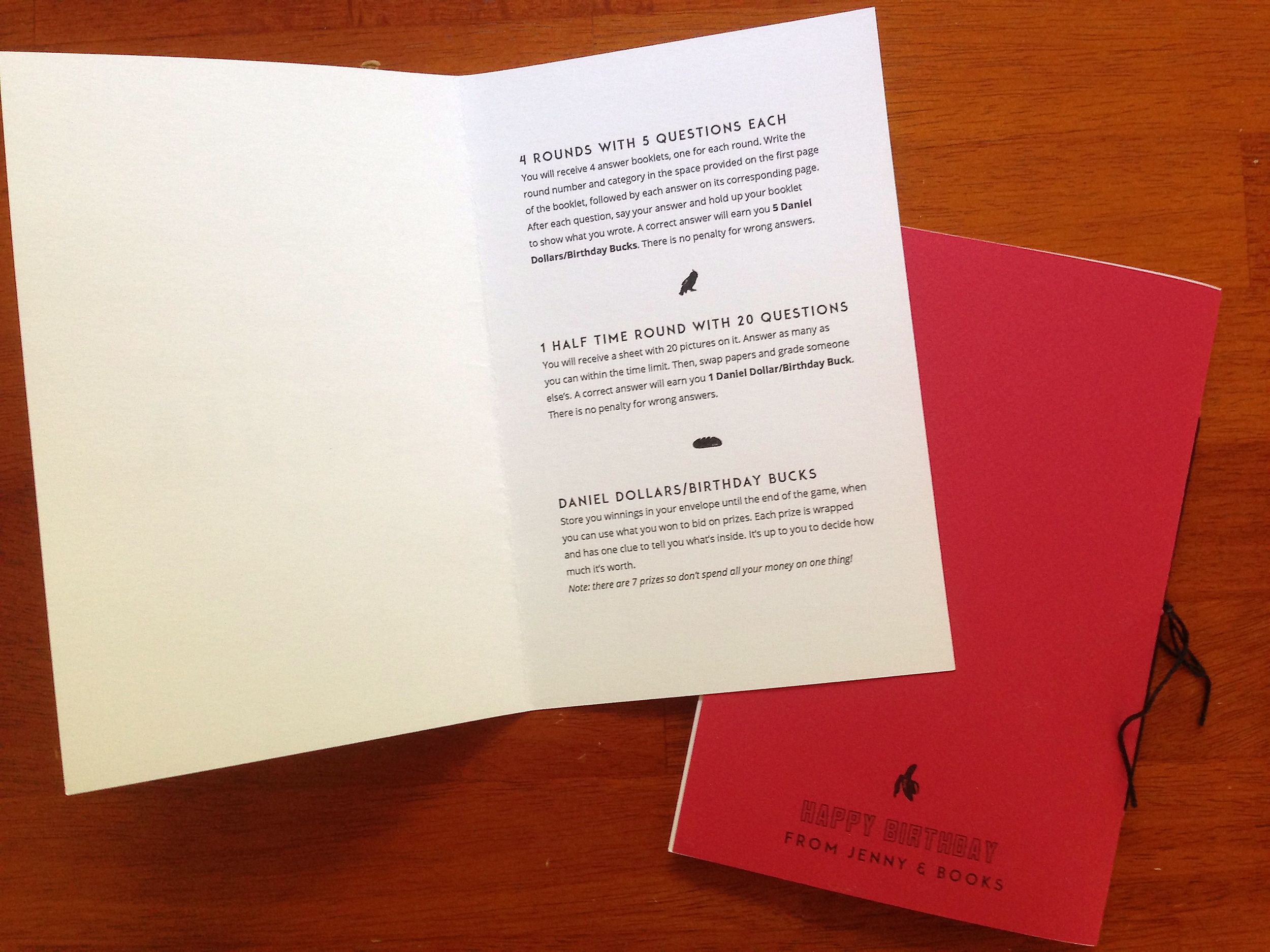
Me and Daniel always go to bar trivia, so I decided to make him his own personalized trivia game with all questions loosely based on his birthday. There were 4 rounds with 5 questions each and a special half time quiz. Each of the four rounds had a category - his birth date in history, the year he was born, famous people with the same birthday, and facts about the number 25 (the age he turned).  I spent a while researching historical events and famous people, getting a lot of helpful information from The History Channel's This Day in History website. Then, I wrote out all the questions before the real fun part began.

I wanted to make some sort of loose logo, and ended up with a pretty solid one. I mixed three different fonts along with this cool font that is just dingbats (is that the right term?) called Nexa Rust Extras. It consisted of super cute animals and foods with a slight grunge/vintage feel. Perfect. I picked out the ones I knew Daniel would like best - elk, banana, bread, and owl - employing them across all the different booklets and things. I carried the three main fonts across everything with a simpler fourth font for the main body text, which really made everything cohesive and tied together. 

From there, I made a few different printed items. First, the question booklet, housing all the questions and answers, for the host's eyes only. I bound it together with some embroidery floss and an easy pamphlet stitch (learn how here). 

Then, a bunch of blank answer booklets, one per person per round. There is a way to make a 6 page booklet out of a single sheet of paper (learn how here), so I did that for simple no-binding-necessary booklets. Inside, the first page had a line to write down the round number and category, then each of the next pages had a line to answer each of the five questions in a round. It worked out really well, although it was a lot of folding. 

After that, I made the half time round. It is based on half time rounds from the place we used to do trivia at in Chicago, Waddayaknow Trivia. They always passed out a paper with 20 pictures on it for halftime, with the category changing each week. Since the rest of the game was all based on Daniel, I wanted half time to be just for Brianne + Nick, so I chose the category 'Famous People Born in New York' (or more specifically, Long Island, where both of them were born). Thank you wikipedia for having such specific lists, all I had to do was cut it down to 20 and find images or each person.

Once of all of the questions were set, I realized that everyone might wonder how to play. Every board game included a page of rules, so I should, too. I made up the rules into a second small booklet, less fancy, just printed on a single sheet of paper. 

Oh, and there is one more aspect to this game. I was looking online for fun party games, and came across this site that suggested its fun to do an auction with fake money for goofy prizes. Why not combine that with trivia? Each time someone got a question right, they were rewarded with fake money which they could use at the end of the game to bid on prizes. The prizes were all silly things I got at SCRAP and the dollar store, wrapped up so each was a mystery with just one clue taped on top. Everyone had fun bidding against each other on different prizes; it was funny to see how much they got into it and how excited they were to find out what their prize was. That way, too, everyone ends up with something (or a few!), no matter how well they did at the trivia part. This did require me to make one more thing - fake money! I couldn't decide between calling my money Daniel Dollars or Birthday Bucks, so I just went for both. I cut out tons of 1's and 5's to complete the trivia package. 

It was a lot of fun and so personalized. I think Daniel liked it a ton, and everyone got to be involved. Now that I have the template set out, I can easily customize it for other friends birthdays or special occasions. It was also super fun to design and make a physical useable thing like a game. I really enjoyed it, and hope I can do more projects in this vein.

View more here.

Design Museum Portland: Sign Painters Screening

A couple weeks ago, I volunteered with Design Museum Portland for the first time, and I already can't wait for their next volunteer opportunity.

Although titled as a Museum, the Design Museum doesn't have a physical space. Instead, they host events all over the city, each with a design focus. From talks and movie screenings to studio tours and print exhibitions, there is something for every kind of designer. 

I helped out with at the Sign Painters Screening, a screening of a documentary focused on sign painters. It was really interesting, describing the rise and fall and now rise again of the industry. Signs for every shop and every thing used to be hand lettered and painted by a professional sign painter. When vinyl printing came about, however, signs could be printed fast and cheap and the sign painters lost a lot of business. Recently, the hand made has regained a lot of its appeal. Once again, companies look to the sign painters to add  that hand made, long lasting touch to the front of their shops. 

It was really interesting to see what a fine art sign painting is. It takes tons of practice to get all your lines perfectly straight before you can even think about the multitude of font and lettering options. Now I want to spend all my time practicing until I can make perfectly straight and even letters with a brush. Its like making a career off of calligraphy.

Portland Sign Painters

Portland Sign Painters

After the movie, four Portland sign painters took the stage for a question and answer session. They ranged in experience and age, making it even more interesting to see how different generations have dealt with the trials of the job. They all agreed on one thing, though - If you have enough desire and drive to do what you love, you can make it work. Even if the industry is shrinking, find your niche and find people interested, and you will become indispensable. A great lesson for any career.

I am blurry, but happy!

I am blurry, but happy!

As a volunteer, I helped with setting up, checking people in, signing people up for memberships, offering Design Museum info, and cleaning up afterwords. I met a bunch of great people already involved with the Design Museum, as well as people just there for the movie. It was a really fun experience, and I'm happy such an organization exists to further design learning and involvement as well as to create a place where designers can come together as a community. Its something I'm super excited to be involved with.  

National Letter Writing Month: Complete!

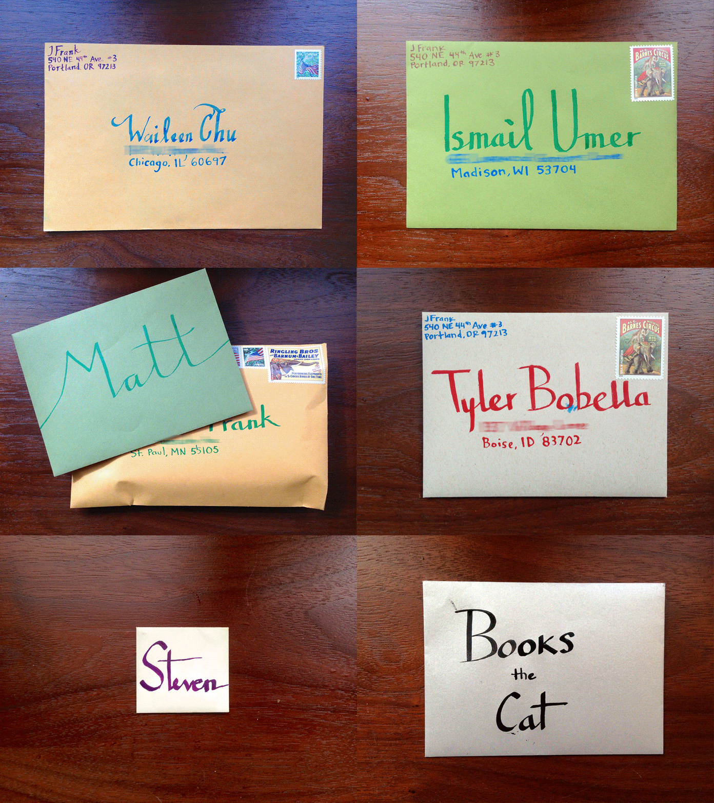
This past month, I took part in National Letter Writing Month and the #write_on challenge, where I wrote one letter for each day of April. [Read my first post about it here.] After 30 days, I mailed and gave out 30 letters to 26 people, 2 cats, and 2 dogs in 10 different states. 

All of these cards plus a few more have been given to their recipients

All of these cards plus a few more have been given to their recipients

It was pretty fun, and it got easier to know what to say as it went on. I feel like I could probably do another 30 now. I thought I'd have to know the person really well to write a letter, but as I went along some of the more interesting ones were people I'm not as close to or out of touch with lately. 

stamps.jpg

I also got the best stamps ever. Circus. One of my favorite parts. Plus I added a dino rubber stamp on the bottom of each letter and threw in some temporary tattoos for the second half. I totally forgot I had them at first (sorry first batch of people!), but it seemed a fitting addition. Hopefully these brightened up people's days! 

I didn't, however, become a calligraphy pro. Gotta work on my alphabet, I think. And maybe not use dip pens? 

Either way, happy letter writing month!

From the Ground Up North

My brother, Matt Frank, recently started a new project: From the Ground Up North, an organization dedicated to agricultural-based story telling, advocacy, and resource sharing in the Upper Midwest.

A Minnesota resident for the past 12 years, Matt has worked in sustainability and environmental advocacy. He holds certifications in both permaculture design and urban farming. From designing rain gardens and planting urban orchards to researching transit growth and serving on neighborhood committees, he always has his hands deep in ways to better his community. Now he has created a space to house and share all of his knowledge.

From the Ground Up North will highlight farms, businesses, and people in both Minnesota and Wisconsin. Even if you don't live in the midwest, you can follow along on Facebook, Twitter, Instagram, and subscribe to the monthly newsletter

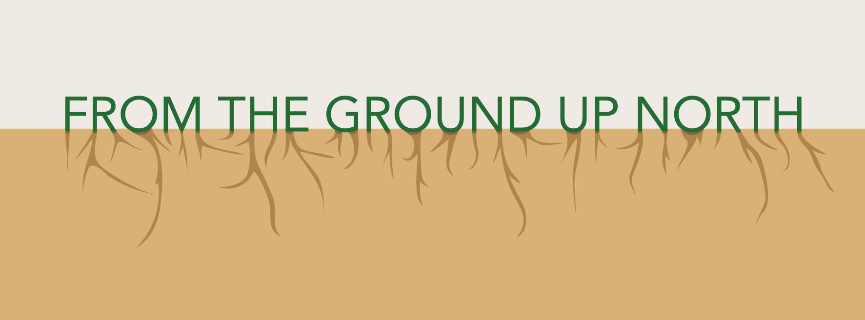
For my part, I took ideas my brother had and created the logo. It is like the agriculturist's coat of arms, including the states to be covered in the background. I also made facebook and twitter headers with the whole name written out, growing up out of the ground. I'm definitely a root-drawing pro now. We used all earth tones, as the main focus is on the earth. Hopefully he will do well and I'll get to expand some more on the initial concept for print items. I'd love to see this stuff in print as well as draw more plants and tools and nature.

So follow along! 

Also, see more of my work for this project here.

National Letter Writing Month

Happy April 1st! Yes it is april fools day, but this is no joke. The nice creative people over at Egg Press (a nifty Portland-based letterpress and card company that I have loved since I got here) and Hello!Lucky (a cute San Francisco card company) have challenged the internet and the world to write 30 letters in 30 days, one for each day of April. It is a chance to return to analog, to make someones day a bit brighter, to reconnect with an old friend, to say thanks, or to congratulate. 

I have always enjoyed having pen pals. After moving around a few times, I accumulated a bunch of friends on all sides of the country. What better way to keep in touch than through letters? Getting a hand written letter in return is so much more special than an email or a text. It means that person cares enough to put in the extra time and effort. A friend is always worth it, I think. And who doesn't love getting mail that isn't only bills?

It thought it would be hard to get up 30 people, but after some thinking I ended up with the perfect list. It is of course full of best friends, as well as friends I haven't talked to in too long and a couple I wish I hadn't lost touch with. I had to throw in a few dogs and cats for good measure.

cards from Happy Hour & Co.

cards from Happy Hour & Co.

My friend Brianne, co-founder of Happy Hour & Co., clued me in to this. Running her own card company, she is always up on the latest card happenings. A few lucky recipients will even receive a Happy Hour & Co card! The rest I found digging through bins of blank cards at SCRAP. I got a lot of really good ones, the hard part now will be deciding who gets which card.

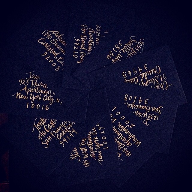
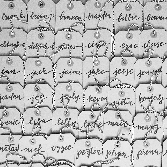
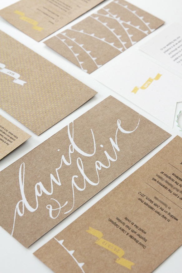
This is also the perfect opportunity to get better at calligraphy. I have been wanting to learn, and what better time than when I have to address 30 letters? I was super inspired by my friend Taylor who did a massive amount of calligraphy for her wedding invitations, place cards, and thank you notes. More inspiration came last summer when I went to Creative Morning's talk by Mara Zepeda, an amazing calligrapher and entrepreneur. Plus typography is the best and I want to learn all about it that I can. Maybe I'll be a master calligrapher by May?

Its not too late to take part in the challenge! Visit the Write_On website to get a free starter kit and search the #write_on tag on instagram and twitter to see what other people are doing.


Knitting up a [well organized] storm

Oregon had an unusually warm winter this year, which really made me miss the freezing cold midwest and east coast winters I am used to. As compensation, I did an extra lot of knitting for friends in cold climates. 

A screenshot of my projects page on Ravelry

A screenshot of my projects page on Ravelry

I've been using Ravelry to house and organize all of my projects. Its so useful. I am always super organized, but knitting was the one thing where I wasn't. I just had tons of yarn in bags and no record of anything. Thank god for who ever started Ravelry. Now I can record all of the yarn I have, note what needles I have on a handy chart, and document my process and past projects with photos and links to all the patterns. Like the Basecamp for knitting (and I love Basecamp). Its also great to look at what other people are making and search through tons of patterns to discover what to make next.

If you're a knitter and on Ravelry, be my friend! jfranknberry (note: you can only see my page if you have an account)

Talking with My Dad [part 2]

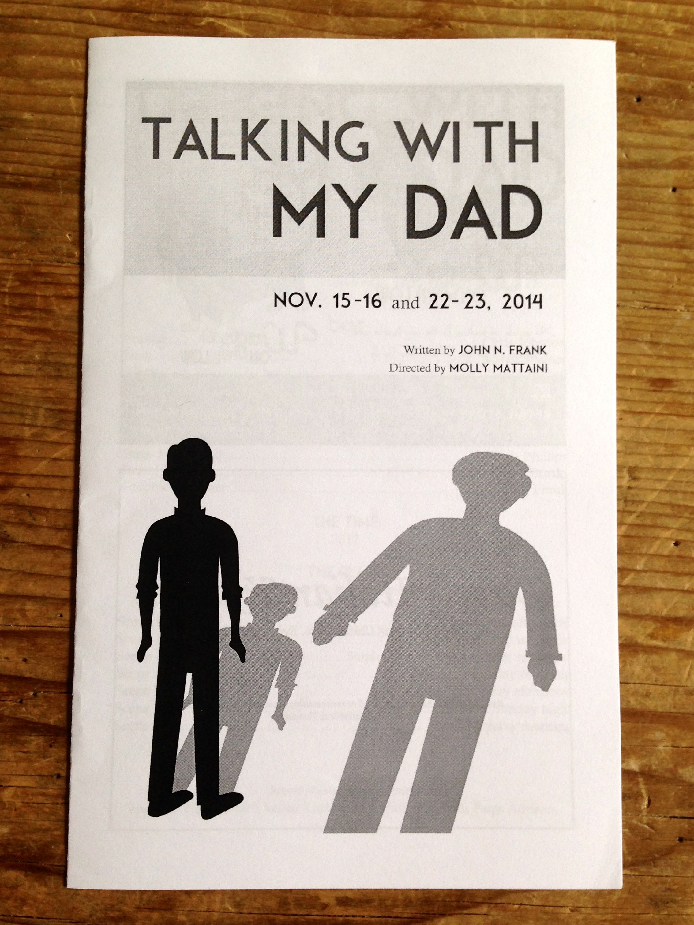
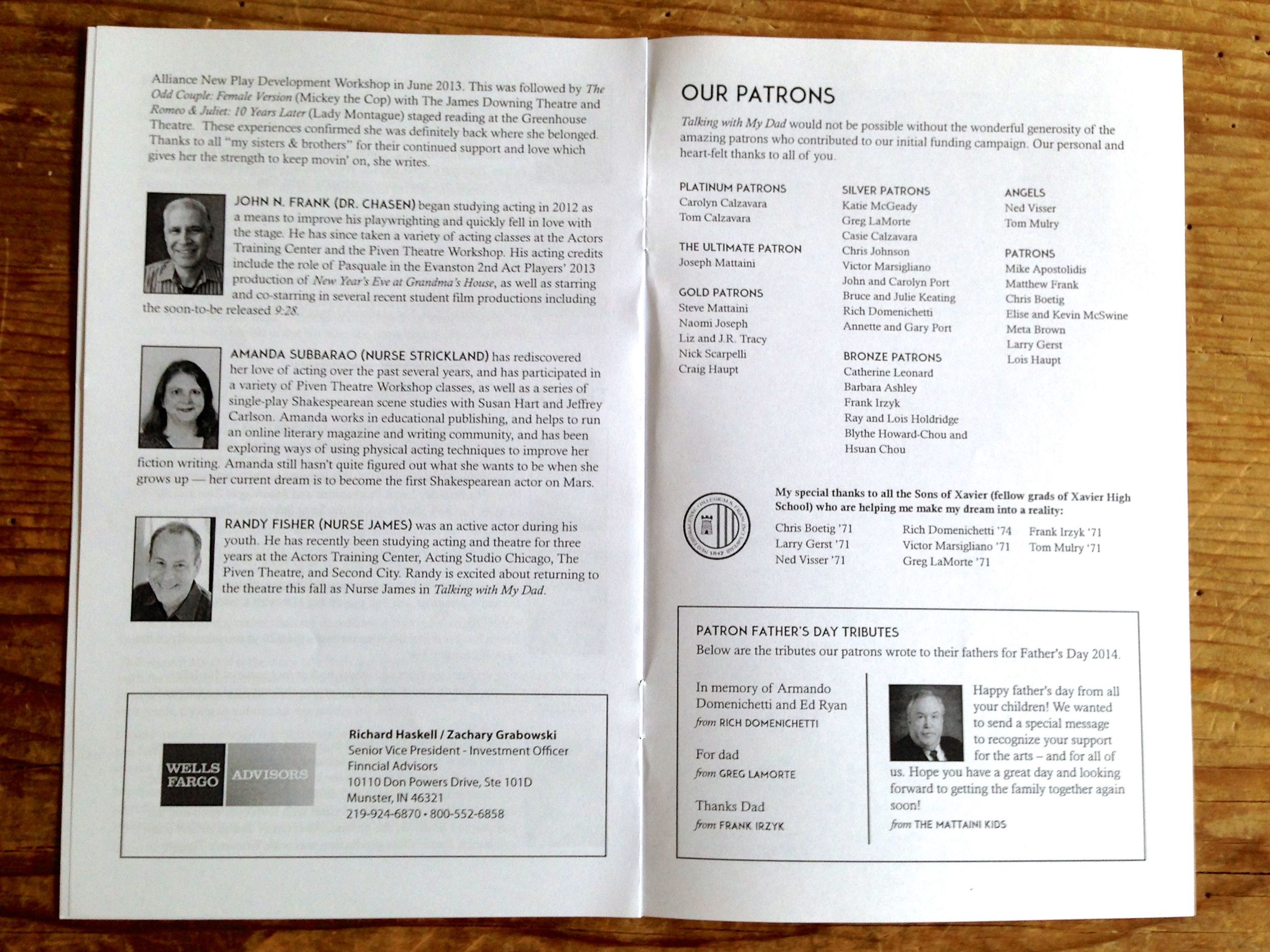
My dad put on his second play, Talking with My Dad, a few months ago and I did all the designs for it, just as I did for his first.

Both plays are about familial relationships, but while the first was focused on a certain time and place, this one was more about the complexity of the relationships themselves, specifically that between my dad and his dad. After reading the script I came up with a few ideas for how to put the feeling this play conveys into images. My dad was pretty open to any ideas, but when he saw this one he thought it was perfect. It shows that the parent-child relationship endures even after the parent is deceased. The parent is still aways there, even if he's not actually there. I paired the image with sterile blue tones of a hospital room, since the play takes place in a hospital. 

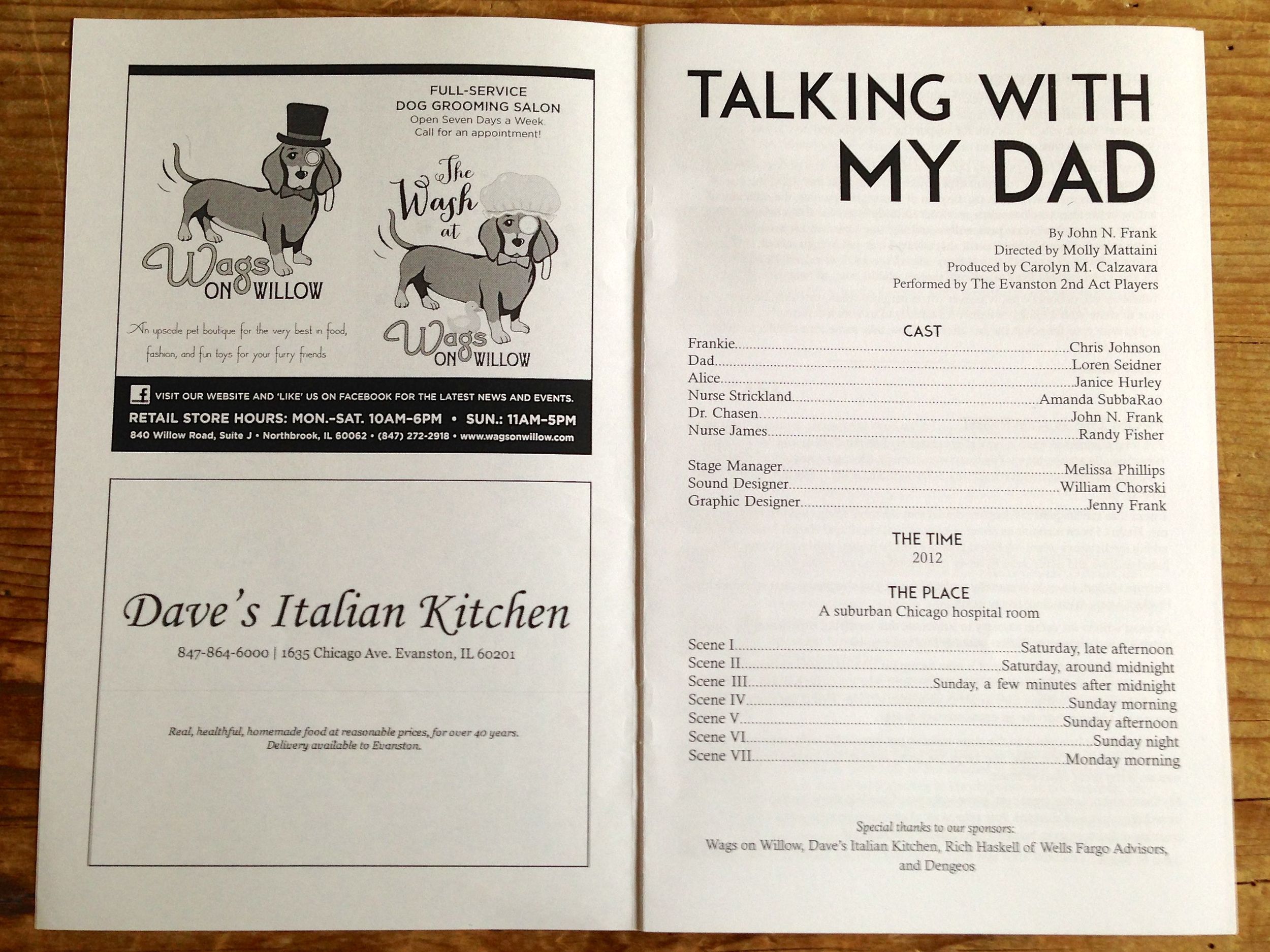
I used this image to create a few poster variations and email header, then translated it to the programs. I am a serial organizer and I've got a soft spot for anything in book format, so I really enjoyed making the program. Its always satisfying to organize pages and pages of information into something more comprehensive. I had to incorporate ads, bios, and patrons as well as a few other sections and I think it turned out really well.

This was a fun project and its always good to help out family. 

You can read more about the play here and see more of my work for it here.

another Valentines post

I usually am not a big Valentine's day celebrator, but that card workshop set me on a valentines projection. 

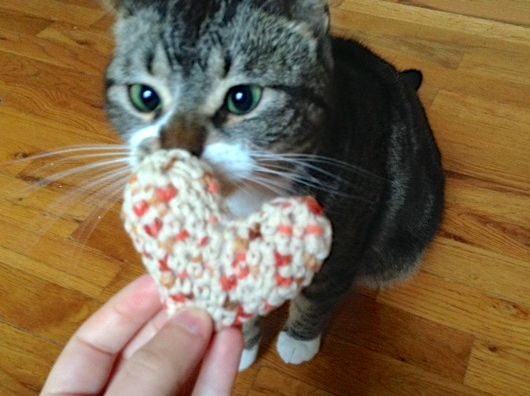
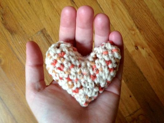
I made a Valentine for Books the Cat. A crocheted heart, stuffed full of catnip. 

And for dinner, a heart-shaped pizza complete with heart-shaped vegan pepperoni.

FullSizeRender.jpg

Valentines isn't so bad. Just another reason to make stuff.

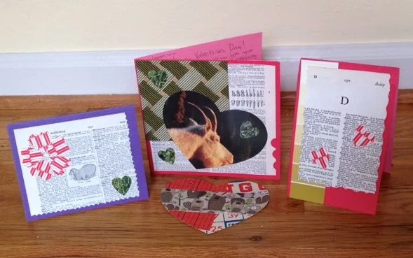
SCRAP valentines

Happy almost Valentine's Day! Always a great excuse to make things and let friends know that they're appreciated.

Last week, me and Hope ventured over to the SCRAP annex for a free valentines making workshop. They had all kinds of different patterned paper and images, fancy edged scissors, file folders to cut down as the base, and a die cut so you could make anything into a heart. It was lots of fun, even though we were some of the only adults there.

SCRAP, a donation-based creative reuse store, is a really great resource to have here in Portland. I can't help but wander through (maybe more often than needed) to discover inexpensive art supplies and office supplies, craft kits, lots of yarn, and tons of other things I didn't even know I wanted. I've got to keep on making to keep up with all the cool stuff I've found there!

Vibe marketing material

One of my favorite projects lately is the marketing material I made for Vibe of Portland. I previously wrote a bit about Vibe and what they do - seen here, but to reiterate, they are an organization that brings art and music classes to kids who don't have access to them as funding for art in schools keeps getting cut. Its something I care a lot about, making it that much more fulfilling to help them out. Hopefully the things I made will attract more people so that Vibe can continue growing. 

I created business cards and a postcard. For the business cards, we employed the colors from their logo, designating one color for art and one color for music. The postcard sticks with a neutral background to better display photos and information.

After a few variations of trying to make the front of the postcard look more 'artsy', we settled on a simple grid to get the point across. Sometimes I feel like if I am too minimal, the client will think they aren't getting what they paid for. But most of the time simple really is better. In this situation, the focus should be on the kids, not the design. 

I always love working in print and these were extra exciting to get back from the printers - since they're so bright and fun. They nicely convey the spirit of Vibe, equally bright and fun.

View more here.

Alicia Nagel Creative's Gift Guide

I know the holidays are over, but people always need gifts, right? 

I have been working with Alicia at Alicia Nagel Creative for a while and have learned a ton about design and business from her. This time, she took a bit of art from me. Together we came up with thirteen gift ideas from food and prints to classes and tickets, all made or situated locally. Then I got to employ some of my skills in illustrating each gift. I love minimal line drawings but don't get to do it that much in my day to day work, so this was really fun and made the blog post a little more unique. 

I also took a stab at some writing. I'm not a pro copywriter at all, but when I get away with saying things like "revel in the flavors of Oregon" I am happy.

Check out Alicia's blog! And the gifts! (there are some good ones, I've gifted and purchased at least half.)

See more here.

Pay It Forward Bundle!

Just in time for the holidays, a bunch of creative companies have come together to help those in need with the Pay It Forward Bundle!

One of my personal favorites, Creative Market, has joined with Dribble, MOO, Threadless, and many other companies I have yet to discover, to offer design assets and discounts on creative services. A massive bundle worth over $4500, and you can get it for as little as $2. Pay what you wish, with all proceeds going to Watsi, an organization funding healthcare around the world.

While you're at it, join Creative Market. Every week, you'll receive a bundle of 6 free design elements, from fonts and textures to illustrations and web layouts. Download as many or as few as you wish. They're all free for commercial use and really come in handy to help make designs more dynamic. This site it too good to keep a secret.

Just a sampling of what Creative Market offers

Just a sampling of what Creative Market offers

Also included in the bundle: Karma - the internet of the future? I'm intrigued. 
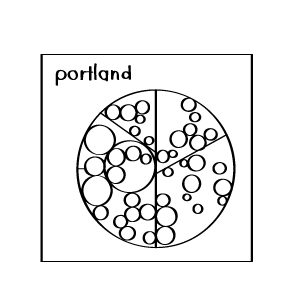
Portland-themed Bus Decals

I recently had the opportunity to design and illustrate some vinyl decals that would cover two buses for iHeart Productions, a Portland-based marketing company. They are focused on organizing branded events and interactive campaigns for their clients. Now, when they drive their team out to events, they can show up in their own branded buses. 

busdecals_2.jpg

Since they focus mostly on other brands, they don't have a strong identity themselves. They want to be seen as a local company that can make big things happen, so we focused on the Portland theme.

Together we brainstormed and came up with 20 symbols of Portland. From there, I got to work drawing each of them in a way that wouldn't be too difficult to peel and stick as a sticker. It was pretty enjoyable, its not every day that I get to draw big foot. They were then laser-cut onto vinyl and stuck onto the buses in an organic pattern. 

This was a really fun project, and super exciting to see it all come together - from a computer screen to a giant bus. It was also a good way to learn more about a new city, having lived here maybe 6 months at this point. Plus, I always love making stuff about places. Now I should just make a bus for every place I've lived, right?
busdecals_4.jpg

View more here.

Dave and Taylor

One of my close friends, Taylor, just got married. We spent the weekend at a summer camp, having adventures, playing games, seeing old friends, and making new ones.

It seems so suitable to Taylor's personality to make her wedding be focused on spending time with family and friends. She's always been a great and caring friend, so I knew I had to do something great for her and Dave. After accidentally telling them I might make something, I was locked in. At least I had a pretty good idea.

daveandtaylo_2.jpg

I haven't done printmaking in a while, mostly because it requires a press and a studio in which to do it. But when I did do it, I really loved it. And this project seemed best suited for a print.

After carving a block of linoleum, I went searching for a studio. Thankfully, I found Radius, where I could rent studio time and make what I wanted to make. Everyone there was so nice and friendly and helpful. It was great to be back among like-minded art people. 

daveandtaylo_3.jpg

Since the wedding already had a bit of an adventure theme, and since both Taylor and Dave have traveled and lived all over the world, a map was the thing to do. I returned to my love of making maps and art about places - the main focus of my work senior year of college. 

One color for him, one color for her, and a middle color for both. Personalized, made with my hands, and from the heart.

daveandtaylo_1.jpg

Sometimes you need that extra push from a friend to keep on going, to keep making. Thanks Taylor and Dave, for the much needed inspiration. I'm glad you like it, and hope you find a good spot to put it in your new house. 


[I also just picked up some topographic maps from Scrap the other day. Time to keep on making, and keep on printing.]

Free Fonts!

Font Fabric just released some new free fonts today! You can get them here.

I'm kind of into the grunge ones. It might not be in my usual character to say that, but this whole earthy-oregon thing is getting to me.

The set of extras is great, too! Such cute little animal and food icons that will come in handy.

They're all pretty nice, although I'll probably pass over the handmade one. I'd rather make it myself, to be truly handmade. But definitely put the rest to good use. And commercial use!

Thanks Font Fabric! 

Creative Mornings PDX: Mark Lakeman

I am behind in my updates on Creative Mornings. I am always behind on blog posts, it seems. But I don't want to skip over this talk I went to a couple months ago by Mark Lakeman. It was the most inspiring Creative Mornings talk yet out of the ones I've been to. My favorite. 

Mark Lakeman

Mark Lakeman

Mark Lakeman is the co-founder of The City Repair Project - an organization focused on reclaiming public space for the community. He talked about how modern cities are all laid out in a grid, with each person inhabiting their own little sectioned plot and not crossing over the lines. This is in stark comparison to ancient cities, where everything was laid out around the public square, a place where neighbors would congregate and interact. The grid has taken that away. 

I lived New York City for four years, the biggest grid in the US. I understand first hand how a grid like that separates people instead of bringing them together, even if its 8 million people crushed into that grid. For all the people that you're constantly squished between on the subway, sidewalks, and in tiny apartments, you probably actually talk to less than 5 percent of people you see in one day. Thats not a good feeling, and something I was trying to get away from when I left New York. 

When I first came to Portland, everyone seemed so friendly and welcoming. I became even more excited to be here after hearing Mark Lakeman talk about how this is a city focused on community. He is one of the leaders pushing away from grid-life. 

An example of a painted intersection

An example of a painted intersection

In various neighborhoods all across the city, Mark brings people together. He has turned tons of intersections, where people normally only pass by each other, into destinations for paths to converge. He brings neighbors together to paint the street, to create a gathering place, to get to know who they are living around. He makes public spaces where there formerly weren't any. He fights against planning and zoning laws that stop neighbors from interacting.

And his biggest message - collectively, we can make life better for everyone. People should work together, not against each other. Portland is a progressive place, where humanity and community takes precedence over each individual's gain. It is a city made by and for its people, instead of faceless corporations. Thats exciting to be a part of, and I'm so happy to be here.

Makes me think a bit about utilitarianism, but hopefully this is better.

This talk is really worth watching, no matter what city you live in. Its a message that more people need to hear. If you've got an hour, definitely check it out - here.

Race for the Animals

I've recently donated some of my time and designer skills to a cause near and dear to my heart - animals! 

Northwest Veg is a nonprofit organization dedicating to educating and encouraging people to make vegetarian and vegan choices for a healthy, sustainable, and compassionate world. I have been vegetarian for the past five years, and mostly vegan for 3 or 4 of those years, so its great to meet other people with similar ideas and be able to help them out with their mission.

1398364251.633304.IMG_1293.png

Their big even coming up this weekend [June 28] is the Race for the Animals. It is a fun walk and run, with proceeds going to a local farm sanctuary.

Grow Creative had made such cute designs for a previous year's race. I updated those into postcards, flyers, t-shirts, newspaper ads, web banners, and a giant race banner. I keep seeing the postcards and flyers around town, and its awesome every time to see things I've made out in the world, especially when its for a cause I'm invested in. I can't wait to get a t-shirt on Saturday, too.

I hope they have a good turn out, to help as many animals as possible, and I hope I've aided in that number a bit.

If you're in the Portland area, there's still time to sign up!

Snail Friend

Daniel got me a needle felting kit for christmas, since I've been talking about wanting to learn how to do it for a while.

I just finished him this weekend:

1402345544.683256.IMG_1595.JPG

Needle felting is cool since you can make any shape you want, but its kind of tedious. And you have to always pay attention or else you stab yourself (which happened a few too many times).

Either way, a new skill!