From the Ground Up North - Seasonal Banners

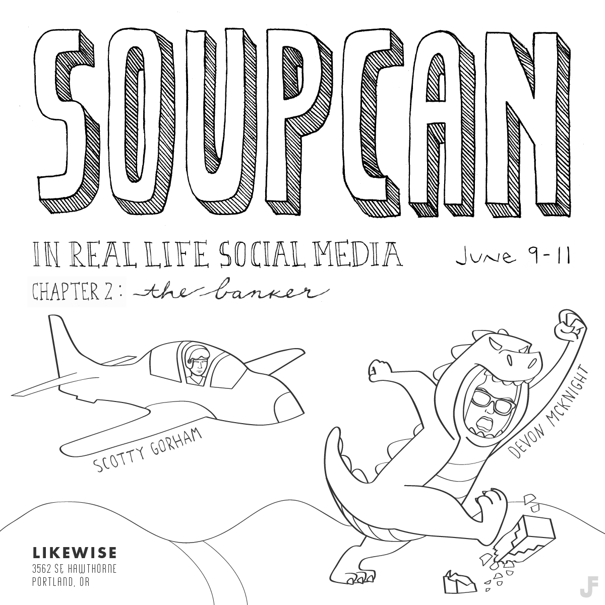
I like vegetables and I like illustration. I like animals a lot so I don't eat them. I like cooking and I think I'm pretty good at it, having convinced many a skeptical omnivore how good vegan food can be (although I'm not all the way vegan. mac+cheese/pizza forever, vegan plus cheese). I really like doing design for things I really care about. 

My brother likes eating locally, seasonal ingredients, and sustainable agriculture. He likes helping the planet and sharing his knowledge with his community, both local and online. His website, From the Ground Up North, does just that. 

ftgun-site_spring.png

Food. We both like food. I guess we're related, right? For the past year or so we have had a Frank-Frank food-based collaboration. Four seasonal homepage banners for From the Ground Up North: summer, fall, winter, and now spring. He told me what vegetables grow each season in the midwest and I drew them. 

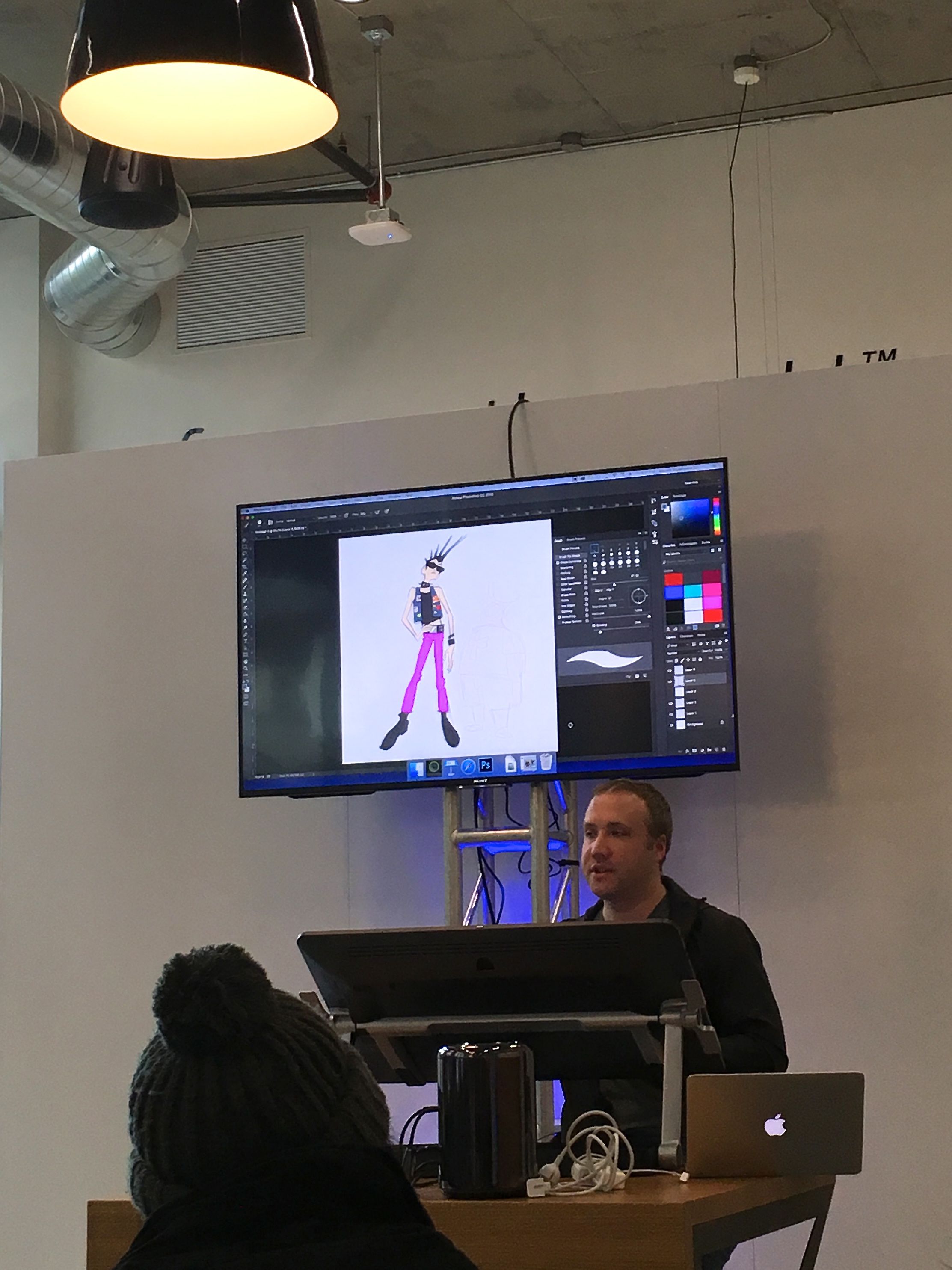
A fun part of this project was delving more deeply into this coloring style I've been working on. I always do illustration using my Wacom tablet in Illustrator, then make it into a live paint group. Perhaps it is a slight bit of OCD, or perhaps it has a better reason, but once I have those live paint sections I like to make each one its own unique color, different from every other color in the image. Subtle color differences make for easy shading while larger differences are obviously more clearly different. Learning about color theory in college was one of my favorite parts of drawing class and Josef Albers' Interaction of Color is forever one of my favorite books. Seeing the interaction of colors in these drawings is really exciting to me, and also allows me to think about it more as putting different shapes together instead of just drawing.

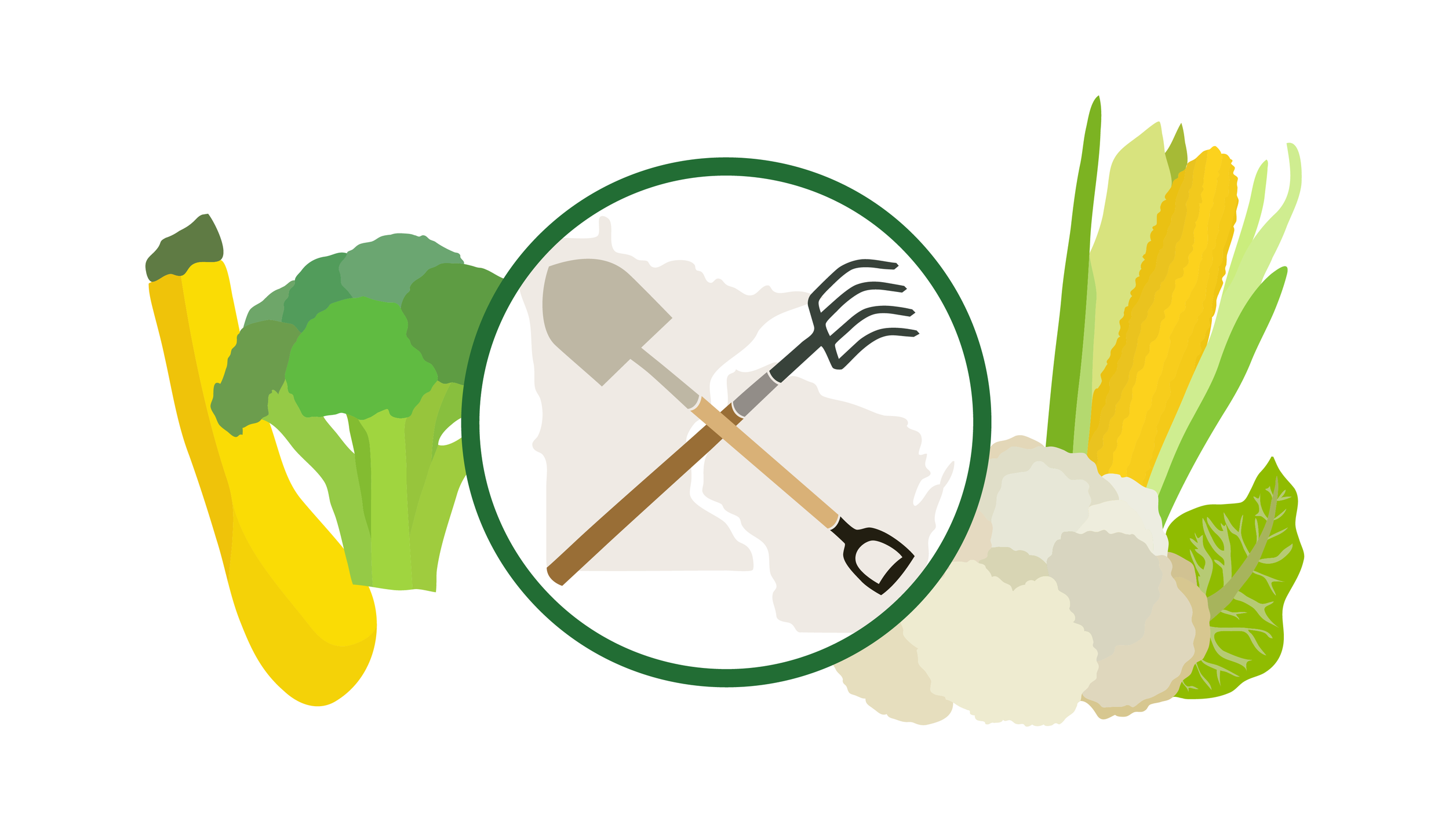
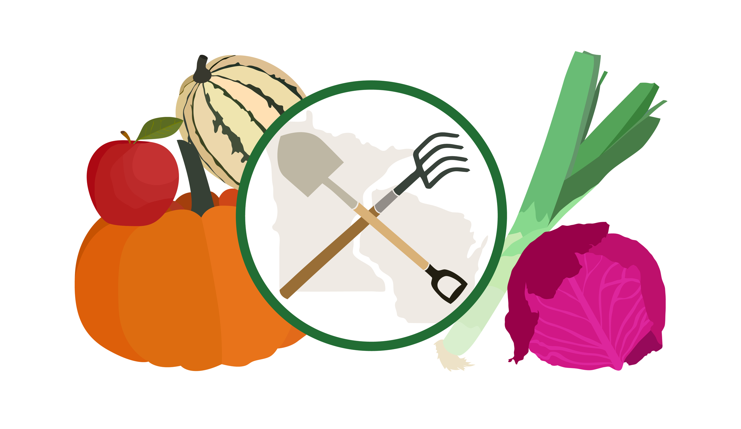
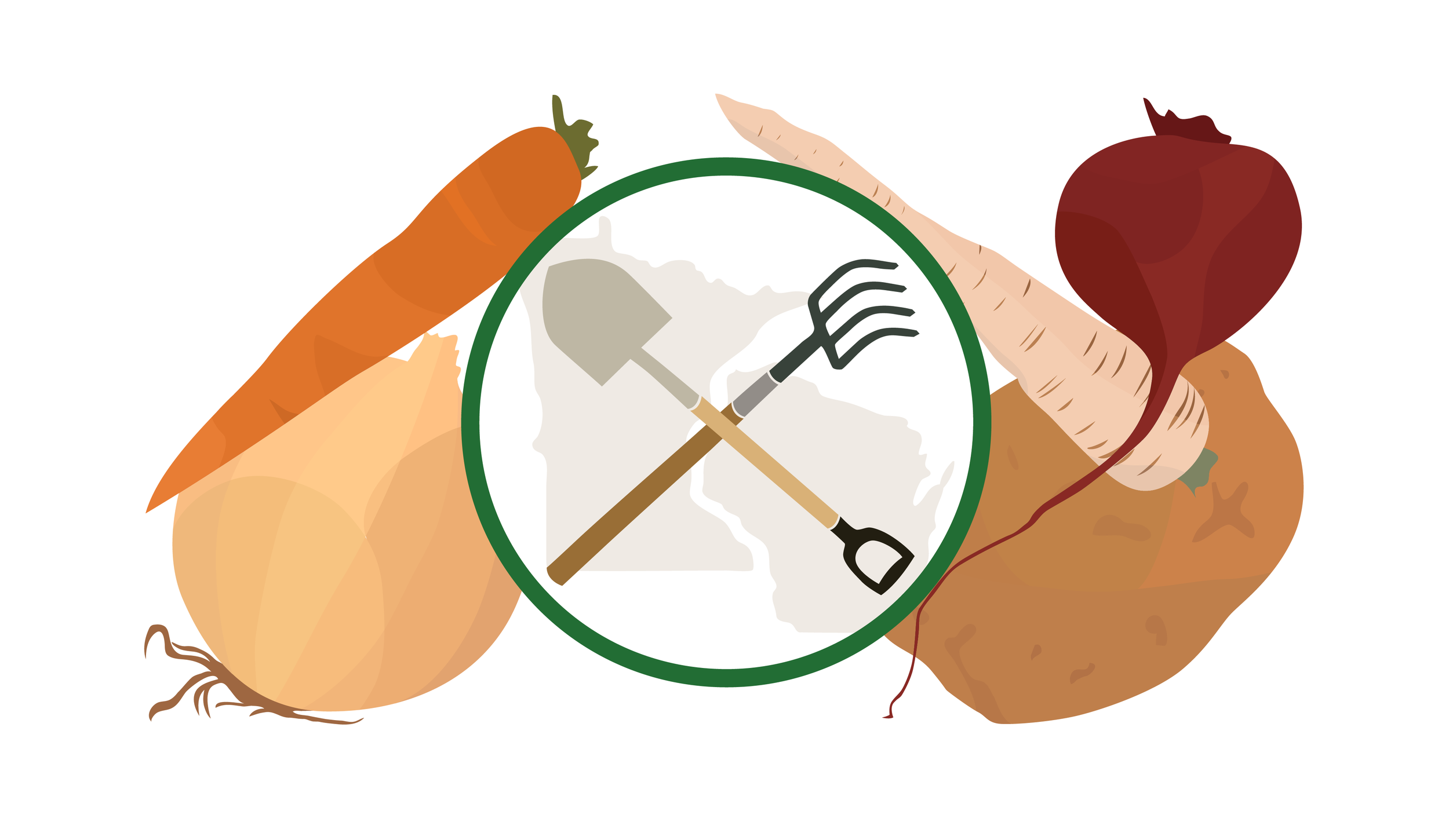
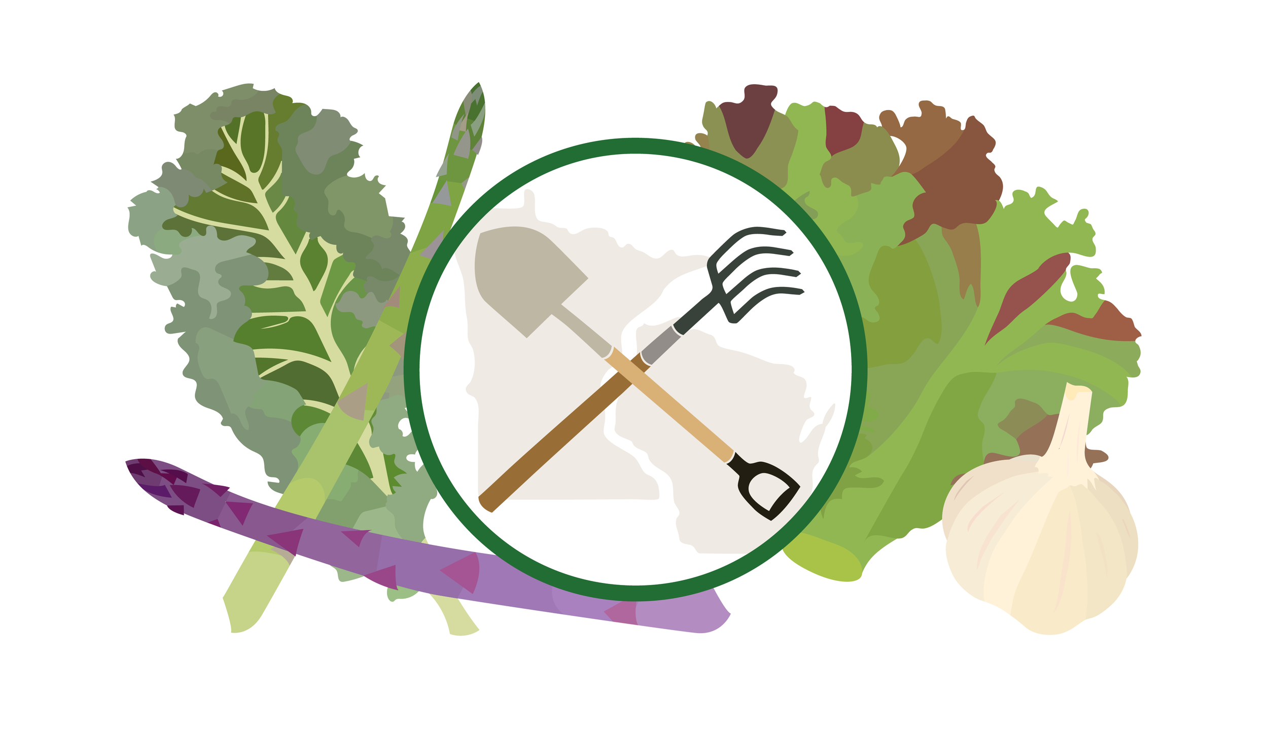
Plus vegetables! One of my favorite subjects. Leafy greens are exponentially more fun to draw than I thought they would be going into this. And carrots are sort of boring. (Unfortunately, I don't think level of drawing fun and taste necessarily coordinate, although that would be a fun project to explore.) Its an interesting progression from the summer banner to spring, as I got more into smaller details and sectioning things off more. Similarly, its cool to see the seasonal colors, how summer is bright and vibrant and winter is much more muted. I can cook all the vegetables, and I can draw them all, too.

Check out From the Ground Up North for more food and plant knowledge, and see more of my work for them here.

Hello Chicago!

About a week ago I moved back to my hometown of Chicago from Portland, meaning I have to take down the Portland video I made for my homepage. I am leaving it here, for safe keeping:

Keep an eye out for something new and exciting on my home page soon! In the mean time, bison will hold that spot. (If you don't know, I'm a super animal lover and bison is the animal at the top of my list.)

I'm looking forward to continuing creative work here in Chicago. If you have any design projects or just want to meet up for a drink, head over to my contact page  and let me know!

Rejuvenation Gift Wrap

Just in time for the holidays, here's another recently completed project from my work at Rejuvenation. Every winter, they sell an ornament to benefit St. Jude's. Its always made out of a repurposed lightbulb with a different style of house in it. This year's house was an a-frame.

The St. Jude's a-frame ornament, featured on the back of the most recent catalog

The St. Jude's a-frame ornament, featured on the back of the most recent catalog

To go along with it the ornament was an idea to make some custom a-frame wrapping paper for use in store displays. I'm not sure how I got ahold of this project, but I'm so glad I did. It was 100% my style, simple line illustration plus house drawings. I did a whole project a few years ago where I illustrated every place I lived during college (see it here), so this is very much right up my alley. I absolutely love when I can put on my headphones, turn the volume way up, zone out every thought that isn't vector-related, and really put my trusty wacom tablet to work on some good building illustration. 

I first drew a nice snowy a-frame house and some trees using two colors. Then I learned that we were switching to print in only one color. Another designer gave me this good idea to use close together parallel lines to act as a second color. That turned out really nicely, with the front parts of the house in solid white and the roof and trees in thin parallel lines.

Once it was all printed in white ink on craft paper, a big box full of rolls arrived in the office. That was the most exciting part, to see it repeating in big long sheets. The team wrapped up boxes and dispersed them throughout the store displays, as well as sending rolls out to each of the other six stores across the country. 

They look so cute and festive, but I think the scale is a little too large. My design teacher in college repeatedly told us to ask as many questions as you possibly can as a designer, and while that advice is always running through my head, I definitely missed the important question of box size here. I guess we'll just have to wrap up a couch or a sink next to fully see the pattern.

You can still catch these holiday packages in all seven Rejuvenation stores through Christmas! 

See more of my work for Rejuvenation here.
Check out some other buildings I've drawn for the 2nd Act Players here, and for another personal project here.

Rejuvenation Catalog

Earlier this year I started working as a print designer at Rejuvenation, a lighting, hardware, and home goods store under the Williams Sonoma umbrella. My main focus is the catalog. I work closely with my creative team as well as buyers and photo retouchers to bring it all together 8 times a year. Its been really cool being part of a big brand like this, especially as they continue to expand more and more (a new store just opened up in Chicago, and a New York store is on the horizon!)

Rejuvenation branding is full of clean lines, negative space, and refinement, something I am proud to put my name on and add my own touch to. And I always love working in print, seeing a physical product at the end is so fulfilling. Its pretty exciting that this catalog that I have such a large roll in putting together is then sent out all across the country. That's hundreds of thousands of people seeing my work! 

Along with each catalog, we create an accompanying mini catalog that is about half the number of pages. I have been taking the lead on the mini, from scheduling to building out all the spreads to rounds of editing and final proofing. Its really rewarding to see those come through from the printer, to see all of my hard work manifest in a tiny little version of the big catalog.

It's been great working with everyone at Rejuvenation, and I'm so happy with everything we've created together so far!

Check out more of my work on these here  
And browse the latest catalog on rejuvenation.com

The Institute

The Institute: Coming of Age During the Vietnam War is nearing the end of its run by the 2nd Act Players. There's still one weekend left, so don't miss out! 

For the past three weeks, playgoers have been enjoying the story of kids in military high school finding their way during the Vietnam War and creating lifelong friendships. Positive reviews have been pouring in, including this article from the Loyola Phoenix, and I'm so happy to say I was a part of it all coming together.

Once again, I created the poster and programs for the show. They all started out with this photo my dad had of he and his classmates in high school. It shows all of the kids lined up in their military uniforms about 45 years ago. The story is based on a few of these guys, so its seemed only fitting to use the photo as a visual representation of the play. After some back and forth and 60s posters education on my part, we decided to overlay a tie dye peace sign on top of the photo. The color against the black and white image further exemplifies the two competing ideals present at the time. Then I picked this tall bold condensed font to mimic the military students standing tall side by side. Upon completion, I was excited to hear that a bunch of high school classmates that my dad still keeps in touch with have hung the poster up in their homes as a reminder of the happy times they all shared and continue to share together.

I also got to create this magazine ad for the show, which was pretty fun.

I also got to create this magazine ad for the show, which was pretty fun.

There are still three shows left! Get your tickets here

Earth Hatz

It's been really great working with Zeph from Earth Hatz.  He came to our first meeting with clear ideas and source imagery of scenes that would be embroidered onto the fronts of baseball hats. He has worked a lot in nature and each scene, from the dessert to the beach to the mountains, seems close to his heart.

I took his initial ideas and drawings and illustrated them. The first few consisted of a dessert arch, an homage to Oregon, and a hammock at the beach. I especially love the arch design and even got a hat with that design on it for myself! 

After this, I expanded the beach design to include both a stand up paddle boarder and a surfer. Then I drew a hiker to fit in with some trees he already had. That makes a total of six different designs, each embroidered onto four different hat colors. So many options. (I don't think this second batch is in production yet, but coming soon!)

It was really interesting to learn more about commercial embroidery in the process. I was worried about color, thinking they would only have so many thread options. But apparently they can match nearly every color. It was also interesting to work while keeping in mind that they charge per stitch. I've made a lot of t-shirts where they charge per color, so I had to change my mindset a little for this. Unlimited colors, less area. I'm always happy to learn new things and new ways of making, and enjoyed combining my love of illustration with a new learning experience. I think they all came out super great.

Zeph has been selling Earth Hatz at a few different markets around Portland. You can also buy them on earthhatz.com!

Reflektive

I've recently been working on some projects for Reflektive, a performance management company based in San Francisco. The first thing I did was was a big infographic. Using their company colors and fonts, I turned a giant list of stats into something more digestible. I really enjoy infographics, they're just like super precise illustrations. I even got to draw a few icons.

I want to delve really deep into infographics now, and be the best infographics guy around. Its cool to turn something thats sort of boring like a big list of numbers into something really visually impactful, to communicate without words. 

I also worked on some ebook covers and banners for them. I made two different sets, first using stock photos and companies' logos. These each highlighted performance management and reviews at big corporate companies. The general office photos we chose give it that corporate feel, and the colors are pulled from each logo. I mocked up each cover as a real book and used those on the banners. 

For the second set about more general performance management ideas, I drew up a bunch of simple line drawings with highlights and shadows. Then I made monochromatic covers which were again mocked up for the banners.

I'm happy with how everything turned out and also really happy to find another way to incorporate some illustration into my design work.

Soup Can

As I've mentioned a few times, my good friend and former boss Scotty Gorham was here in Portland for a month long artist residency this summer. He and his partner Devon McKnight made a ton of cool projects and I really loved having them both around. 

It was pretty funny how it all came together. I pass along artist residencies and opportunities to Scotty once in a while, mostly from NYU art program alumni emails. Since they're coming from the other side of the country, they usually don't include any close to me. This 'bartender in residence' program was probably the only opportunity I've ever sent him that is in the town I currently live in. It was such a pleasant surprise, then, when that was the one he actually did! His friend from grad school (Devon) knew the people who owned the bar (Likewise) from North Carolina. Small world. I'm so happy that it all came together and than I got to take part, too, even more than I anticipated.

The beginning and end of the story is Likewise, a bar that hosts the only 'bartender in residence' program in the country. That means that artists come to their bar and, usually for about a month at a time, are free to use the space for whatever art they want while also acting as bartender. When I first heard about the concept, I immediately thought of Scotty. Two things I know he's an expert at: making art and bartending. He is an artist working in new media and installations, and we used to work together at a group of bars. Perfect combination. 

So he and Devon wrote a proposal for Likewise that was quickly accepted. Then Scotty and I got to work talking about branding. I do design work for him every so often since working together, but I definitely didn't realize what a collaborative environment we would create for this project. Before he got here, though, it was a little rough. He'd never been to Portland before, had never seen the space he was about to make art in for a month, and didn't know what kind of reach we would have with advertising, if any. We passed a bunch of different ideas back and forth, none of which ever came to fruition. We talked about logos, and how a physical neon logo could relate to a printed logo. Lots of interesting things that I would still like to explore, but nothing was really working. (See some designs that got passed over and repurposed here). Finally, a few weeks before he was set to arrive, Scotty had an epiphany: Soup Can. 

Soup Can, an snappy digestible title, to describe a concept of communication, environment, and a bit of a nod to what came before us. The initial image is that of two empty cans connected with a string, used as a telephone between city windows and at every treehouse. Such a simple form of communication, vibrations through a string, that carries with it a feeling of nostalgia. The next thing that comes to mind is Andy Warhol, mass producing an object that was already being mass produced: the Campbell's soup can. Pop art pulled mainstream culture and aesthetics into a fine art realm, putting concept and theory behind that which is intended solely as a commercial product. The third thing I thought of were soup kitchens and can drives, events whose main purpose is to include and provide for those left out. These three main points (communication, commercialization, and inclusion) would be translated through neon environments and interaction with the bar patrons. It is conceptually rich, which was really exciting for me to talk through and ultimately get behind full heartedly. 

 For a bit of explanation, Scotty decided the tagline would be "In Real Life Social Media". He works with social media a lot in his work as a medium and a platform. Similar to two cans on a string, a bar is a way to bring people together to communicate. It's also kind of like a pre-technology form of social media, where you go to talk to your friends or meet new people. Every project at the bar would bring people together in real life [IRL]. 

Along with this conceptual epiphany, Scotty also had a collaboration epiphany. Rather that compromising each of our styles and getting nowhere, he wanted me to go deep into my own aesthetic and style to remake the first flyer. I immediately pulled out my sketchbook and markers to start drawing. I like really simple line drawings, sometimes colored in and sometimes not. You can see them in a lot of my work (pretty much whenever I have the chance, I sneak them in). I've also been doing a lot of hand lettering lately and trying to get better at that. So I drew up some big marquee letters for the title and we both knew we were finally getting somewhere. 

Stemming from thoughts of social media and communication, we decided to use Bitmojis as a base for all images on the flyers. Bitmojis, personalized emojis, allow you to say even less in order to communicate. They're pretty far removed from communicating via the soup can telephone, but thats what makes it an interesting juxtaposition. Modes of communication are constantly evolving, and Bitmojis definitely have their place in that. I took Scotty and Devon's Bitmojis and turned them into Jenny-style line drawings. I made a lot of small tweaks but left the overall Bitmoji style present so that anyone who knew about them could recognize the style but the reference wasn't hitting you over the head. 

Shortly after the first flyer came together, Scotty packed up two giant cases of neon bars and I met him at the airport on a rainy Portland night. We hugged and got a drink and caught up. I didn't know what was in store for me, but it turned out to be one the funnest, most creatively stimulating months I've had in a long time.

Scotty and Devon worked the bar Thursday through Saturday each week, giving them a few days in between to deinstall and install the next project. The first weekend started the day after Scotty got here, so it was more about feeling out the space and clientele. Likewise has these big bleachers in their front window that they use as an unofficial logo of the bar, so Scotty and Devon started off by outlining these bleachers in neon. It was a nod to what the bar already was with a hint of what was in store for the coming month. There was a big opening party complete with an official 'Neon Lighting' towards the end of the night. Just like a tree lighting, everyone gathered around and counted down. Then the neon was plugged in and we all oohed and aahed and took tons of photos. It was such a real event, like happenings in the 60s - one time art events involving everyone present. A perfect kick off to an incredible project.

For each consecutive week, projects were inspired by interactions that Scotty and Devon had at the bar, incorporating a few pre-conceived social media-inspired ideas and some current events. The second week focused on three particular bar patrons and their stories - a man who recently quit his job as a banker to start his own pot farm, an asian woman who was feeling trapped and repressed by views of women in asian culture, and a pilot who just finished his 10 year commitment in the air force and now has every option in front of him. These three individuals represent a dichotomy of freedom and restriction. To symbolize them, Scotty and Devon created an installation on two facing walls. On one side, a big green rectangle outlined by green neon. This represents wide open freedom and, more literally, a pot farm. On the other side were alternating pink and orange bars to show restriction. It was super bold and striking, and interesting when they turned off one wall or the other, to see how different the room felt bathed in different colors of light.

The third week was focused on another bar patron, fondly known around Portland as Nitwit. Nitwit is a man who works as a baker by day and a street artist by night. He makes hearts with nice quotes on them and cartoon characters out of styrofoam and leaves them all around town. To represent him, Scotty and Devon used the painted green rectangle from the previous week to act as a green screen. Just like Nitwit, the green screen is one thing at one time of day and something totally different at another. People coming to the bar could pose in front of the green screen and Scotty injected space cat photos in behind them. (This was probably inspired by living with Books the Cat for a few weeks.) All photos were posted to Likewise's instagram, bringing back in thoughts of social media and its validity. It was obvious where the green screen ended, obvious they weren't trying to make it look like people were really in space with cats, but whats on instagram is still not what you'd see in person. There was a ticker above the green screen with the date and time, brining some analogue back into something completely digital, too. People got really into it and even came back weeks later asking for space cat photos.

The Sunday of the third week was also Pride, so Saturday night was a Chicago-style pre-pride party. Scotty played Chicago house music all night and they projected Paris is Burning, a documentary from the 90s about vogueing, drag, and gay culture in New York, onto one of the walls. Nitwit also made some super cute gnomes holding pride flags to put around the bar. In being Chicago-style, it was definitely not as loud and energetic as Chicago pride, but still really fun and brought back happy Chicago pride memories, including some that me and Scotty shared. Portland pride in general seemed a lot more subdued than Chicago pride, but always prideful!

The same week is when the shootings at Pulse in Orlando took place. To commemorate, Scotty and Devon made a column of green neon at the front of the bar. It wasn't super loud and obvious, but something to say "we stand with you". 

The fourth week is the week I got involved! My dad was in town around week 2, and told Scotty about how I wrote plays in high school. You can read more about that in my last post. After that, I spent two weeks writing a play for Soup Can. On Thursday, anyone who came to the bar could read a part while I filmed. Then on Saturday there was a big screening of the final film. It didn't turn out totally perfect, but it was really great to get back into more creative thinking and making. The play was about my three best friends, with three colors of neon connecting different readers to the same character. I didn't think I was going to be one of the interactions that inspired a project, but I think learning new things about me was the same as learning about new people. I was really inspired by everything Scotty and Devon were doing and was excited to interpret their existing project in my own way. I'm beyond ecstatic that I got the be involved in such a way. Look out for more projects from me in the future! (and watch my movie here).

That Friday featured a breathtaking ICE + NEON project, with ice curtesy of ICEovation. I met James from ICEovation a little while ago (read about it here) and texted Scotty about him immediately. My intention was only to talk to Scotty about art and making, as we usually do, but it turned out that he had thoughts of putting neon with ice for a long time. I knew it would be amazing, but was worried they'd never be in the same place to do a project together. Thats another perk of this residency. Scotty, Devon, and James did a bunch of brainstorming and concluded that they wanted to make a project focusing on the formal qualities of both ice and neon. It would be about material, and the interaction between them. James cut big blocks out of ice, each with one or two holes going through. Then, neon bars were fed through each hole. These blocks sat all along the one long table in the middle of the space. It was super cool, both in concept and temperature. I'd never seen the bar so busy the entire month. ICE + NEON will do that for you.

The fifth and final week was a culmination of everything that had happened that month. Nitwit covered the front window with styrofoam hearts. He also made my drawings from the first week's flyer out of styrofoam and put them all around Portland (including an extra special fancy version at my house).

James brought more ice, what we lovingly called an ice guillotine. A big pointed slab of ice was hung from the skylight, dripping down onto an even bigger pointed block on the table. At first it seemed like everyone was going to die while installing the hanging ice, then it seemed the splash zone was far too large. But as the ice kept melting it got to a spot where you could watch the drips coming down and melting the block on the table without any fear. So cool. Scotty and Devon also created an archway out of neon along the wall, with the ice completing the circle. This was interesting from every angle, both walking through the portal and viewing the neon through the ice from the other side. A awe-inspiring end to an already superb project.

I'm sad its over, but more than anything glad it happened. Who would have thought that these people from all over the country would come together in this little bar to create and collaborate and be so inspired. It exceeded all expectations, and, for me personally, reinvigorated my creative spirit. I met so many amazing creative people and feel lucky to be counted among them as a collaborator in this project.

Before he left, Scotty installed some neon in my house, making me the proud owner of a Scotty Gorham original. Now my house and heart are forever filled with neon.

So come to where I live, stay in my extra bedroom, hang out with me every day for a month, oh and invite me to make some art with you? Couldn't have asked for any more. Lots of love Scotty. I know I'll be there as you continue on in your art journey, where ever that may take you, and I know this will be a huge step towards your continued success. 

Books the Cat had a good month, too

Books the Cat had a good month, too

See all of my design work for Soup Can here.

You're Supportive Like a Brassiere

Scotty has been here, staying in my house, doing cool neon installations with Devon, and learning things about me that are probably not common knowledge. My dad was visiting a couple weeks ago and we all had a big dinner together. He told Scotty about his budding acting career and theater company, the 2nd Act Players, which led to talk of the three plays I wrote in high school. It's not exactly something I go around telling everyone I meet, especially since it wasn't that recent, so this was the first Scotty heard of it. He was intrigued and after everyone left we drank lots of wine and watched the videos of all three plays. 

Every year at my high school there was a one act play festival. Anyone could write a play and submit it, then they chose 5 each year to produce. After attending the performance freshman year, I knew it was something I could be good at, and my plays were chosen the following three years. It was really fun, not only writing but also casting and directing. The premise of each play was super random, from crayon naming to animal actors to flashlight salesmen. But a good representation of my weird creative teenage brain.

the flyer for the week

the flyer for the week

Scotty is probably the only person who could talk me into getting back into playwriting, but I'm really glad he did. He asked me to write a short play for Likewise, the bar he is doing his artist residency at. Anyone who came to the bar could be in it and then we would have a screening a few nights later. And it would include neon, of course. I have been making all of the flyers for his + Devon's residency, but they were excited to collaborate with me in this more creative way.

Recently, my dad has been writing plays that are each about a part of his life. Its got me thinking more about writing personal things. When I was in college, all the art I made was personal, so why not make a personal play? I knew the story that would be most important - that of my friends. I've got the best friends in the world. Unfortunately, I don't live in the same place as any of them anymore which gets kind of tough. Its so magical, those friends you can see after not seeing for a long time and its like nothings changed. I just want them to know they're appreciated and know how much they matter to me, even when we are far apart. 

filming at Likewise

filming at Likewise

I pulled a lot of memories from an old blog, emails, and various other places on the internet. I also chose a bunch of song lyrics that I directly associate with each person. Then I threw in some inside jokes and tied it all together with recent conversations. Its as if each of them are talking to me, but the whole audience is me. Scotty and Daniel read through it with me a lot, which was really helpful. I was worried about making it so personal that other people couldn't relate, but they told me that making it more personal and specific to me would make it more interesting. If its trying too hard to be inclusive, it goes the other way and becomes totally neutral. After many revisions, I think it got to a good place that tells an interesting story of my relationship with each person, while also reminding viewers of their own best friends. 

The day of filming was pretty successful. Lots of people got into the script and laughed at the funny parts and were moved by the serious parts. To not limit the number of people involved, I thought we could make this background of neon. Three arches, each a different color, so that as people switched out you would know it was the same character based on the color of the neon. I'm really happy with how that worked out. 

The movie itself I am less sure about. At some point I just had to let go of thinking it had to be the absolute best since it was about and for the best people. I had the footage I had and there was no going back to reshoot anything. The audio isn't the best but that was the equipment we had. And the color of the neon changed slightly as the sun set, making it less obviously connected from person to person. So I starting thinking more about a good way to combine and organize all the clips, which felt like a completely different thing from directing a play. At the viewing, it was really awesome when people that I didn't know and who weren't even in it told me how much they enjoyed it and felt all the feelings from it.

In the end, I think that people reading it in person was more successful, but telling them it was for a movie made for an interesting dynamic. I'm hoping in the future to take the script and set it on a stage or shoot another movie in a more controlled setting. I'm still really happy that I put this all together and dusted off my playwriting brain. I am an artist, but I haven't put my whole self into many art things recently. It feels really good to connect with people through art again, like I used to do so often.

If nothing else, I love my friends and this is for them.

Oh and the song in the credits is one me and Paul made when we were 19. The best song we ever made together.

M Train

Since the beginning of June, my friend and former boss, Scotty Gorham, has been in Portland for an artist residency, or more specifically, a "bartender in residence" program. It is at Likewise, a bar that doubles as a gallery and interactive art space. Its been super cool so far, and I will post more about it once its all complete. So far, Scotty and his partner Devon have been filling the bar with neon, and I have been filling Portland with flyers for their shows. 

Although Scotty and I have worked together a bunch in the past and always brought each other's ideas to higher levels, our ideas on this didn't seem to be connecting at the beginning. I first made a flyer combining photos from NASA, drawings of narwhals, and a big font mash up including about 8 different geometric fonts. It was concluded that although cool, it wasn't right for this project.

Most often I am fine with a client scraping something, but this included a lot of ideas that have been swimming around in my head for a while which I didn't want to abandon. So I repurposed it! I recently finished reading M Train by Patti Smith, and had pulled out a few quotes I really liked. Using the first image I had for Scotty's flyer and those fonts, I swapped out the bar copy with the quote. I then made a few others using more photos from NASA, more narwhals, and more of the same fonts.

I really enjoy this sort of free design exploration. Lately I have been really into combining as many fonts as I can into one project, and I always am thinking about outer space. I also recently watched The Martian, which probably influenced this some. Its fun to just play around and test things out and not have to worry about it fitting with any brand, to just explore my own personal aesthetic more. And a good use for these quotes that feel really powerful to me. Space juxtaposes well with that powerfulness.

I am almost done with another book, All Tomorrow's Parties by Rob Spillman. It is possibly my new favorite book, and I already have 20+ quotes that I've pulled. I'm excited to continue exploring and find ways to make these quotes visual, too.

p.s. the final flyer for Scotty + Devon (the first in a weekly series):

A photo posted by LIKEWISE (@likewiselikewise) on

If you're in Portland, come check it out in the next few weeks! And follow along on Scotty's instagram + Devon's instagram.

Design Week Portland 2016

This past week was not only Design Week, but also Portland Pizza Week (!!!). It made for a really great week full of lots of art & design, talks, new friends, pizza, and free drinks. I had to recover all the way through Monday, but now I just want to find lots more design events to fill up all my time. Here's a quick rundown of all the great events I attended.


Saturday - Opening Party

The opening party was at Revolution Hall, an old school that's been repurposed as an office building/event space. It was a really cool space, still feeling just like a school but with bars in some of the class rooms. Perhaps a more ideal school? Among other things, there was a room full of puppies, who were unfortunately too sleepy by the time we got to them, a room where we drew robots on the back of dominos for kids in the hospital, a room where Murmur was holding an 80s prom, a room where Struck let us draw on the wall, and on the main stage I got my portrait drawn by a PSU art kid through a two way mirror using some fancy Wacom products. All in all, it was kind of a weird layout, with small rooms and people gathering in the halls (I guess that's school for you?), but each individual part was pretty cool and fun to be able to go to so many different things at once. It was also fun to hang out with old friends and new friends and swap a few business cards. Now I want to go back to Revolution Hall when its not Design week and just hang out at one of the bars.


Sunday - Letterpress Printer's Fair

On Sunday, I headed over to the Bison Building (my new favorite building) for the Letterpress Print Fair. I learned that Portland has one of the biggest letterpress communities in the country, who knew? I did letterpress in college and always wish I had my own Vandercook press so I could do it all the time. The Independent Publishing Resource Center had a few presses there that we got to try out, which was cool. I made a pineapple print and a business card. There are so many different kinds of presses to learn about, its really cool that a place like the IPRC exists where you can just go and work with them. I'm definitely looking into it.

We walked through rows of letterpress booths, buying a few greeting cards and other things that couldn't be resisted. Then we had some free beer and watched these guys pull prints with a steamroller. It was super cool. All you need is pressure to make a print, right? Might as well use a steamroller if you've got it. They started with a huge linoleum block, rolled on mountains of ink, and set it on the floor for the steamroller to drive across. I previously saw their pug prints on the wall and was wondering how they had a press big enough for that, so it was really exciting to see the whole process.


Sunday - UO Product Design Exhibition

After the Letterpress fair, we stopped by the Product Design show at the University of Oregon. It was pretty small, but included the largest buffet ever. There were some interesting eye glasses and airplane meal designs, but I really like lamp design. The closest one in the photo above folds flat when you unplug it, then to turn it on you pull it up to attach to the cord. Smart. I'd use it. I just want to fill my house with all the coolest lamps.


Monday - People Process Projects: Snøhetta

I started out Monday by stopping by the Center for Architecture. They had a show up of work by Snøhetta, an international architecture and design agency. All of their work was super contemporary and interesting, all places I want to be. They are currently working on updating SFMOMA, which I was sad to find closed last month when I was in San Francisco. But now that I know the plans I'll definitely have to make another trip down there when its complete. They're also working on the new James Beard Public Market here in Portland. I'm really excited to see that come to life. My favorite project of theirs, though, was this glass building they built in Norway solely for the purpose of watching reindeer. The inside is full of giant swirling wood and a warm fireplace, the prefect spot to look out at snow and arctic animals. All of their things were really cool, and as Portland continues to grow so quickly it could definitely use some help on the architecture front. I went to a talk about more of these ideas on Friday, so I will continue these thoughts below.


Monday - HQ

The headquarters for Design Week was downtown in Pioneer Square, and I figured I should check it out since I didn't really know what it would include. I got some info in the form of a printed schedule, which was nice, but the main thing they were doing was asking people's opinions of issues pressing to Portland. You picked out a tag and wrote what you'd like to see change on one of five topics, then tied your tag around your neighborhood pole. I chose transportation, because the lack of public transportation here drives me so crazy. But I could have just as easily chosen education (fund the arts!) or housing. Its interesting that this was a part of Design Week, since its not as straightforwardly design-focused. Then again, any city growing as rapidly as Portland is bound to have many pressing issues effecting all of its residents, even Design Week-goers. And I'm sure its location ensured that many more people got involved than just those specifically there for design.


Monday - Graphic Design Center Throwback

PSU had a small show up in one of their buildings that showed their own personal design evolution. From 2000 to present, almost every year had some print collateral for marketing PSU and its design program. It was really interesting, to see the speedy progression in design. Since technology and computers have progressed so quickly, things from even 8 years ago look super outdated. Its funny how 80s and 70s really had their own clear aesthetics, but now even the 2000s are getting that same feel. It was a really small show but still great to see.


Tuesday - Open House: Designing for the Birds

On Tuesday, I first went over to the Open House at Tillamook Station, where WeMake had a show of birdhouses. Each birdhouse, made by a local artist, was being auctioned off to support art education. There was a wide range of birdhouses, but one of my favorites is in the photo above. Cute little pueblo town for birds. There was also a screenprinting demo and we even go to try it out ourselves! The space was super cool and WeMake seems awesome as well. Its so awesome that all of these small creative spaces and companies thrive in Portland.


Tuesday - Overshare: PDX

Later on Tuesday, I again found myself at the Bison Building. Another really cool building, like an old airplane hanger all lit up with little white lights. Kate Bingaman-Burt, Rich Tu, and Adam R. Garcia, three people well immersed in the Portland creative design scene, talked candidly about the tough parts of being creative. From creative insecurities to business logistics to personal fulfillment, they were open and honest and didn't hold back on the tough questions. It was refreshing, to hear that other people have the same struggles. Creative people just want to be free spirited and creative, but we still have to worry about the business side, something I don't think any of us would voluntarily sign up for. Its a difficult dynamic that isn't present in many other industries.

Rich came from New York, just as I did, and talked about how the creative community is way less cutthroat here. He said Portland is a place where creative people want to help each other, not beat each other. I feel like I was finally getting it, at this talk. Its hard to imagine a place where people aren't just looking out for themselves, but maybe Portland has some of that. People have been so nice all through Design Week. Maybe I am a part of a nice friendly creative community.?


Wednesday - Graphic Means

 This was a really cool event at the IPRC - the screening of Graphic Means, a documentary that is still taking shape about graphic design before computers. I guess its not something I've thought about that much, since computers have existed the whole time I've done design. Now that I've started thinking about it, I want learn everything about it. Graphic design is what I do, I should know its history. I'm really excited for the whole movie to come out. Briar, the film's creator, showed us two clips, one about creating layouts and the second about setting type both, before computers. To accompany this, we could try our hand at some paste-up graphics as well as Letraset transfers. 

I remember when I was a kid and my mom published her own newsletter, she always had tons of clipart books around the house that I used as color books. I knew those had some graphic design purpose, but didn't really realize all the cutting and pasting that it took to put it together. It felt more like collaging to me than designing, but with hot wax instead of glue. Its so interesting how quickly design has changed. I'm sure it will change just as quickly in the coming decades, what will be next!


Wednesday - Boxcar One Artist Series

From what I read, I knew this Boxcar show would be based off of the Boxcar Planter, but I thought the pieces would be further away from the original thing. I thought the artist, Damien Gilley, would use the planter as a platform to jump off of and be inspired by, and I was interested to see how far he would take it. Turns out, he just laser etched some designs into the side of a couple planters. Not as exciting as I hoped, but still a well designed planter.


Thursday - Show & Tell: Art Chantry

I started out Thursday by going to a talk given by Art Chantry. Art is a graphic designer who made a lot of influential posters for Seattle subculture in the 70s. I enjoyed how he talked about purposely making things ugly to go against the mainstream and make it more interesting. As a designer before computers and still choosing to do all of his work without a computer (tying back into Graphic Means on Wednesday), he views his role as a composer. He brings together different images and typefaces to create interesting juxtapositions.

He also talked some about how design becomes art after the fact, or perhaps even artifacts. After the play is over or the product is bought, the poster still exists but without as much intention. It is then that he can reclaim ownership over it and show it as his own 'art'. At the same time, it shows a piece of past culture and doesn't hold as much relevance anymore, making it an artifact. Really interesting to think about design this way, especially as I come from a fine art background. I like that act of reclaiming from corporations.


Thursday - IDL's Design Fight Club

Later, I headed over to IDL Worldwide's Gallery 135 to participate in their Design Fight Club. I love how they have a gallery on the ground floor of their office. Complete with huge windows, it was the perfect spot to hold a retail design competition. The participants were separated into four groups, each with four people and one special guest leader. Each group was given a bike and some bike merchandise, as well as a wall and window. We only had two hours for the challenge, so everything moved pretty quickly.

After some quick brainstorming, it was decided that we would put things together with not much rhyme or reason, just make it look good. That's definitely something I'm not comfortable with. I think I'm too conceptual, I don't like to make anything without a reason behind it. I had many ideas, but none were well received, and I was soon delegated to cutting out paper flower petals (half of which were thrown out). It wasn't my finest hour. I know I'm good at working on a team and I have a lot of other creative and fine art skills that could have been employed, but with the time crunch I didn't want to ruffle any feathers. 

In the end, the crowd voted us as the winners and we each got our own pair of Design Fight Club boxing gloves. The win brought us all together, and I really enjoying getting to know my team members. All in all, it was a good learning experience. Just gotta make sure my voice is better heard next time, and get my hands on the hand lettering before anyone else.


Thursday - 99 Bottles of Art on the Wall

After the stress of speed-retail design, it was so nice to mellow out with some drawing and beer at Baerlic Brewing. They were holding this really fun event where everyone got to design their own growler label to make "99 Bottles of Art on the Wall". Smart. I drew a bunch of party snakes, of course. I also ran into some Design Week friends and enjoyed a really good banana hefeweizen for a perfect finish to the day. The growlers are going to be up through May, and then I get to use it for all of my own beer. Baerlic is awesome, too, I should hang out there more often.


Friday - Creative Mornings

I go to Creative Mornings pretty often, so I didn't want to miss this special Design Week edition. The theme for the month was Risk, something speaker Kevin Cavenaugh knows a lot about. Kevin is a developer here in Portland, working on projects to help the city grow in better directions. His company, Guerrilla Development, is responsible for the Zipper, one of my favorite places, among lots of other cool multi-use buildings. After working as an architect, he realized that developers were the ones with the power to actually get things done and built. Now, he bends the rules to find ways to make the city more accessible to everyone.

Aside from making public spaces where people can come together, he is working on some affordable housing projects. I'm constantly hearing how theres a housing crisis in Portland from the huge influx of people moving here. Big shitty apartment buildings are going up like crazy and are way over priced. Kevin is trying to show those people a better way to do it. Not only does he only build well designed buildings, but by finding investors that care about a better future for Portland and even crowd-sourcing some funds, he can charge less for rent. He then finds a way to lawfully discriminate; apparently its legal to discriminate by job. So people that are social workers or working directly with the homeless get pushed up to the top of the list of potential tenants. That means that people helping the city can actually live in the city, helping them help us as a city. It seems so smart and obvious, but of course not really supported by capitalism. Portland is so lucky to have someone like Kevin here, helping it grow. I left feeling really inspired. I hope Portland turns into a great big city as it continues to grow. Its kind of in a similar state to Chicago after the Chicago fire, and that resulted in super impressive architecture. WIth Kevin here, I hope Portland can go in the same direction.


Friday - Wacom Creators Day

Wacom recently relocated their US headquarters to Portland, opening their doors only a few days before Design Week. They said that they are still working on getting situated, but their Wacom Experience Center is getting close to completion. Its full of giant tablets that anyone can go and work on. I'll definitely have to stop by their grand opening party next month. 

I use a Wacom tablet daily for my design work, but its a little old by now. It was cool to see how they are progressing, with new Cintiq tablets that have a screen right on them, as well as pens that you can draw on paper with that transfer your drawings directly to a computer. 

Grant Alexander, an artist from Pixar, did a demo on a Cintiq tablet. He quickly sketched up some punk characters in Photoshop and talked about working on Pixar movies like the upcoming Coco. It was interesting to see and hear about his process, and to see how quick and easy Wacom technology is.


Friday - Open House @ Skylab Architecture

I was doing petty good at taking at least one photo of every Design Week event I went to until the very end. After Wacom, I walked over to Skylab where my friend Nick works. They were holding an open house, and I got to check out their space and have a drink with architects. Nick gave me a tour of the space, and although pretty small its full of beautiful wood, hip lightbulbs, and tons of architectural models. They have even teamed up with some glass artists to make an installation for their entrance way. I'm still not sure why they don't have a real ceiling, but the space is awesome and produces a lot of great work. And I didn't even have to talk about columns once. 


Friday - Esque Popup

As we were leaving Skylab, we walked by a glass pop up on the bottom floor of the building and had to check it out. It was full of glass work by Esque Studio, including some really cool hanging lamps and lots of lumpy vessels (lumpy in the best way). I love glass blowing, so I really enjoyed it. I know I keep saying I should get back into glass, but I should really get back into glass.


Saturday - Closing Party

Design Week came to a close with one last big party, this time at Rejuvenation. It was nice to see a bunch of people I met throughout the week again (including some of my Fight Club team members!) and feel like there was closure. Thank you, Design Week, for the best week, super packed full of all of the best things. There were so many other events I wish I could have gone to, but unfortunately I can't be in 2, 3, or 4 places at once. I think I made myself a pretty good schedule and really enjoyed everything I attended. It was great to feel like I am a part of a community here, and to connect with more people in that community. I'm already looking forward to next year!

After a week full of events, I collected an entire table full of prints, business cards, buttons, flyers, and boxing gloves. 

JF rebranding

A week or two ago, I went over to PSU for their Open Studios night with my friend Erica, a fellow design-y art school grad. After reminiscing about our own time spent in art school, eating a lot of candy from the candy bar, snaking our way though the maze of grad student studios, and making our own buttons with Letraset transfers, we found our way to the graphic design building. It was great to see all of the branding and packaging projects lining the hallways. There was even a big mural stating "Work hard & eat lots of sandwiches". (Isn't art school the best?) Then we looked through tables and tables of impressively designed business cards, resumes, and portfolios. 

I miss art school

I miss art school

It was really interesting to me, having not gone to school for graphic design myself. My background is in fine art, although I did take the two design classes offered at my school. To me it seems like theres a big difference between work you do for a job and work you do for school, but apparently it doesn't have to be like that. These kids are so beyond prepared to enter into the job market and the real world, which was pretty inspiring to me.

I'm not that old, right? But I need to keep up these kids that are younger than me and already doing such great things. So I gave my resume a big overhaul. And I just ordered some new business cards, keeping branding more consistent across everything. The first step was to introduce a logo for myself. I've written my initials like that forever, so it seemed an obvious thing to use. Then I carried the same fonts and golden color across everything. (I just got these super cool new black and gold glasses, which I inadvertently based the colors on.) On my resume, I tried to make everything more digestible by separating it into two columns and creating emphasis with font size and color. See the new vs. old below, and download my new resume here

I'm not sure why I haven't updated this before. To be honest, I designed my old resume when I was taking that design class that I mentioned above. That was probably 7 years ago by now. In that class I also designed my first portfolio website, which I then attempted to build in Dreamweaver. I haven't looked at it in a while, but seeing it again after so long, I have to say the idea was pretty great. I didn't have any experience making websites back then, which left me free and open to any ideas. Now, I think, I would be a bit bogged down by thinking of how to build it and what is possible. Too bad. For my first site, I wanted to make these buttons of all different shapes that when rolled over would show a section of the project or piece. Once clicked, a light box would pop up to show the whole thing. I got the light box figured out, but not the image mapping for the buttons. I bet it'd be easier now. 

rip first portfolio website

rip first portfolio website

At some point, I moved my website over to Squarespace and lost some of the branding that made my resume design make sense. I got busy with work and life and other things. I am happy to finally say that everything is branded consistently once again. Although I still really enjoy the handmade aesthetic, this new branding definitely represents my continued growth and increased sleek minimal tendencies. The pop up book I made recently is a great combination of both of these ideas, with hand lettering and updated branding. Take a peek!

Scotty Gorham

Back in 2010, I got my very first design job at Eat Well Drink Better, a group of bars in Chicago. I was just a college kid making art with no design experience, but after a night of drinking together in one of their bars, I got the job. I made flyers and posters for various specials and events at three bars - The Grand Central, Angels & Mariachis, and The Bar Celona.

I couldn't have done it without the help of their Director of Marketing and Promotions, Scotty Gorham. He was the first person in my career to give me a chance and believe in me. I have learned a lot on the job, but none more than with him. Both he and that first job always hold a special place in my heart. It was one of the funnest jobs I've had and really team-focused. I loved working so closely with the other people there in our little office above the bar, and I especially loved all the 'team building' that took place when we'd go out together after work and get free drinks and stay way past closing time. 

Scotty and I have kept in touch over the past 6 years as we have both zigzagged back and forth across the country. After that job, I went back to New York to finish up my undergraduate degree at NYU. I then moved back to Chicago and eventually Portland, bringing my creative mind with me every step of the way. Scotty has a fine art background just like me, and in the past few years he found his way back to that. He also went back to school, ultimately receiving an MFA in Spacial Art and Digital Media Art from San Jose State University.  

Nowadays, Scotty is traveling around the country making art. His main focus is neon, showcasing minimal shapes and clean lines. He finds industrial spaces, cleans them out, and highlights them with neon. He also recently traveled to Scotland to juxtapose his neon with a more natural (or questionably natural?) setting, the Callanish Stones.

Synthetic Sunshine at the Callanish Stones

Synthetic Sunshine at the Callanish Stones

I am happy to be here for every installation and piece from Scotty.  And happy to always offer my thoughts and critiques - and there have been a lot. As a serial website tinkerer, Scotty is always texting me in the middle of the night asking for my opinion on another part of his site or another piece. It feels so comfortable, though, to be back in an art setting. I really enjoy delving deeper into his work and hearing all his thoughts behind it. It reminds me of art history classes, where you learn about the artist and his or her whole body of work, how each part informs the others. Its even more exciting to be experiencing that as the artist and work are progressing. That backstory and conversation are something you don't usually get when you go to galleries or museums. Makes me want to just give up everything and be a professional art critic sometimes (Clement Greenberg, lets go back in time and be friends? Okay.) 

I have been employing my design skills to make show cards for Scotty. Lucky for him, those skills have greatly improved since 2010. He is currently finishing up a 6 month residency in Navasota, TX, and I just made the card for his big last show there. Its coming up in just a few days as part of Navasota's Texas Birthday Bash. In an old building on Railroad Street, it is appropriately titled 'Neon Railroad'. I wish I could be there to see it in person!

I also made the card for a previous show he had along with the two other Navasota Artists in Residence. I gave that one a more Texas-y feel with the font choice. It's been nice working together on design again, just like old times. I guess its true that you never forget your first (career-based) job. I'm so lucky to have a lasting friendship from mine.

Next up, Scotty is headed here to Portland this summer for a 'Bartender in Residence' program at Likewise. It is a bar that is also an art gallery/installation space, with the artist playing the role of the bartender. I'm looking forward to this neon drinking experience, again bringing us back to where we first met. Its funny how life goes.

See more of Scotty's work on his website here and watch him talk about his art on the news here.
See more of my work for Eat Well Drink Better here.
 

2nd Act Players + Boys in the Basement

My dad has been writing and putting on plays for about three years now, and last year he and his wife formed an official theater company, 2nd Act Players. This was also the first year that they produced not only a play written by my dad, but a second play by another playwright. They also expanded into improv and are currently holding a one act contest. It's been growing a lot, and I hope it continues on in that direction. You can read more about the 2nd Act Players at evanston2ndactplayer.com

I worked together with them and a few board members to create a theater logo. I thought about it from two different sides. First, the black box. All theater starts as just an empty box that can be filled with a million different stories. A theater company who puts on all different plays needs to have some of that black box quality, where any feeling can be applied onto it. The other side, then, is the emotional personal side. From people, by people, for people. It seems a personal thing to watch someone act. I wanted it to be a combination of a simple clean sans serif and a script font to show those two sides. 

After many trials and errors, everyone agreed on the above final logo. I really like how the ascender from the L fits right in below the superscript 'nd'. Everything in its right place. The organization size of my brain is very pleased.

I then went on to create a poster and other collateral for my dad's third play - Boys in the Basement. This was a story about divorce, but told from a unique perspective. While most stories we hear about divorce all focus on the woman and children, this was from the man's perspective. It was set in an apartment building filled with divorced guys, all with varying degrees of hope left. It was a pretty intense serious play, so I wanted the poster to feel a little bit rough, too.

I drew the chairs by hand, then scanned it in. When I usually would clean up lines and shapes in Illustrator, I instead left them shaky and uneven. These mismatch chairs are where the divorced guys would hang out in the basement. I added a barred window and broke up the background into two colors to make it more obviously a basement. Then I added a woodgrain texture overlay to give it an all around more masculine feel. I think it turned out really well and fit perfectly with the play. 

See more of my work for the 2nd Act Players here and read my thoughts about their previous plays here and here.

Jenny Frank, Ice Sculpting Novice? (and other thoughts on making)

This was such an exciting opportunity that I happened across. I'm not sure if I can call myself an ice sculptor yet, but now I definitely know the basics. 

I've been fascinated by ice sculpture since I was a little kid. I remember going to the Chicago Botanic Garden every year around christmas and seeing people carving ice into plants and animals. Its so cool how they can pull something out of a big block, and with such speed. I talked my dad into getting this big (weird) swan ice mold at one point. You just filled it up with water, froze it, and then tried to pull the swan out of the silicone mold without breaking its neck (very tricky). Although that didn't involve any power tools, I think it still counts as my first foray into the world of ice.

A few months ago, I met James from ICEovation at an event at my job. He was busy making sponsor logos out of ice. We got to talking and I had a million questions. James is from Alaska, a true ice expert. He grew up in the town that hosts the World Ice Carving Championships every year, that is how he got into it. Now he makes ice sculptures for events and weddings here in Portland. (He recently made this crazy Predator drink luge for The Tannery's Anniversary party, below). After many emails back and forth about ice, he agreed to let me help him out with an ice project.

Guess who just showed up to the party...

A photo posted by The Tannery (@thetannerybar) on

I was expecting to watch and help out where I could, but he threw me right into the deep end. He had to make 3 vases for another event at my job, and wanted me to design and make one completely on my own, with his guidance in all technical aspects. I had free reign over the aesthetic, which turned out to be more of a challenge than I thought it would be. Without previous ice experience, it was hard to imagine what was even possible. I have also done a lot of glass blowing, another thing I found interest in as a child (a pattern?), and my mind just kept going back to that. Although totally opposite in temperature, both are natural elements that don't really want to go into the forms you want them to be. Both being clear didn't help me get away from that thought.  

Perhaps less known about me now that I am fully immersed in the design world - I went to art school, and my degree is in fine art. My program was focused on the conceptual side of art and art theory and criticism way more than on the technical side of making. I also minored in philosophy. That has given me really great problem solving skills as well as conceptualizing abilities. I love modern and contemporary art and super minimal stuff, because its all about the concept behind it. I think my overall aesthetic in everything I make comes directly from that, always minimal and conceptual. I was so worried it wouldn't translate to ice. I struggled with feeling like I wanted to make a really impressive ice vase but also wanting to make something that felt like it was coming from me. 

my glass vase

my glass vase

After discussing concept and the difficulty of different shapes and ideas with James, I chose to mimic a glass vase that I previously made. When I made that, everyone kept saying they thought it was a pitcher. This time, with a florist filling the ice vase with flowers, no one would be confused that it was a vase. 

The first step

The first step

We started out with a 300lb. block of ice. The first tool I used was the chainsaw, pretty exciting. With it, I cut out the general shape. From there we used chisels to round out all the curves. This is where my glass brain really got in my way. In glass you're constantly rotating the piece, so being radially symmetric is pretty standard. With that process, you think of the shape as a whole, then go to individual spots or sides that you want to be different. I imagine it's the same in pottery when using a wheel. This was like looking at sculpting from the completely opposite direction. You have to shape just one side, then think of how that fits into the piece as a whole. Thankfully, James was there to explain it to me in at least eight different ways and I got it all rounded out.

After some chiseling

After some chiseling

After that, we sanded it smooth with an electric sander. At this point, it was a giant round pointy thing. Even though I always tend towards minimalism, I thought it might be too plain. In glass, I was always thinking about adding texture and this was no different. James showed me a few tools that could add some texture, and I settled on one that created small divots. I made a ribbon all the way around the vase with that. Then it was done! A florist added some flowers to the top, and everyone oohed and aahed at it all day during the event.

The finished product

The finished product

It was really exciting, and overall not as difficult as I thought it might be. As long as I have the tools and the giant ice, I could probably make a lot of things. It was really fun to make stuff with my hands again, too, and use this kind of 3D sculptural thinking again that I don't have to use very often.

My vase after it melted all day

My vase after it melted all day

It made me think a lot about process art and medium. In process art, the focus or the 'art' is the act of making, not the finished product. Jackson Pollock is a prime example. For him, the act of dripping and throwing paint across the floor is what makes it, not the finished product. Is that the same in ice? Of course, the finished product still matters, but ice melts. Ice time is fleeting. James mentioned that one of the most exciting parts of ice sculpting is seeing it melt over time. It makes me think that the process of melting is what makes it what it is to view an ice sculpture. Corporate companies hiring him to carve their logos out of ice probably aren't considering any of this, but it sure is interesting to think about. 

And then there's medium. There were many discussions when I was in school about what limits what. Is the idea limited by the skill set and medium? Or is the medium only limited by the idea? I tend to think that I, personally, can only do so much. I can't do that which I can not do, simple as that. Even if I take a lot of classes and read a lot of books, I can only become a better version of me. Everything I make still comes from me and has my hand and eye. That makes me want to try out all available mediums and see how they fit into what I do. I like to learn every aspect of a medium and look at how other people have used it, then try to come up with new ideas of how I myself can use it. I do a lot of knitting and other fiber works, I blow glass, I do print making, and now I carve ice. All of those rely on a specific medium which I have learned a lot about and continue to explore. Even cooking fits into that, making things out of food (I still have a food blog!). 

The last obvious thing to mention, then, is design. I view design as figuring out how to pull what I want out of a computer. A computer is its own medium, one that I have explored a ton and always continue to try to make new things with. Its just the same as all the other things I do. It's all making. Overall, I am a maker. I am a creative problem solver. 

Another sculpture by James

Another sculpture by James

Thank you so much James, for teaching me about ice and helping me process all of my conceptual thoughts. I definitely recommend him + ICEovation for a fun ice addition to your event!

From the Ground Up North - T-Shirt

From the Ground Up North has been reaching more people and gaining more readers and followers, so it was about time to create some marketing material. Matt wanted to make something that would get the word out even more as well as help fund his growing educational initiative. 

Just in time for the holidays, we created a t-shirt. Perfect to spread the word, even better if it can make people look good in the process. I had all sorts of grandiose ideas of printing on the front and back and incorporating the design into a pocket t-shirt, but due to the nature of a budding company we had to simplify. 

I picked a font that was strong, bold, and a little earthy. We went for a simple layout, incorporating the tagline at the bottom. I also had to simplify the logo down to 4 colors, which then made choosing the t-shirt color kind of tricky. We had to pick a t-shirt that both light and dark inks would show up on, and finally decided on dark grey. I was a little worried about the grey of the tools, but the printer did a white underprint to make it stand out more.

The final t-shirt color is even darker than I was imagining, but I think it turned out nicely. The design is very bold on grey and easy to read. So exciting to have a t-shirt I made, too! I'm gunna wear it all the time.

They are available for purchase at fromthegroundupnorth.com. Buy one now to help From the Ground Up North bring you more stories and info about sustainable agriculture (and look good while doing it)! 

Read more about my thoughts on From the Ground Up North here, and see more of my work for them here.

More Christmas Gifts

My brother and his wife have two cats, and I like including everyone, so I made the cats some gifts.

I came across this cute pretzel pattern and then went on the hunt for another good snack food. Cats like snacks, right? The result - a hot dog. Two New York street foods stuffed full of catnip. Great. They were pretty easy to make. Books the Cat helped me by testing them out, and he thought they were fun. My brother said his cats like them, too!

I always like giving homemade gifts. I also made some layered soup mixes and a cookie mix in jars this year, but forgot to take photos before the security guy at the airport thought they were suspicious and shook them all up. Either way, this was a successful year of gift making.

View the projects on my Ravelry page here and here.

Christmas Trivia

I went home for Christmas this year, and it was the first time in a while that my family all got together for the holidays. We made lots of good food, played games, hung out, etc. - all the standard things. 

Usually at my Dad's house on Christmas day, we eat a big meal around lunch time and then just hang out for the rest of the day. I got this really fun game that I was thinking about bringing to play, but then me and Daniel thought why not make our own trivia game? Personalized for the occasion and for the people (and one less present to buy). 

I based the set up and printed material on the trivia game I made for Daniel's birthday. So it was once again 4 themed rounds plus a half time picture round. Instead of birthday stuff, these rounds focused on winter, Christmas, and New Years, and the half time round was 'Name that Christmas Movie'.

I made the same answer booklets, question booklet, and rules sheet, as well as adding in a score sheet to easily keep track of everyone's score. I also switched up the design and fonts some, so the appearance was more in the spirit with the season. 

At the end, there were goofy prizes all wrapped up and everyone got to pick based on their score. Everyone said they really enjoyed it and it was a good balance of hard and easy questions. A good christmas challenge and fun for everyone to be take part in.

Afterwords, my brother took it home with him to replay at a New Year's Eve party he was hosting. While we played with 8 people, he did it again with 12 more people and said they all enjoyed it, too. I bet I could do a whole bar trivia, but I really like the design and making physical usable objects part of it. I'm just excited to see this idea continue to progress.

See more here.

Happy Thanksgiving!

I am always thankful for all of my super great friends and all the people in my life, but this year, I am really thankful for time to work on my own projects. 

Everything has been so busy for me lately, from non-stop huge deadlines at work to an overload of freelance projects and 5 trips in 3 months. Not that I'm complaining - its great to have an income, know that people believe in me enough to hire me solo for freelancing, and of course I love traveling. Its just made me extra grateful these past few days to have some time to work on things that I, personally, really want to work on. Now I am setting my mind on finding more time for that in the coming months. 

Theres so many things I want to have time for. I just want to make all the things. Try everything once. Learn new skills as often as I can, while still having time for the old ones. I recently learned a really exciting new skill, but more on that later. 

In the past two days I made two slippers. One pair. I've been so busy I haven't even had time for knitting! A travesty. This pattern was super simple and fast, each one only took me a couple hours total. Daniel's been stealing my slippers lately, so I thought it was about time he had some of his own. A thanksgiving present? Plus a present to myself to have the time to do it.

slippers.jpg

View this project on my Ravelry page here.