Just in time for the holidays, here's another recently completed project from my work at Rejuvenation. Every winter, they sell an ornament to benefit St. Jude's. Its always made out of a repurposed lightbulb with a different style of house in it. This year's house was an a-frame.
The St. Jude's a-frame ornament, featured on the back of the most recent catalog
To go along with it the ornament was an idea to make some custom a-frame wrapping paper for use in store displays. I'm not sure how I got ahold of this project, but I'm so glad I did. It was 100% my style, simple line illustration plus house drawings. I did a whole project a few years ago where I illustrated every place I lived during college (see it here), so this is very much right up my alley. I absolutely love when I can put on my headphones, turn the volume way up, zone out every thought that isn't vector-related, and really put my trusty wacom tablet to work on some good building illustration.
I first drew a nice snowy a-frame house and some trees using two colors. Then I learned that we were switching to print in only one color. Another designer gave me this good idea to use close together parallel lines to act as a second color. That turned out really nicely, with the front parts of the house in solid white and the roof and trees in thin parallel lines.
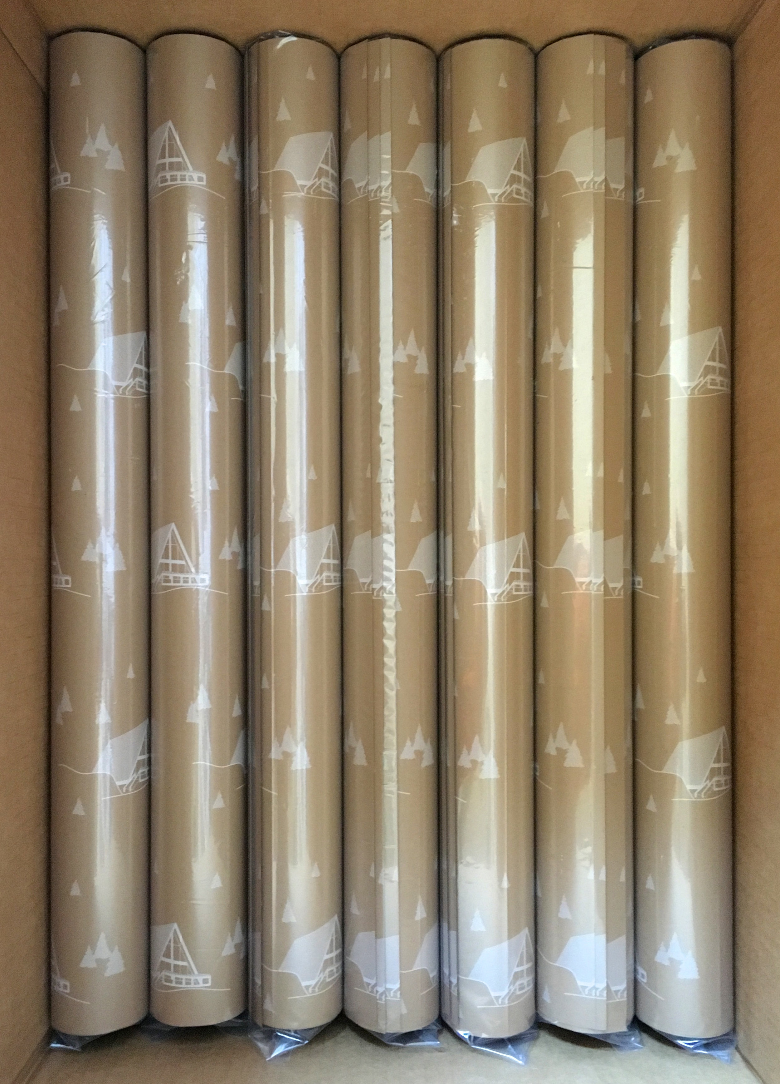
Once it was all printed in white ink on craft paper, a big box full of rolls arrived in the office. That was the most exciting part, to see it repeating in big long sheets. The team wrapped up boxes and dispersed them throughout the store displays, as well as sending rolls out to each of the other six stores across the country.
They look so cute and festive, but I think the scale is a little too large. My design teacher in college repeatedly told us to ask as many questions as you possibly can as a designer, and while that advice is always running through my head, I definitely missed the important question of box size here. I guess we'll just have to wrap up a couch or a sink next to fully see the pattern.


