This past week was not only Design Week, but also Portland Pizza Week (!!!). It made for a really great week full of lots of art & design, talks, new friends, pizza, and free drinks. I had to recover all the way through Monday, but now I just want to find lots more design events to fill up all my time. Here's a quick rundown of all the great events I attended.
Saturday - Opening Party
The opening party was at Revolution Hall, an old school that's been repurposed as an office building/event space. It was a really cool space, still feeling just like a school but with bars in some of the class rooms. Perhaps a more ideal school? Among other things, there was a room full of puppies, who were unfortunately too sleepy by the time we got to them, a room where we drew robots on the back of dominos for kids in the hospital, a room where Murmur was holding an 80s prom, a room where Struck let us draw on the wall, and on the main stage I got my portrait drawn by a PSU art kid through a two way mirror using some fancy Wacom products. All in all, it was kind of a weird layout, with small rooms and people gathering in the halls (I guess that's school for you?), but each individual part was pretty cool and fun to be able to go to so many different things at once. It was also fun to hang out with old friends and new friends and swap a few business cards. Now I want to go back to Revolution Hall when its not Design week and just hang out at one of the bars.
Sunday - Letterpress Printer's Fair
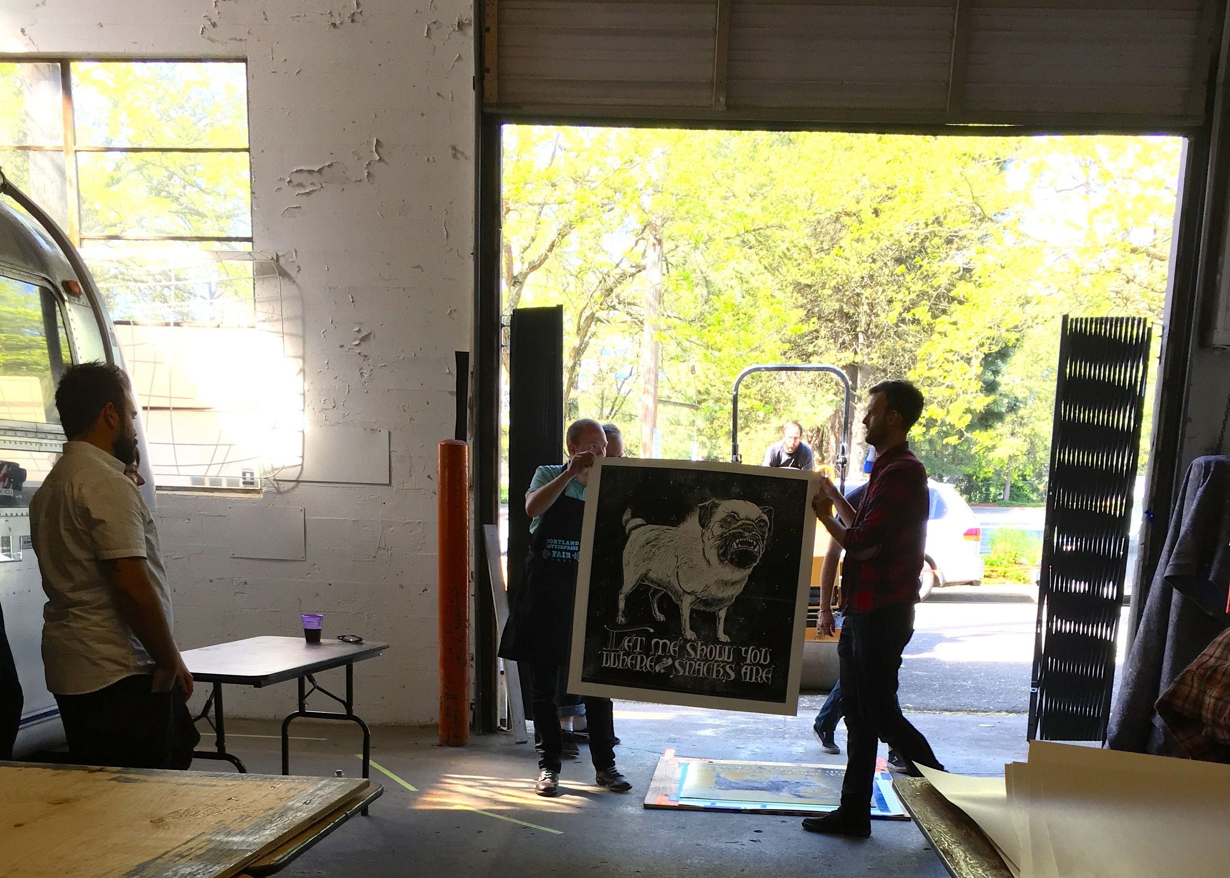
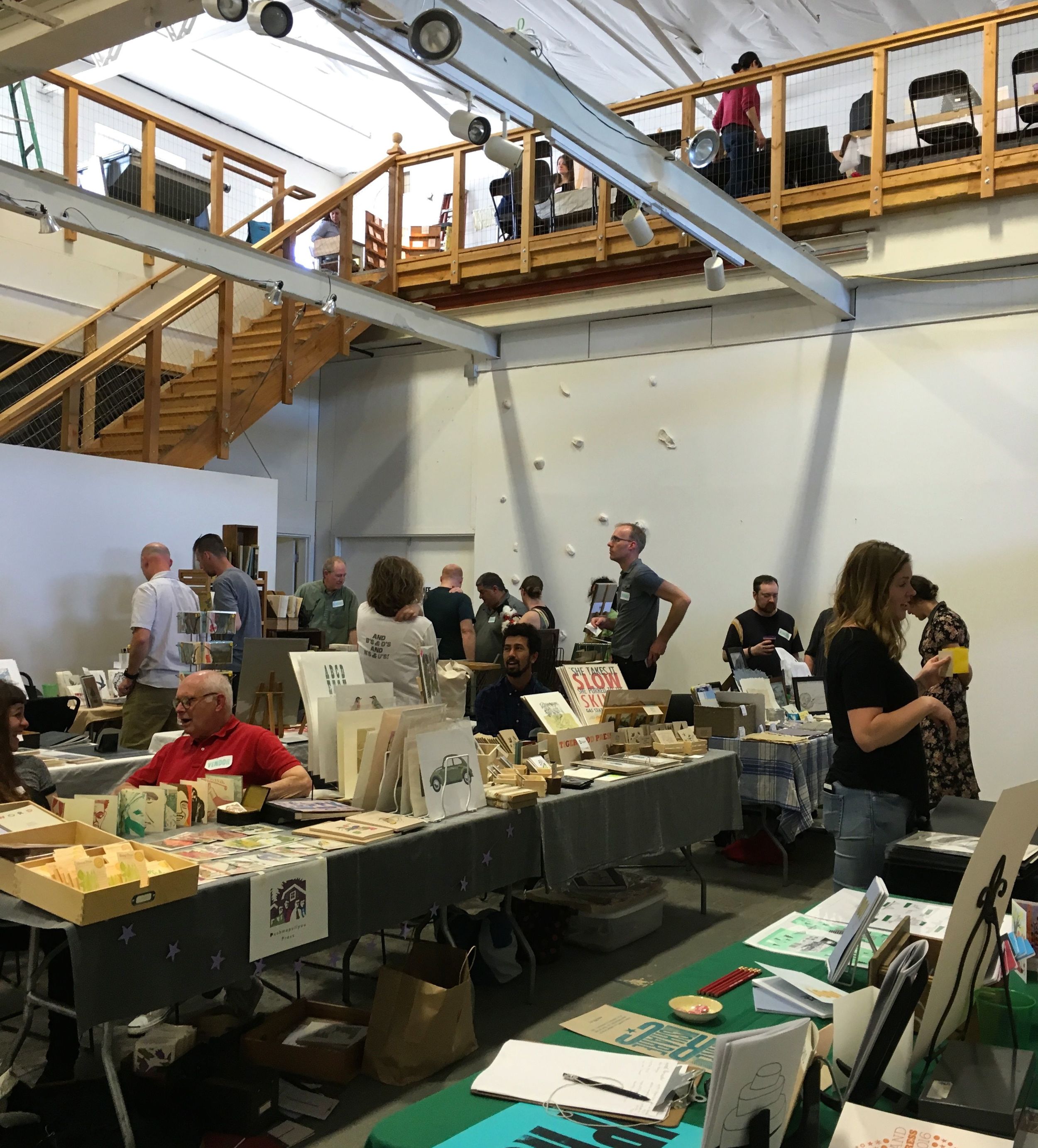
On Sunday, I headed over to the Bison Building (my new favorite building) for the Letterpress Print Fair. I learned that Portland has one of the biggest letterpress communities in the country, who knew? I did letterpress in college and always wish I had my own Vandercook press so I could do it all the time. The Independent Publishing Resource Center had a few presses there that we got to try out, which was cool. I made a pineapple print and a business card. There are so many different kinds of presses to learn about, its really cool that a place like the IPRC exists where you can just go and work with them. I'm definitely looking into it.
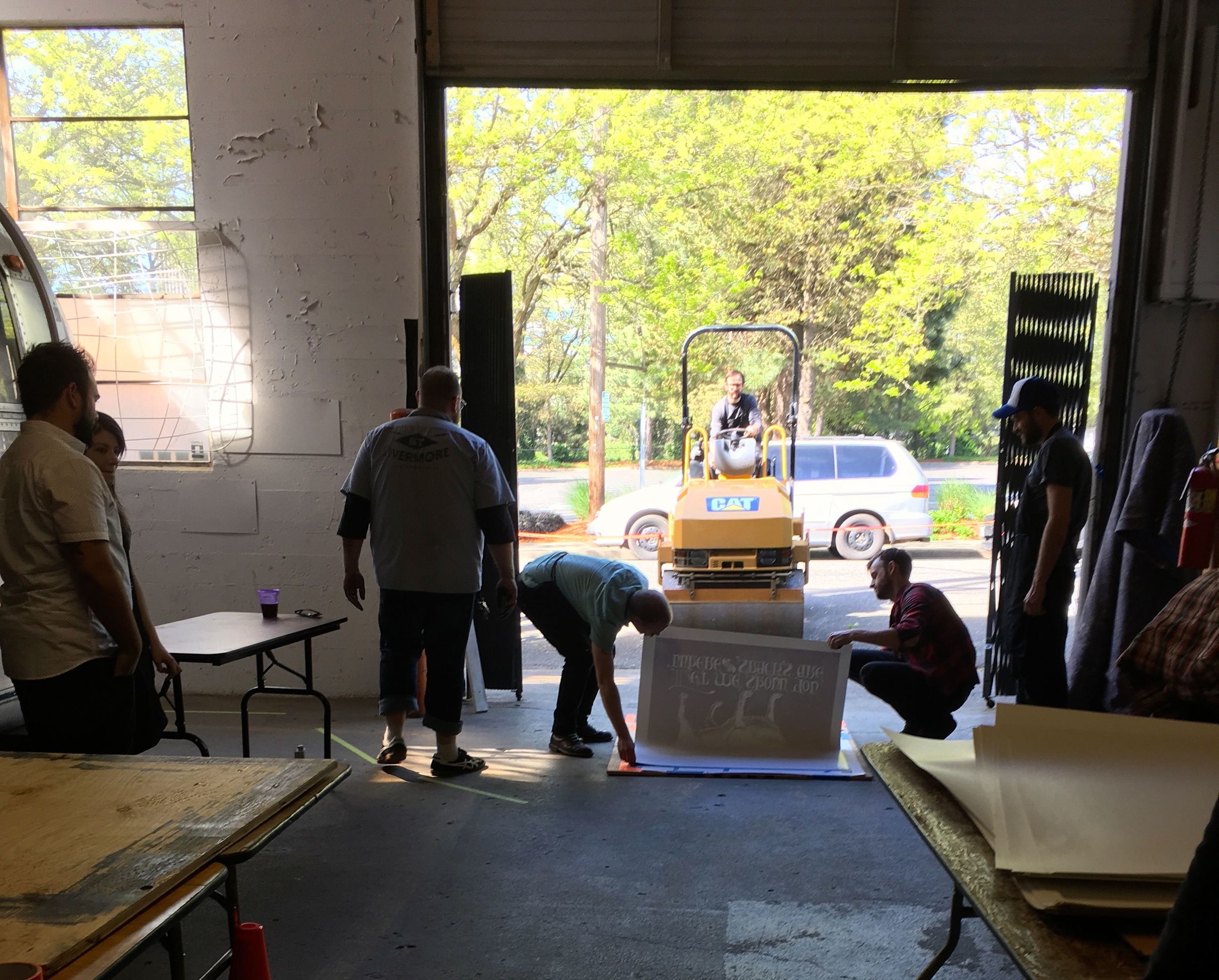
We walked through rows of letterpress booths, buying a few greeting cards and other things that couldn't be resisted. Then we had some free beer and watched these guys pull prints with a steamroller. It was super cool. All you need is pressure to make a print, right? Might as well use a steamroller if you've got it. They started with a huge linoleum block, rolled on mountains of ink, and set it on the floor for the steamroller to drive across. I previously saw their pug prints on the wall and was wondering how they had a press big enough for that, so it was really exciting to see the whole process.
Sunday - UO Product Design Exhibition
After the Letterpress fair, we stopped by the Product Design show at the University of Oregon. It was pretty small, but included the largest buffet ever. There were some interesting eye glasses and airplane meal designs, but I really like lamp design. The closest one in the photo above folds flat when you unplug it, then to turn it on you pull it up to attach to the cord. Smart. I'd use it. I just want to fill my house with all the coolest lamps.
Monday - People Process Projects: Snøhetta
I started out Monday by stopping by the Center for Architecture. They had a show up of work by Snøhetta, an international architecture and design agency. All of their work was super contemporary and interesting, all places I want to be. They are currently working on updating SFMOMA, which I was sad to find closed last month when I was in San Francisco. But now that I know the plans I'll definitely have to make another trip down there when its complete. They're also working on the new James Beard Public Market here in Portland. I'm really excited to see that come to life. My favorite project of theirs, though, was this glass building they built in Norway solely for the purpose of watching reindeer. The inside is full of giant swirling wood and a warm fireplace, the prefect spot to look out at snow and arctic animals. All of their things were really cool, and as Portland continues to grow so quickly it could definitely use some help on the architecture front. I went to a talk about more of these ideas on Friday, so I will continue these thoughts below.
Monday - HQ
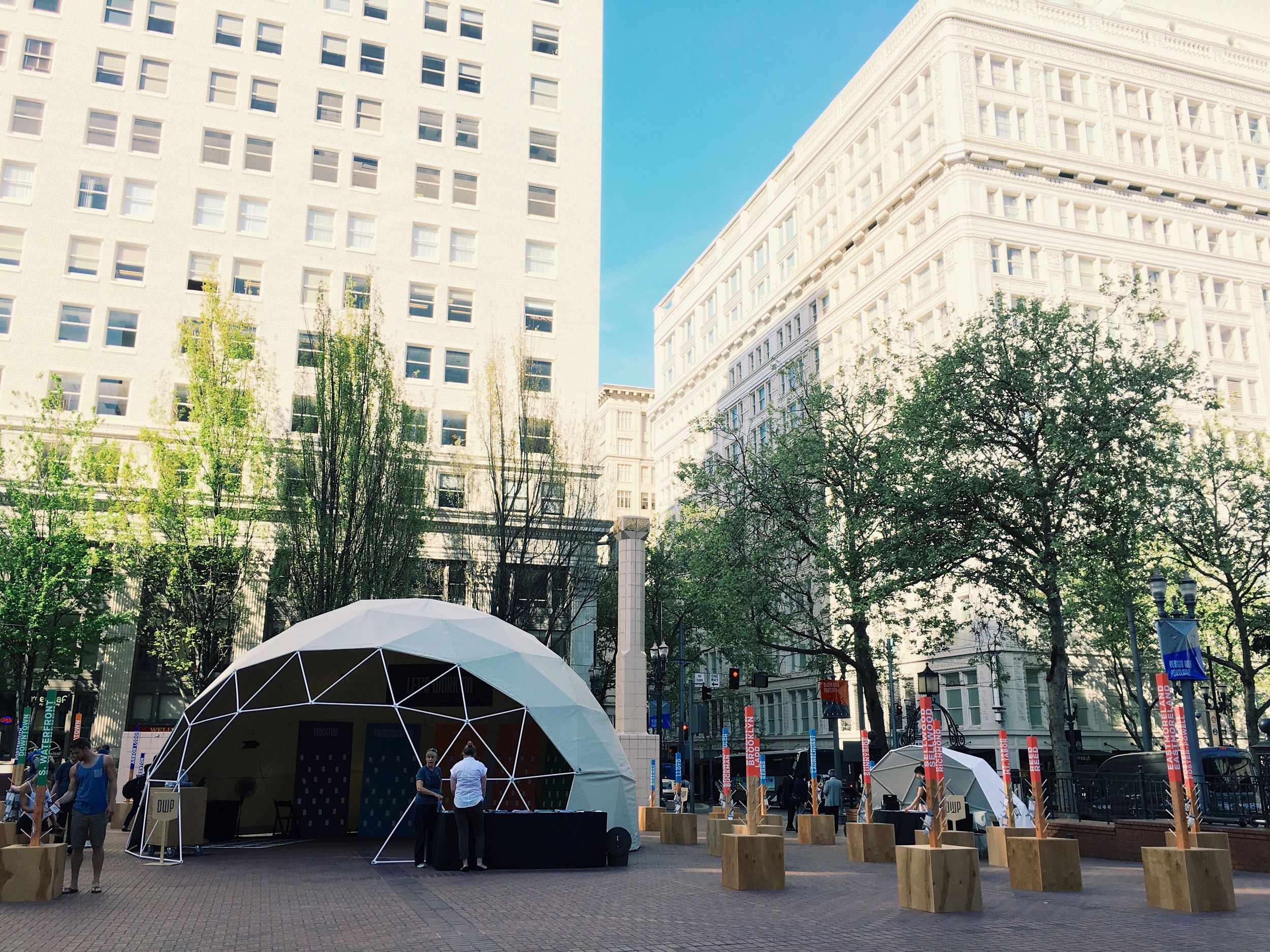
The headquarters for Design Week was downtown in Pioneer Square, and I figured I should check it out since I didn't really know what it would include. I got some info in the form of a printed schedule, which was nice, but the main thing they were doing was asking people's opinions of issues pressing to Portland. You picked out a tag and wrote what you'd like to see change on one of five topics, then tied your tag around your neighborhood pole. I chose transportation, because the lack of public transportation here drives me so crazy. But I could have just as easily chosen education (fund the arts!) or housing. Its interesting that this was a part of Design Week, since its not as straightforwardly design-focused. Then again, any city growing as rapidly as Portland is bound to have many pressing issues effecting all of its residents, even Design Week-goers. And I'm sure its location ensured that many more people got involved than just those specifically there for design.
Monday - Graphic Design Center Throwback
PSU had a small show up in one of their buildings that showed their own personal design evolution. From 2000 to present, almost every year had some print collateral for marketing PSU and its design program. It was really interesting, to see the speedy progression in design. Since technology and computers have progressed so quickly, things from even 8 years ago look super outdated. Its funny how 80s and 70s really had their own clear aesthetics, but now even the 2000s are getting that same feel. It was a really small show but still great to see.
Tuesday - Open House: Designing for the Birds
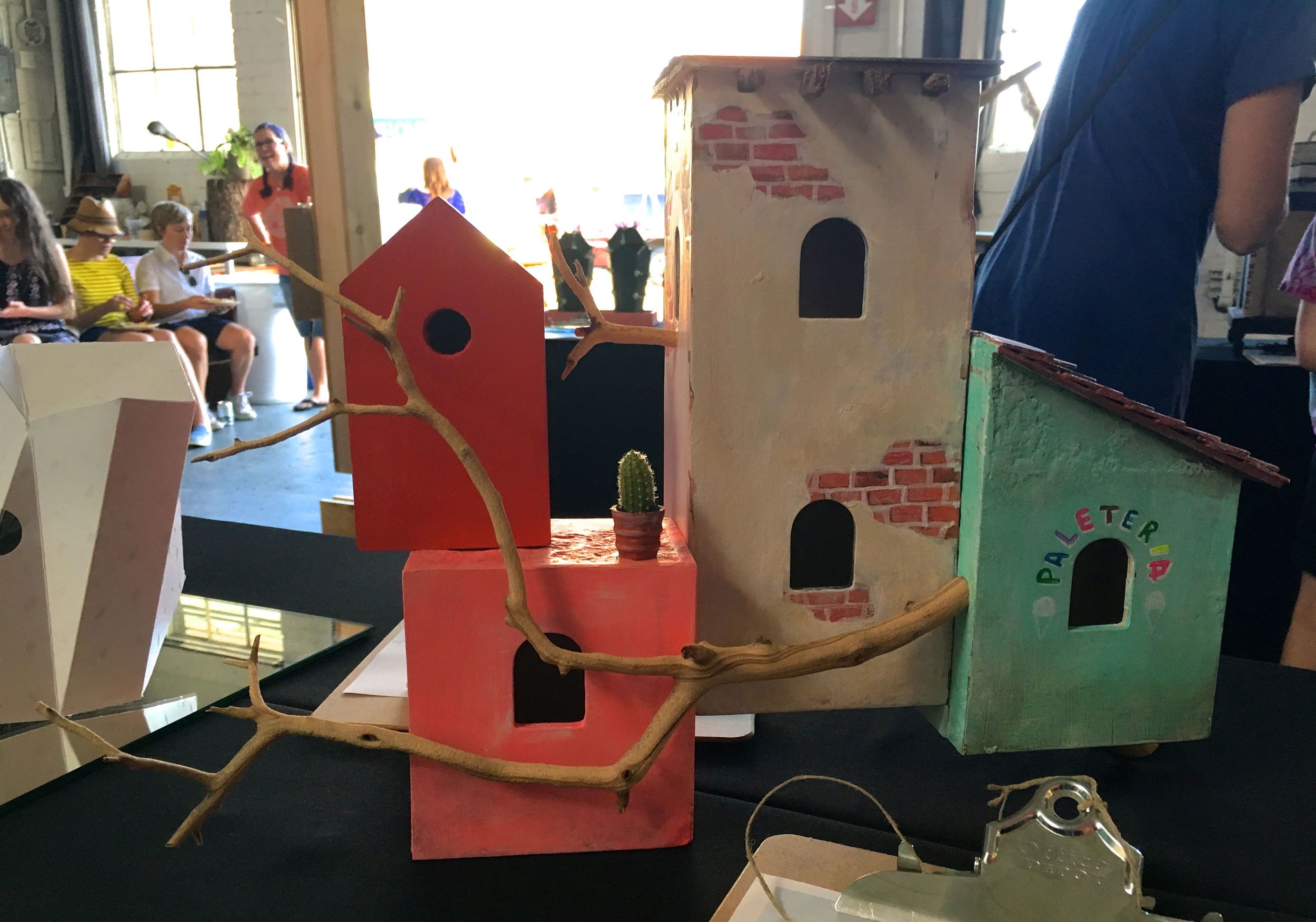
On Tuesday, I first went over to the Open House at Tillamook Station, where WeMake had a show of birdhouses. Each birdhouse, made by a local artist, was being auctioned off to support art education. There was a wide range of birdhouses, but one of my favorites is in the photo above. Cute little pueblo town for birds. There was also a screenprinting demo and we even go to try it out ourselves! The space was super cool and WeMake seems awesome as well. Its so awesome that all of these small creative spaces and companies thrive in Portland.
Tuesday - Overshare: PDX
Later on Tuesday, I again found myself at the Bison Building. Another really cool building, like an old airplane hanger all lit up with little white lights. Kate Bingaman-Burt, Rich Tu, and Adam R. Garcia, three people well immersed in the Portland creative design scene, talked candidly about the tough parts of being creative. From creative insecurities to business logistics to personal fulfillment, they were open and honest and didn't hold back on the tough questions. It was refreshing, to hear that other people have the same struggles. Creative people just want to be free spirited and creative, but we still have to worry about the business side, something I don't think any of us would voluntarily sign up for. Its a difficult dynamic that isn't present in many other industries.
Rich came from New York, just as I did, and talked about how the creative community is way less cutthroat here. He said Portland is a place where creative people want to help each other, not beat each other. I feel like I was finally getting it, at this talk. Its hard to imagine a place where people aren't just looking out for themselves, but maybe Portland has some of that. People have been so nice all through Design Week. Maybe I am a part of a nice friendly creative community.?
Wednesday - Graphic Means
This was a really cool event at the IPRC - the screening of Graphic Means, a documentary that is still taking shape about graphic design before computers. I guess its not something I've thought about that much, since computers have existed the whole time I've done design. Now that I've started thinking about it, I want learn everything about it. Graphic design is what I do, I should know its history. I'm really excited for the whole movie to come out. Briar, the film's creator, showed us two clips, one about creating layouts and the second about setting type both, before computers. To accompany this, we could try our hand at some paste-up graphics as well as Letraset transfers.
I remember when I was a kid and my mom published her own newsletter, she always had tons of clipart books around the house that I used as color books. I knew those had some graphic design purpose, but didn't really realize all the cutting and pasting that it took to put it together. It felt more like collaging to me than designing, but with hot wax instead of glue. Its so interesting how quickly design has changed. I'm sure it will change just as quickly in the coming decades, what will be next!
Wednesday - Boxcar One Artist Series
From what I read, I knew this Boxcar show would be based off of the Boxcar Planter, but I thought the pieces would be further away from the original thing. I thought the artist, Damien Gilley, would use the planter as a platform to jump off of and be inspired by, and I was interested to see how far he would take it. Turns out, he just laser etched some designs into the side of a couple planters. Not as exciting as I hoped, but still a well designed planter.
Thursday - Show & Tell: Art Chantry
I started out Thursday by going to a talk given by Art Chantry. Art is a graphic designer who made a lot of influential posters for Seattle subculture in the 70s. I enjoyed how he talked about purposely making things ugly to go against the mainstream and make it more interesting. As a designer before computers and still choosing to do all of his work without a computer (tying back into Graphic Means on Wednesday), he views his role as a composer. He brings together different images and typefaces to create interesting juxtapositions.
He also talked some about how design becomes art after the fact, or perhaps even artifacts. After the play is over or the product is bought, the poster still exists but without as much intention. It is then that he can reclaim ownership over it and show it as his own 'art'. At the same time, it shows a piece of past culture and doesn't hold as much relevance anymore, making it an artifact. Really interesting to think about design this way, especially as I come from a fine art background. I like that act of reclaiming from corporations.
Thursday - IDL's Design Fight Club
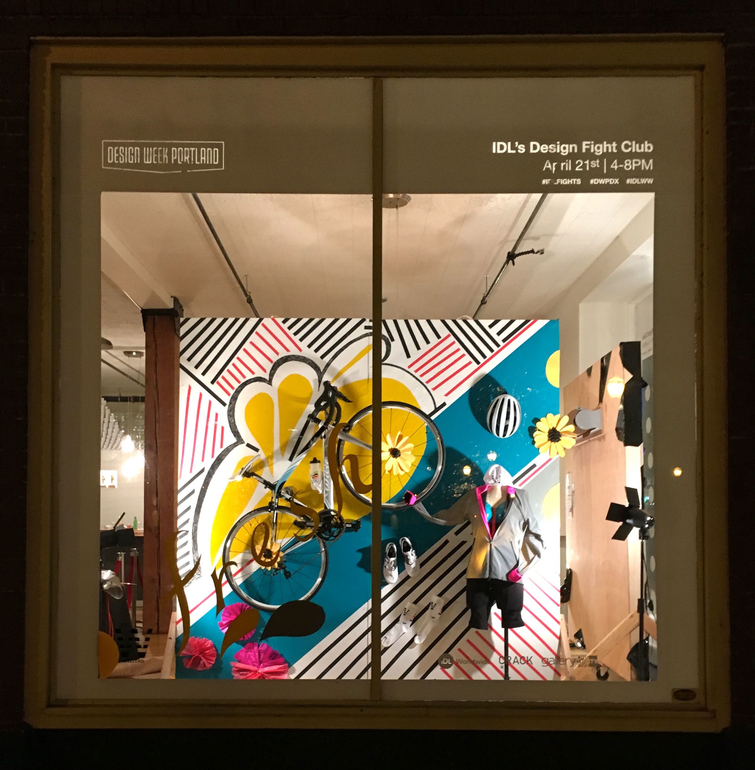

Later, I headed over to IDL Worldwide's Gallery 135 to participate in their Design Fight Club. I love how they have a gallery on the ground floor of their office. Complete with huge windows, it was the perfect spot to hold a retail design competition. The participants were separated into four groups, each with four people and one special guest leader. Each group was given a bike and some bike merchandise, as well as a wall and window. We only had two hours for the challenge, so everything moved pretty quickly.
After some quick brainstorming, it was decided that we would put things together with not much rhyme or reason, just make it look good. That's definitely something I'm not comfortable with. I think I'm too conceptual, I don't like to make anything without a reason behind it. I had many ideas, but none were well received, and I was soon delegated to cutting out paper flower petals (half of which were thrown out). It wasn't my finest hour. I know I'm good at working on a team and I have a lot of other creative and fine art skills that could have been employed, but with the time crunch I didn't want to ruffle any feathers.
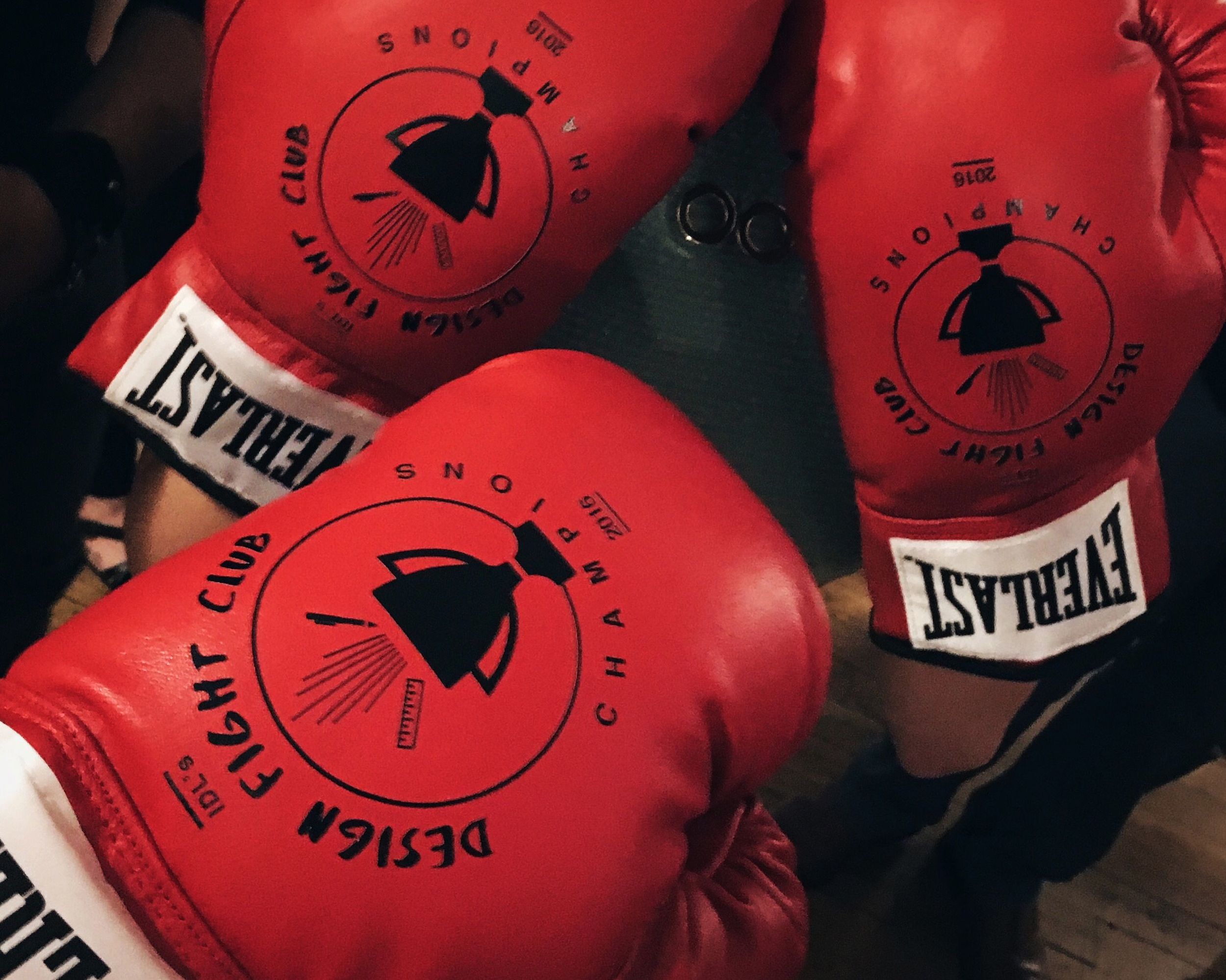
In the end, the crowd voted us as the winners and we each got our own pair of Design Fight Club boxing gloves. The win brought us all together, and I really enjoying getting to know my team members. All in all, it was a good learning experience. Just gotta make sure my voice is better heard next time, and get my hands on the hand lettering before anyone else.
Thursday - 99 Bottles of Art on the Wall
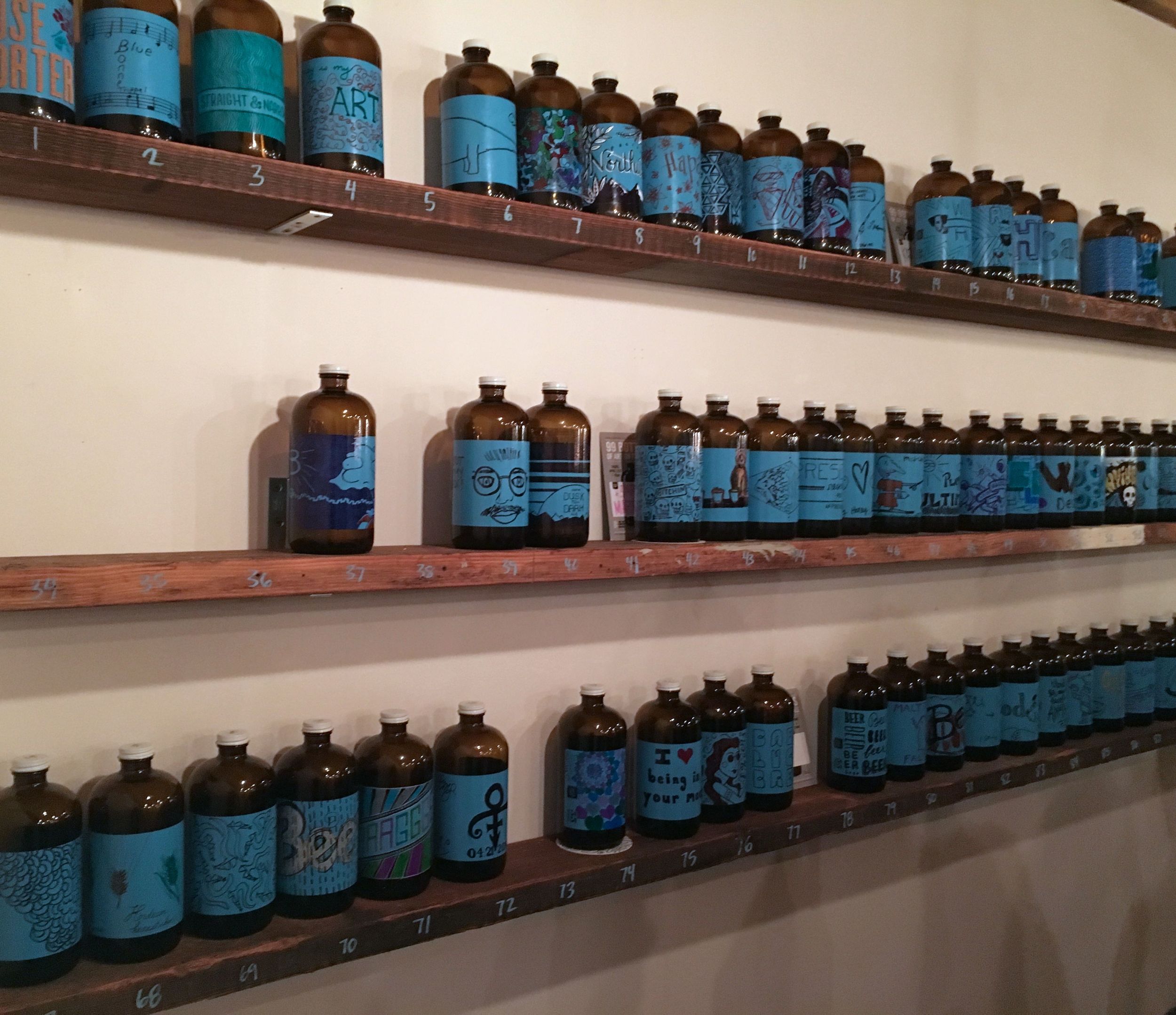
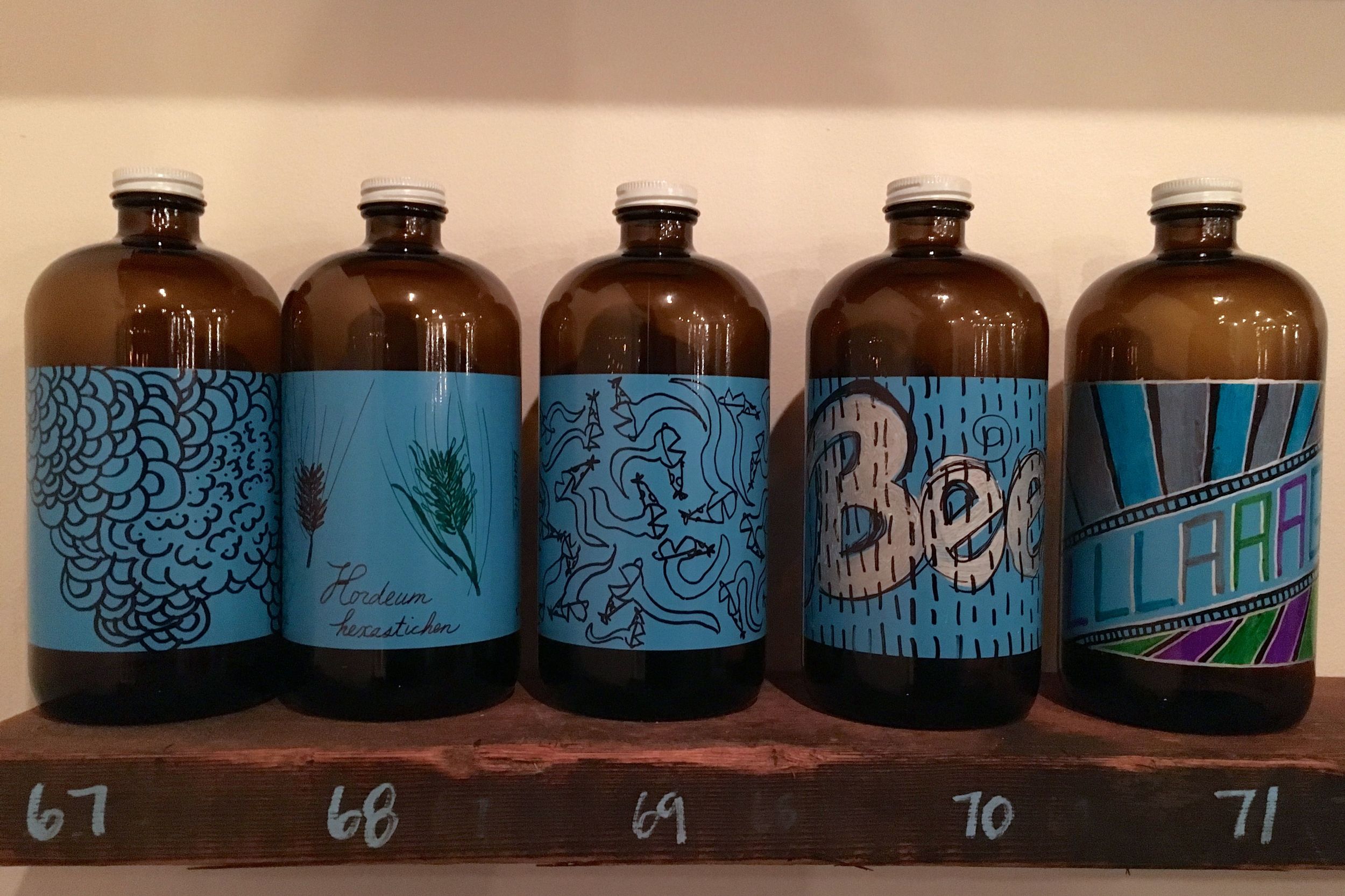
After the stress of speed-retail design, it was so nice to mellow out with some drawing and beer at Baerlic Brewing. They were holding this really fun event where everyone got to design their own growler label to make "99 Bottles of Art on the Wall". Smart. I drew a bunch of party snakes, of course. I also ran into some Design Week friends and enjoyed a really good banana hefeweizen for a perfect finish to the day. The growlers are going to be up through May, and then I get to use it for all of my own beer. Baerlic is awesome, too, I should hang out there more often.
Friday - Creative Mornings
I go to Creative Mornings pretty often, so I didn't want to miss this special Design Week edition. The theme for the month was Risk, something speaker Kevin Cavenaugh knows a lot about. Kevin is a developer here in Portland, working on projects to help the city grow in better directions. His company, Guerrilla Development, is responsible for the Zipper, one of my favorite places, among lots of other cool multi-use buildings. After working as an architect, he realized that developers were the ones with the power to actually get things done and built. Now, he bends the rules to find ways to make the city more accessible to everyone.
Aside from making public spaces where people can come together, he is working on some affordable housing projects. I'm constantly hearing how theres a housing crisis in Portland from the huge influx of people moving here. Big shitty apartment buildings are going up like crazy and are way over priced. Kevin is trying to show those people a better way to do it. Not only does he only build well designed buildings, but by finding investors that care about a better future for Portland and even crowd-sourcing some funds, he can charge less for rent. He then finds a way to lawfully discriminate; apparently its legal to discriminate by job. So people that are social workers or working directly with the homeless get pushed up to the top of the list of potential tenants. That means that people helping the city can actually live in the city, helping them help us as a city. It seems so smart and obvious, but of course not really supported by capitalism. Portland is so lucky to have someone like Kevin here, helping it grow. I left feeling really inspired. I hope Portland turns into a great big city as it continues to grow. Its kind of in a similar state to Chicago after the Chicago fire, and that resulted in super impressive architecture. WIth Kevin here, I hope Portland can go in the same direction.
Friday - Wacom Creators Day
Wacom recently relocated their US headquarters to Portland, opening their doors only a few days before Design Week. They said that they are still working on getting situated, but their Wacom Experience Center is getting close to completion. Its full of giant tablets that anyone can go and work on. I'll definitely have to stop by their grand opening party next month.
I use a Wacom tablet daily for my design work, but its a little old by now. It was cool to see how they are progressing, with new Cintiq tablets that have a screen right on them, as well as pens that you can draw on paper with that transfer your drawings directly to a computer.
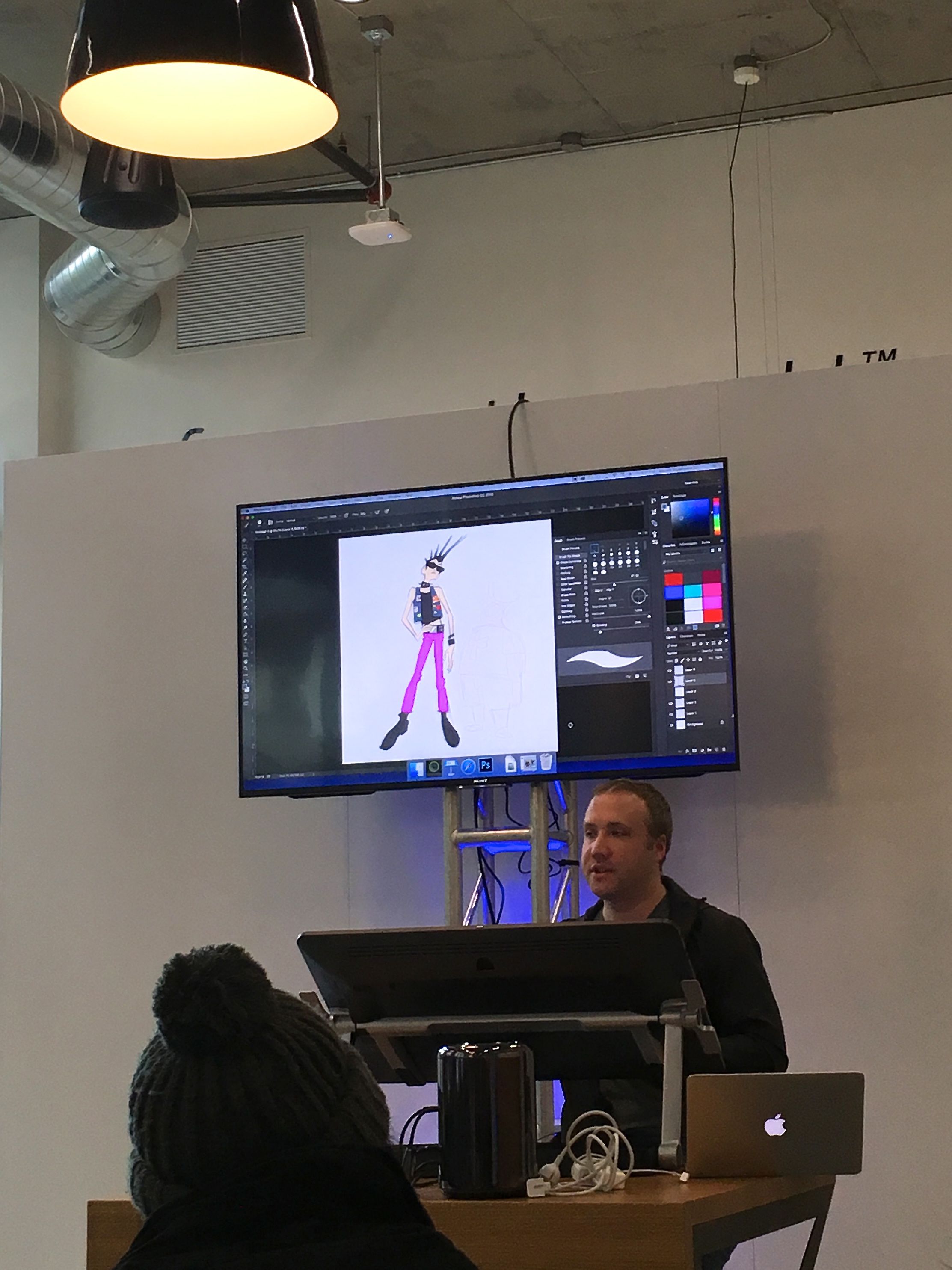
Grant Alexander, an artist from Pixar, did a demo on a Cintiq tablet. He quickly sketched up some punk characters in Photoshop and talked about working on Pixar movies like the upcoming Coco. It was interesting to see and hear about his process, and to see how quick and easy Wacom technology is.
Friday - Open House @ Skylab Architecture
I was doing petty good at taking at least one photo of every Design Week event I went to until the very end. After Wacom, I walked over to Skylab where my friend Nick works. They were holding an open house, and I got to check out their space and have a drink with architects. Nick gave me a tour of the space, and although pretty small its full of beautiful wood, hip lightbulbs, and tons of architectural models. They have even teamed up with some glass artists to make an installation for their entrance way. I'm still not sure why they don't have a real ceiling, but the space is awesome and produces a lot of great work. And I didn't even have to talk about columns once.
Friday - Esque Popup
As we were leaving Skylab, we walked by a glass pop up on the bottom floor of the building and had to check it out. It was full of glass work by Esque Studio, including some really cool hanging lamps and lots of lumpy vessels (lumpy in the best way). I love glass blowing, so I really enjoyed it. I know I keep saying I should get back into glass, but I should really get back into glass.
Saturday - Closing Party
Design Week came to a close with one last big party, this time at Rejuvenation. It was nice to see a bunch of people I met throughout the week again (including some of my Fight Club team members!) and feel like there was closure. Thank you, Design Week, for the best week, super packed full of all of the best things. There were so many other events I wish I could have gone to, but unfortunately I can't be in 2, 3, or 4 places at once. I think I made myself a pretty good schedule and really enjoyed everything I attended. It was great to feel like I am a part of a community here, and to connect with more people in that community. I'm already looking forward to next year!
After a week full of events, I collected an entire table full of prints, business cards, buttons, flyers, and boxing gloves.


