
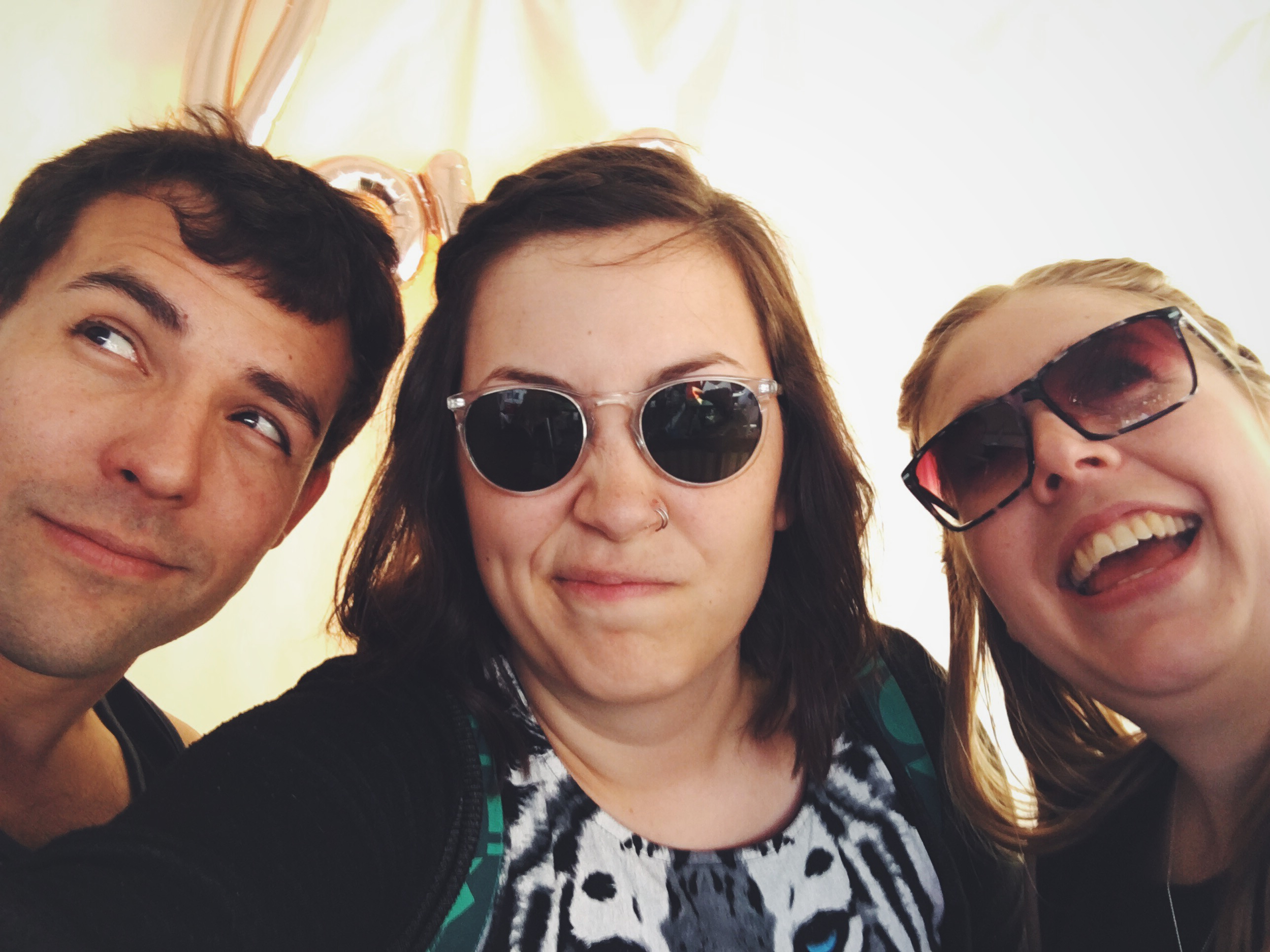
As I've mentioned a few times, my good friend and former boss Scotty Gorham was here in Portland for a month long artist residency this summer. He and his partner Devon McKnight made a ton of cool projects and I really loved having them both around.
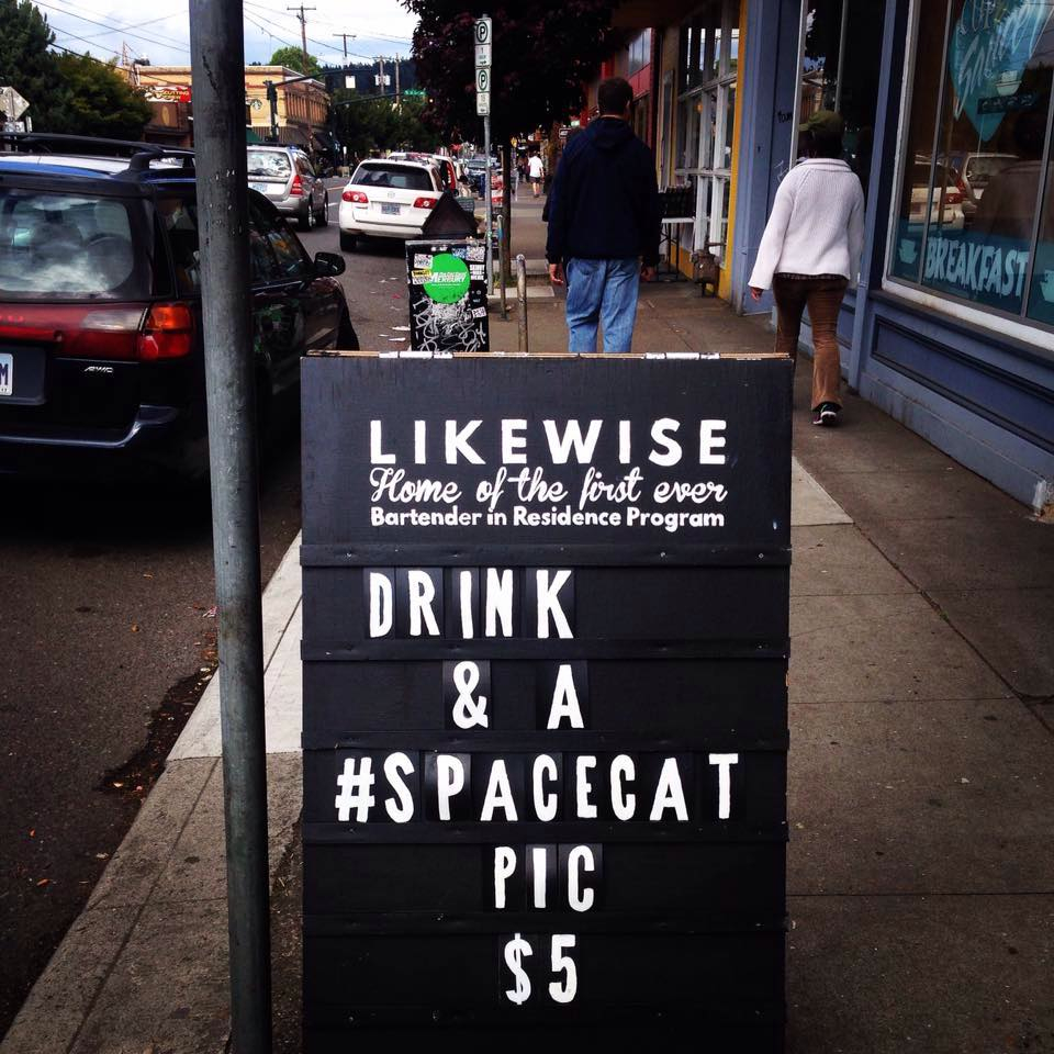
It was pretty funny how it all came together. I pass along artist residencies and opportunities to Scotty once in a while, mostly from NYU art program alumni emails. Since they're coming from the other side of the country, they usually don't include any close to me. This 'bartender in residence' program was probably the only opportunity I've ever sent him that is in the town I currently live in. It was such a pleasant surprise, then, when that was the one he actually did! His friend from grad school (Devon) knew the people who owned the bar (Likewise) from North Carolina. Small world. I'm so happy that it all came together and than I got to take part, too, even more than I anticipated.

The beginning and end of the story is Likewise, a bar that hosts the only 'bartender in residence' program in the country. That means that artists come to their bar and, usually for about a month at a time, are free to use the space for whatever art they want while also acting as bartender. When I first heard about the concept, I immediately thought of Scotty. Two things I know he's an expert at: making art and bartending. He is an artist working in new media and installations, and we used to work together at a group of bars. Perfect combination.
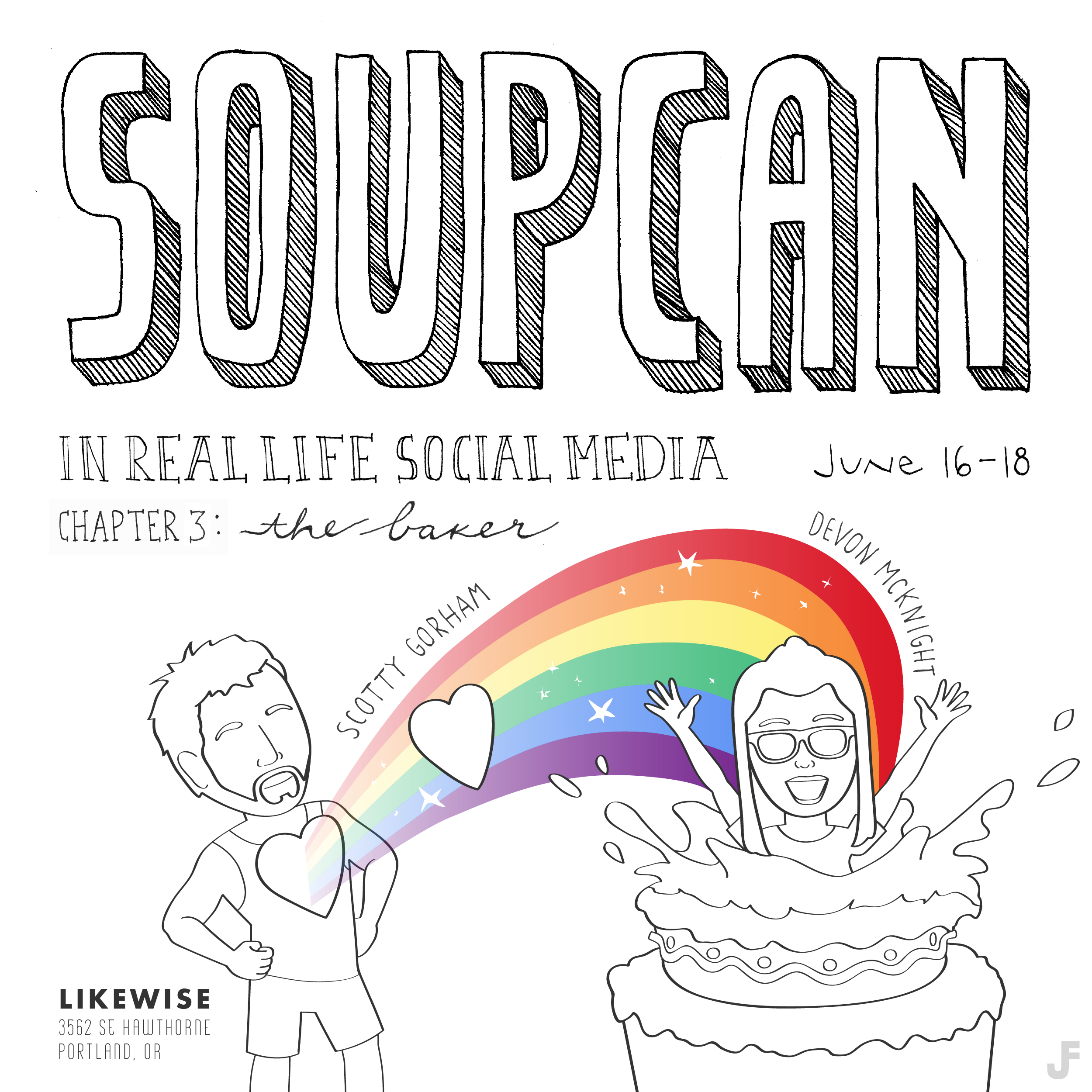
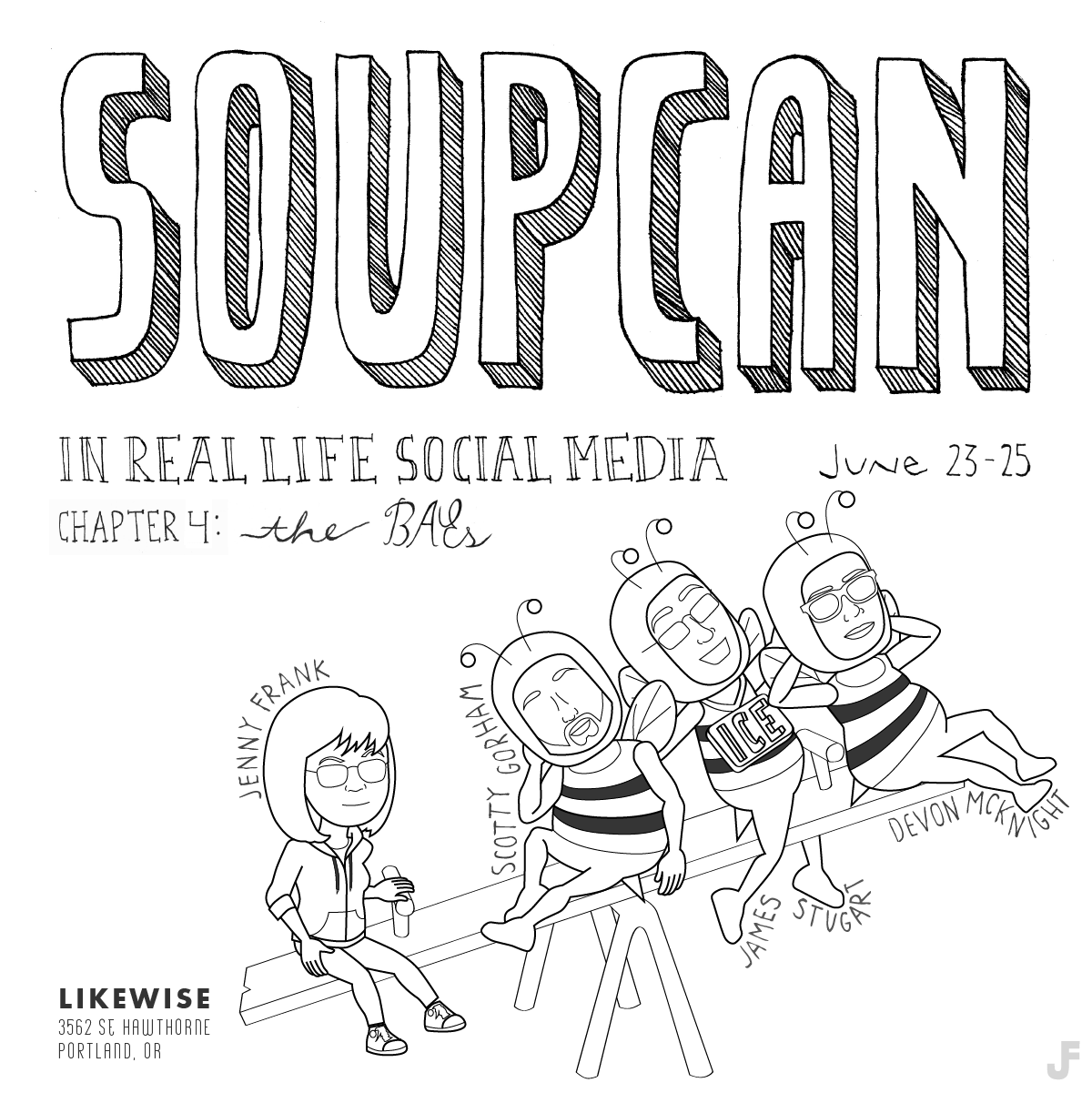
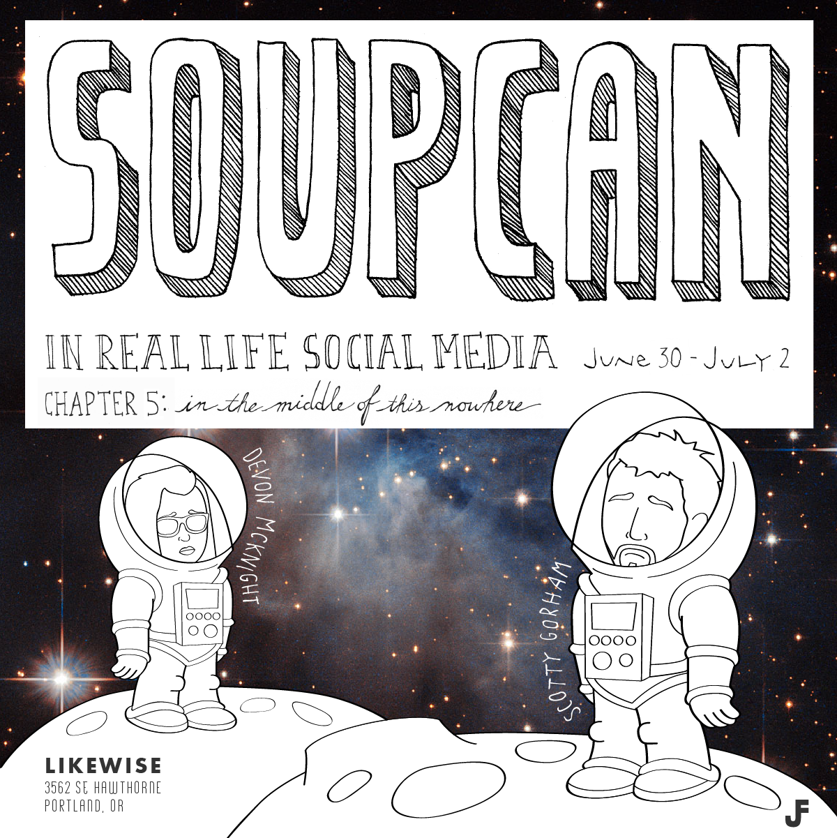
So he and Devon wrote a proposal for Likewise that was quickly accepted. Then Scotty and I got to work talking about branding. I do design work for him every so often since working together, but I definitely didn't realize what a collaborative environment we would create for this project. Before he got here, though, it was a little rough. He'd never been to Portland before, had never seen the space he was about to make art in for a month, and didn't know what kind of reach we would have with advertising, if any. We passed a bunch of different ideas back and forth, none of which ever came to fruition. We talked about logos, and how a physical neon logo could relate to a printed logo. Lots of interesting things that I would still like to explore, but nothing was really working. (See some designs that got passed over and repurposed here). Finally, a few weeks before he was set to arrive, Scotty had an epiphany: Soup Can.

Soup Can, an snappy digestible title, to describe a concept of communication, environment, and a bit of a nod to what came before us. The initial image is that of two empty cans connected with a string, used as a telephone between city windows and at every treehouse. Such a simple form of communication, vibrations through a string, that carries with it a feeling of nostalgia. The next thing that comes to mind is Andy Warhol, mass producing an object that was already being mass produced: the Campbell's soup can. Pop art pulled mainstream culture and aesthetics into a fine art realm, putting concept and theory behind that which is intended solely as a commercial product. The third thing I thought of were soup kitchens and can drives, events whose main purpose is to include and provide for those left out. These three main points (communication, commercialization, and inclusion) would be translated through neon environments and interaction with the bar patrons. It is conceptually rich, which was really exciting for me to talk through and ultimately get behind full heartedly.
For a bit of explanation, Scotty decided the tagline would be "In Real Life Social Media". He works with social media a lot in his work as a medium and a platform. Similar to two cans on a string, a bar is a way to bring people together to communicate. It's also kind of like a pre-technology form of social media, where you go to talk to your friends or meet new people. Every project at the bar would bring people together in real life [IRL].

Along with this conceptual epiphany, Scotty also had a collaboration epiphany. Rather that compromising each of our styles and getting nowhere, he wanted me to go deep into my own aesthetic and style to remake the first flyer. I immediately pulled out my sketchbook and markers to start drawing. I like really simple line drawings, sometimes colored in and sometimes not. You can see them in a lot of my work (pretty much whenever I have the chance, I sneak them in). I've also been doing a lot of hand lettering lately and trying to get better at that. So I drew up some big marquee letters for the title and we both knew we were finally getting somewhere.
Stemming from thoughts of social media and communication, we decided to use Bitmojis as a base for all images on the flyers. Bitmojis, personalized emojis, allow you to say even less in order to communicate. They're pretty far removed from communicating via the soup can telephone, but thats what makes it an interesting juxtaposition. Modes of communication are constantly evolving, and Bitmojis definitely have their place in that. I took Scotty and Devon's Bitmojis and turned them into Jenny-style line drawings. I made a lot of small tweaks but left the overall Bitmoji style present so that anyone who knew about them could recognize the style but the reference wasn't hitting you over the head.
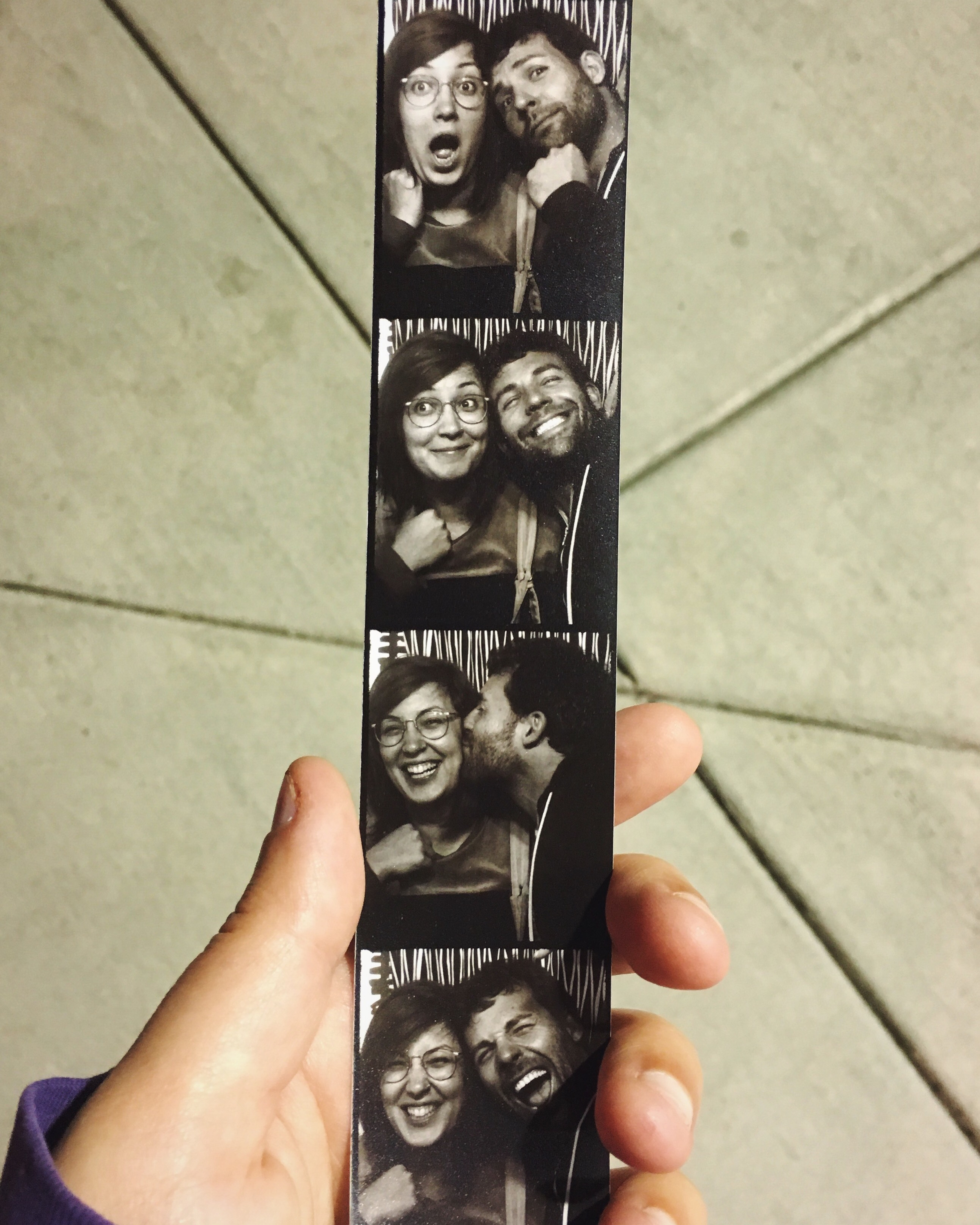
Shortly after the first flyer came together, Scotty packed up two giant cases of neon bars and I met him at the airport on a rainy Portland night. We hugged and got a drink and caught up. I didn't know what was in store for me, but it turned out to be one the funnest, most creatively stimulating months I've had in a long time.

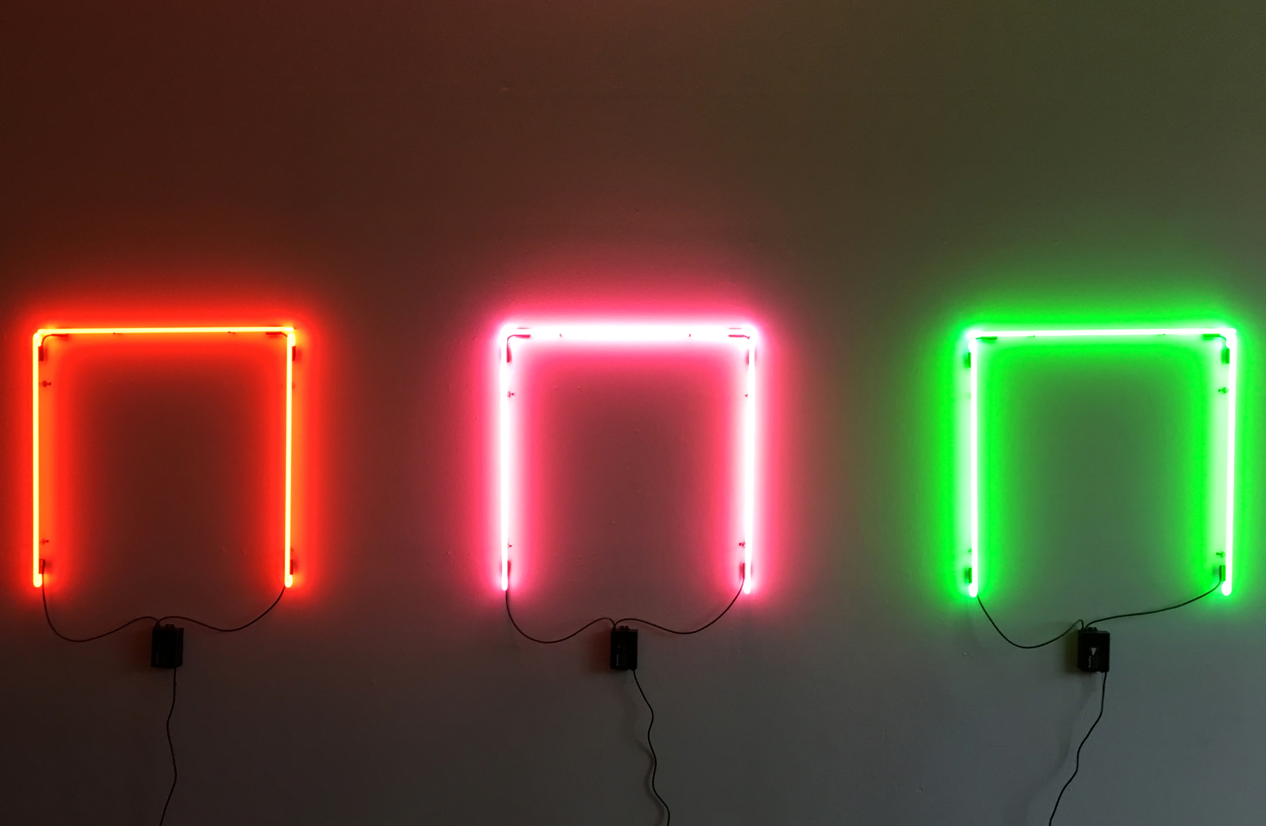
Scotty and Devon worked the bar Thursday through Saturday each week, giving them a few days in between to deinstall and install the next project. The first weekend started the day after Scotty got here, so it was more about feeling out the space and clientele. Likewise has these big bleachers in their front window that they use as an unofficial logo of the bar, so Scotty and Devon started off by outlining these bleachers in neon. It was a nod to what the bar already was with a hint of what was in store for the coming month. There was a big opening party complete with an official 'Neon Lighting' towards the end of the night. Just like a tree lighting, everyone gathered around and counted down. Then the neon was plugged in and we all oohed and aahed and took tons of photos. It was such a real event, like happenings in the 60s - one time art events involving everyone present. A perfect kick off to an incredible project.
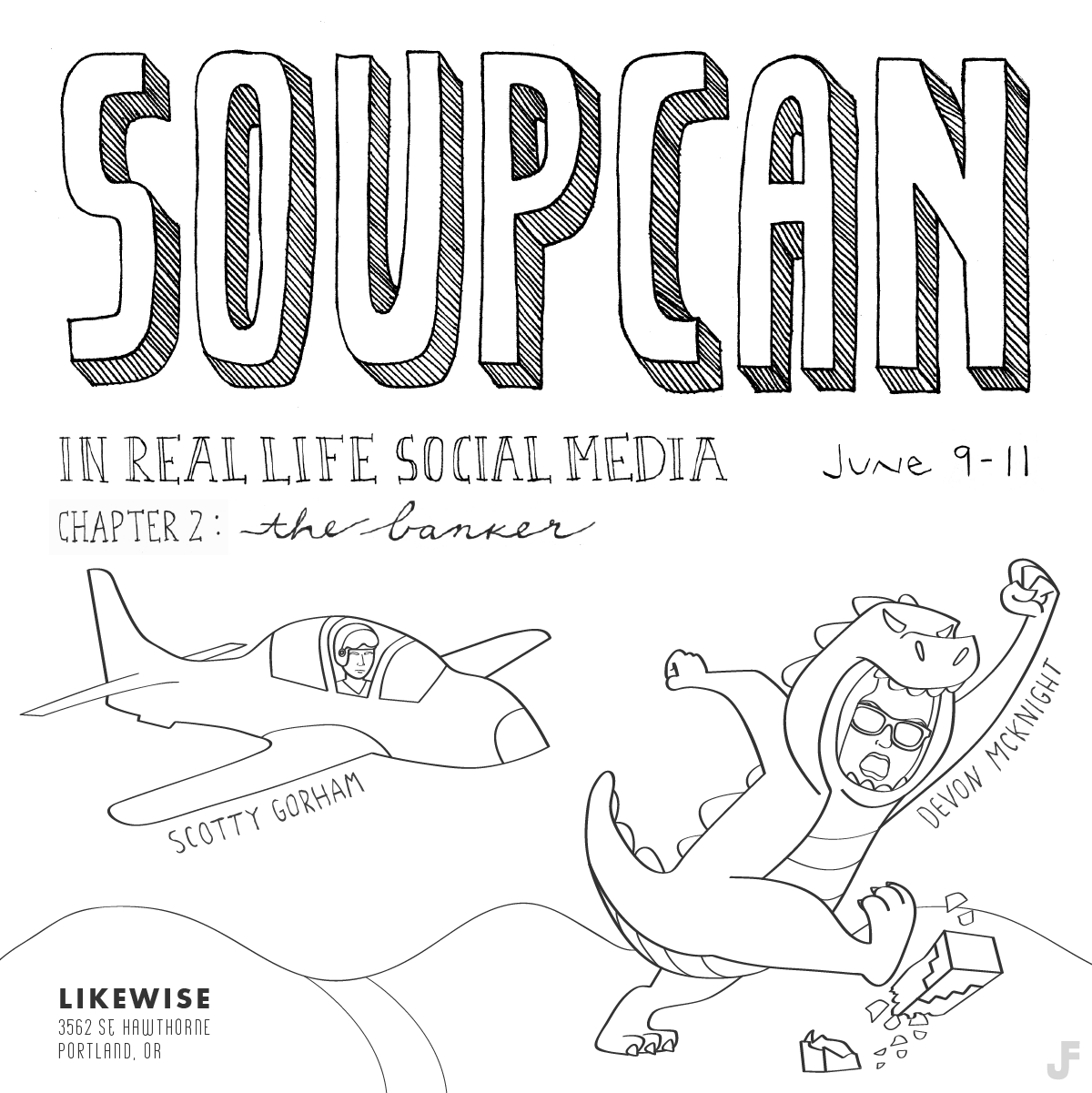
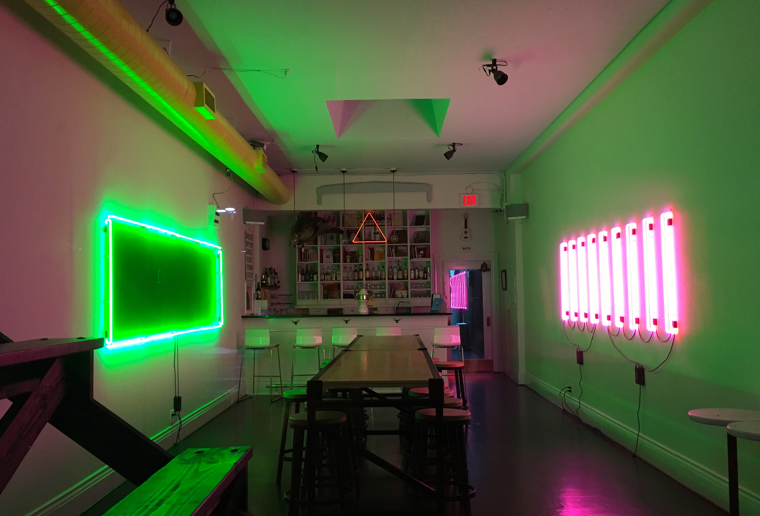
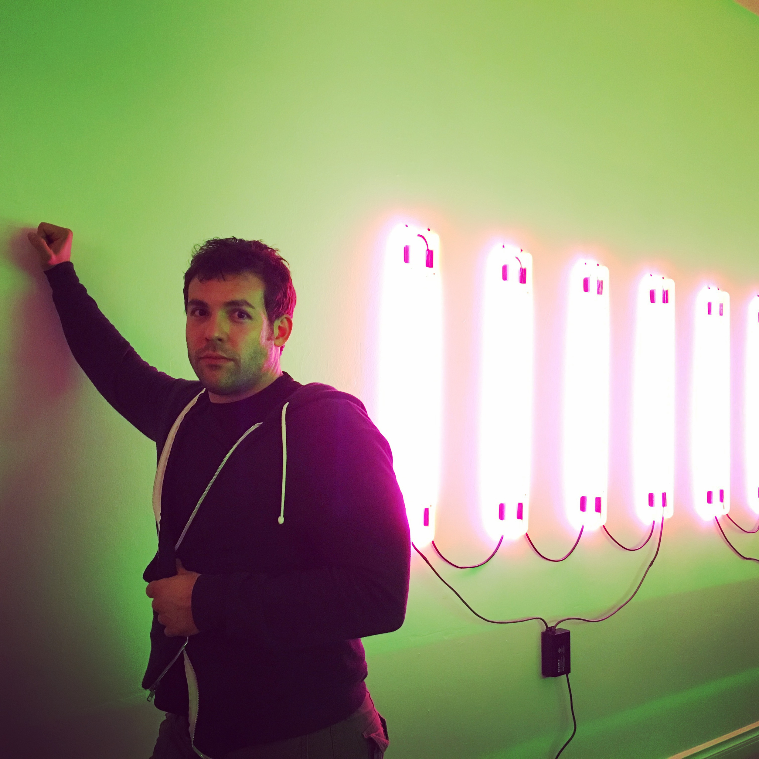
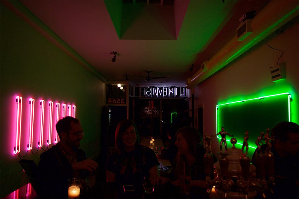
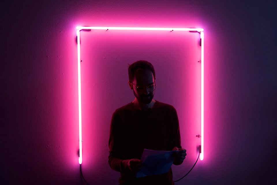
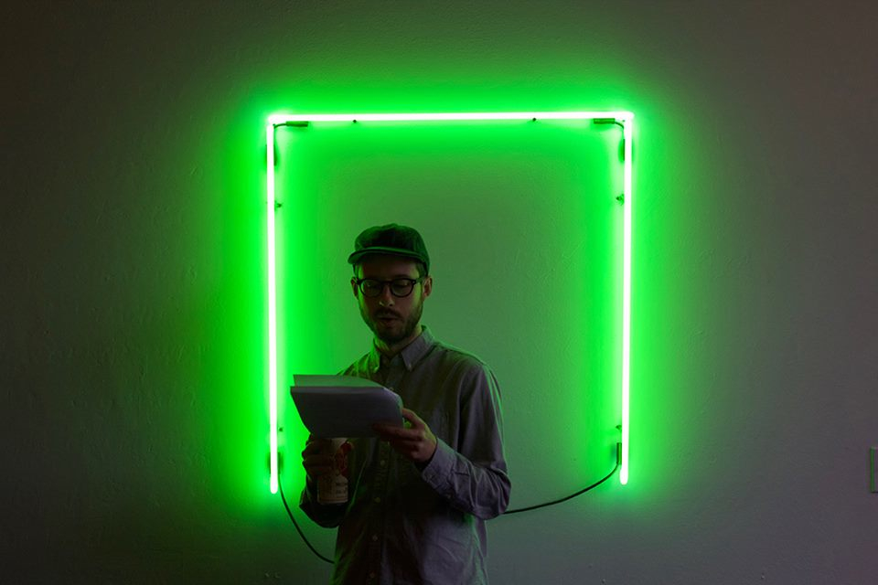
For each consecutive week, projects were inspired by interactions that Scotty and Devon had at the bar, incorporating a few pre-conceived social media-inspired ideas and some current events. The second week focused on three particular bar patrons and their stories - a man who recently quit his job as a banker to start his own pot farm, an asian woman who was feeling trapped and repressed by views of women in asian culture, and a pilot who just finished his 10 year commitment in the air force and now has every option in front of him. These three individuals represent a dichotomy of freedom and restriction. To symbolize them, Scotty and Devon created an installation on two facing walls. On one side, a big green rectangle outlined by green neon. This represents wide open freedom and, more literally, a pot farm. On the other side were alternating pink and orange bars to show restriction. It was super bold and striking, and interesting when they turned off one wall or the other, to see how different the room felt bathed in different colors of light.
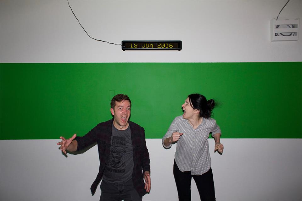
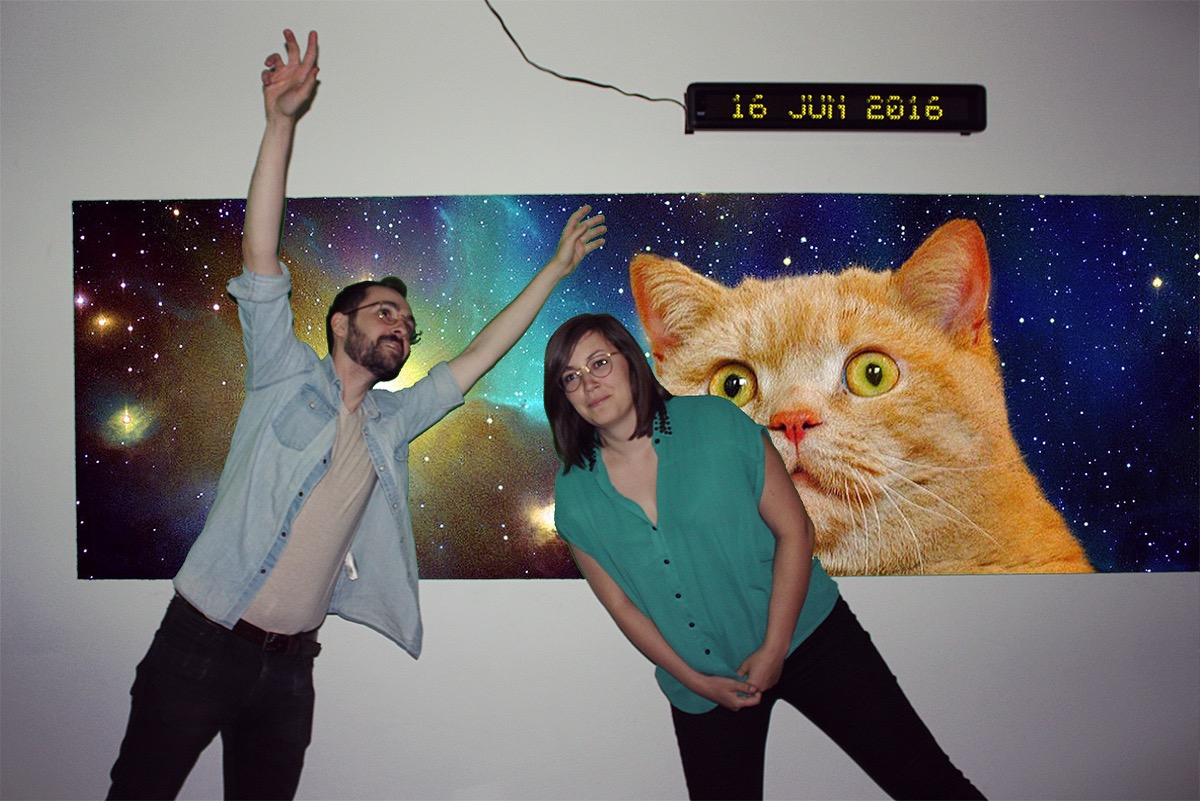
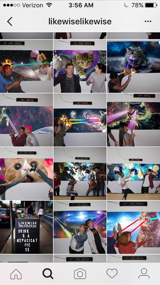
The third week was focused on another bar patron, fondly known around Portland as Nitwit. Nitwit is a man who works as a baker by day and a street artist by night. He makes hearts with nice quotes on them and cartoon characters out of styrofoam and leaves them all around town. To represent him, Scotty and Devon used the painted green rectangle from the previous week to act as a green screen. Just like Nitwit, the green screen is one thing at one time of day and something totally different at another. People coming to the bar could pose in front of the green screen and Scotty injected space cat photos in behind them. (This was probably inspired by living with Books the Cat for a few weeks.) All photos were posted to Likewise's instagram, bringing back in thoughts of social media and its validity. It was obvious where the green screen ended, obvious they weren't trying to make it look like people were really in space with cats, but whats on instagram is still not what you'd see in person. There was a ticker above the green screen with the date and time, brining some analogue back into something completely digital, too. People got really into it and even came back weeks later asking for space cat photos.

The Sunday of the third week was also Pride, so Saturday night was a Chicago-style pre-pride party. Scotty played Chicago house music all night and they projected Paris is Burning, a documentary from the 90s about vogueing, drag, and gay culture in New York, onto one of the walls. Nitwit also made some super cute gnomes holding pride flags to put around the bar. In being Chicago-style, it was definitely not as loud and energetic as Chicago pride, but still really fun and brought back happy Chicago pride memories, including some that me and Scotty shared. Portland pride in general seemed a lot more subdued than Chicago pride, but always prideful!

The same week is when the shootings at Pulse in Orlando took place. To commemorate, Scotty and Devon made a column of green neon at the front of the bar. It wasn't super loud and obvious, but something to say "we stand with you".
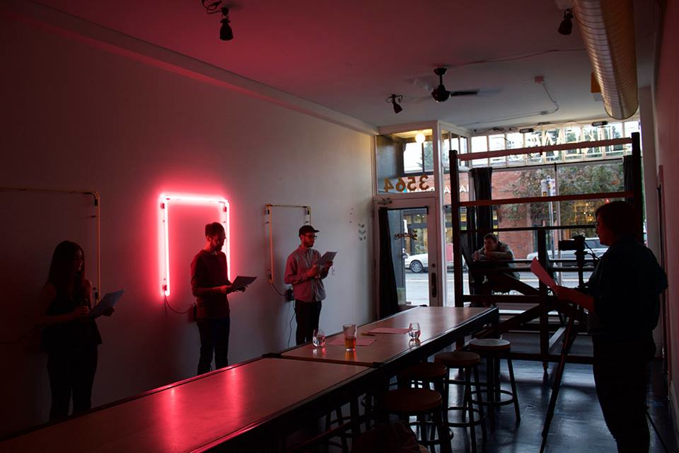
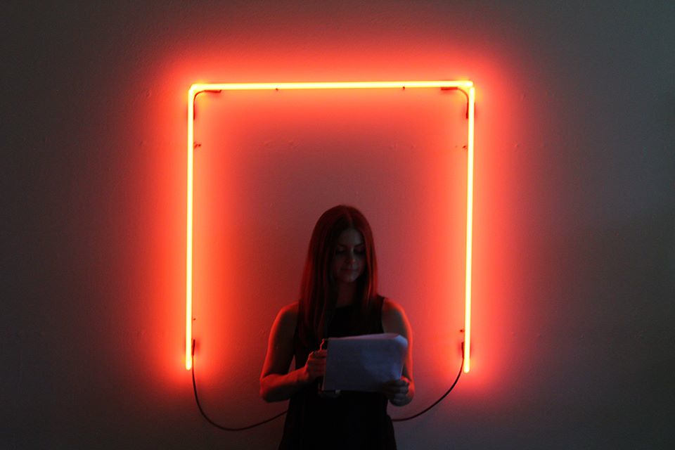
The fourth week is the week I got involved! My dad was in town around week 2, and told Scotty about how I wrote plays in high school. You can read more about that in my last post. After that, I spent two weeks writing a play for Soup Can. On Thursday, anyone who came to the bar could read a part while I filmed. Then on Saturday there was a big screening of the final film. It didn't turn out totally perfect, but it was really great to get back into more creative thinking and making. The play was about my three best friends, with three colors of neon connecting different readers to the same character. I didn't think I was going to be one of the interactions that inspired a project, but I think learning new things about me was the same as learning about new people. I was really inspired by everything Scotty and Devon were doing and was excited to interpret their existing project in my own way. I'm beyond ecstatic that I got the be involved in such a way. Look out for more projects from me in the future! (and watch my movie here).
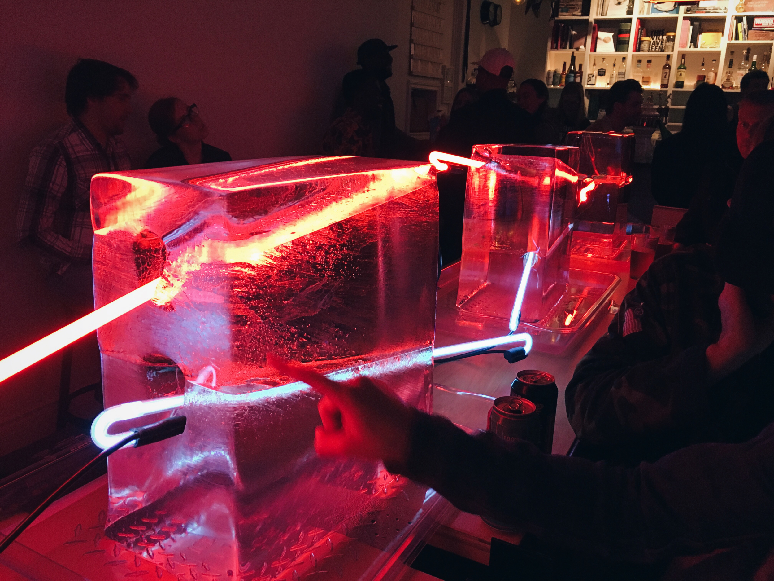
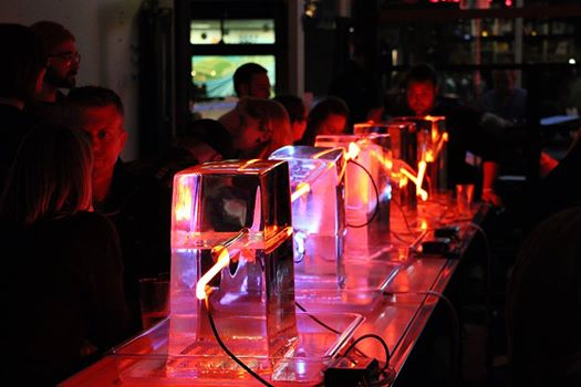
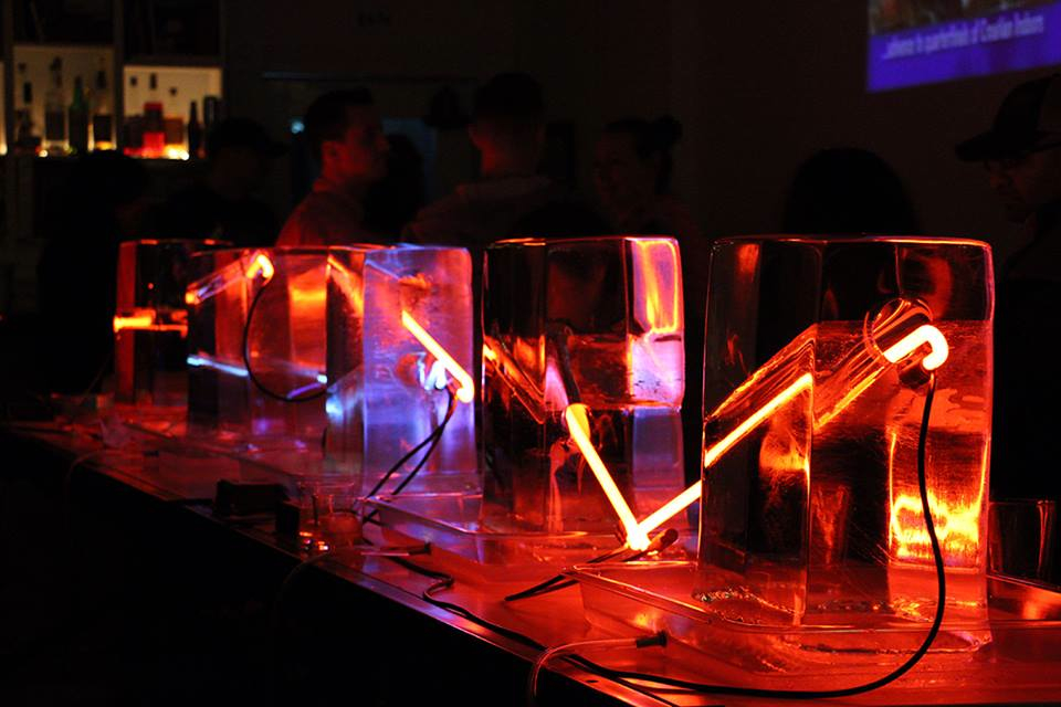
That Friday featured a breathtaking ICE + NEON project, with ice curtesy of ICEovation. I met James from ICEovation a little while ago (read about it here) and texted Scotty about him immediately. My intention was only to talk to Scotty about art and making, as we usually do, but it turned out that he had thoughts of putting neon with ice for a long time. I knew it would be amazing, but was worried they'd never be in the same place to do a project together. Thats another perk of this residency. Scotty, Devon, and James did a bunch of brainstorming and concluded that they wanted to make a project focusing on the formal qualities of both ice and neon. It would be about material, and the interaction between them. James cut big blocks out of ice, each with one or two holes going through. Then, neon bars were fed through each hole. These blocks sat all along the one long table in the middle of the space. It was super cool, both in concept and temperature. I'd never seen the bar so busy the entire month. ICE + NEON will do that for you.
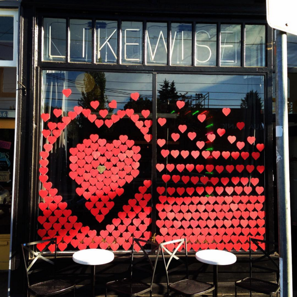
The fifth and final week was a culmination of everything that had happened that month. Nitwit covered the front window with styrofoam hearts. He also made my drawings from the first week's flyer out of styrofoam and put them all around Portland (including an extra special fancy version at my house).
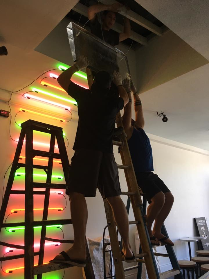
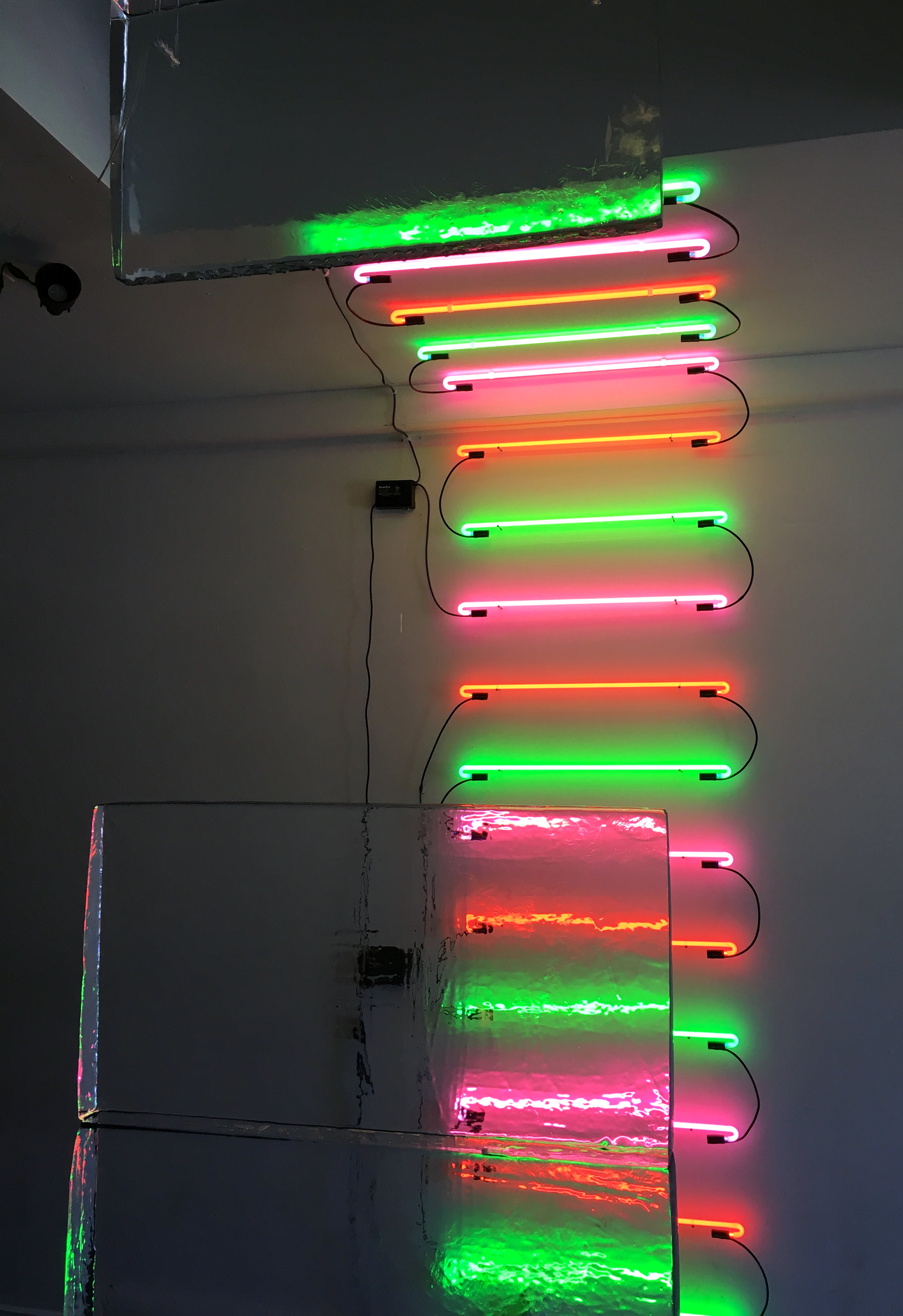
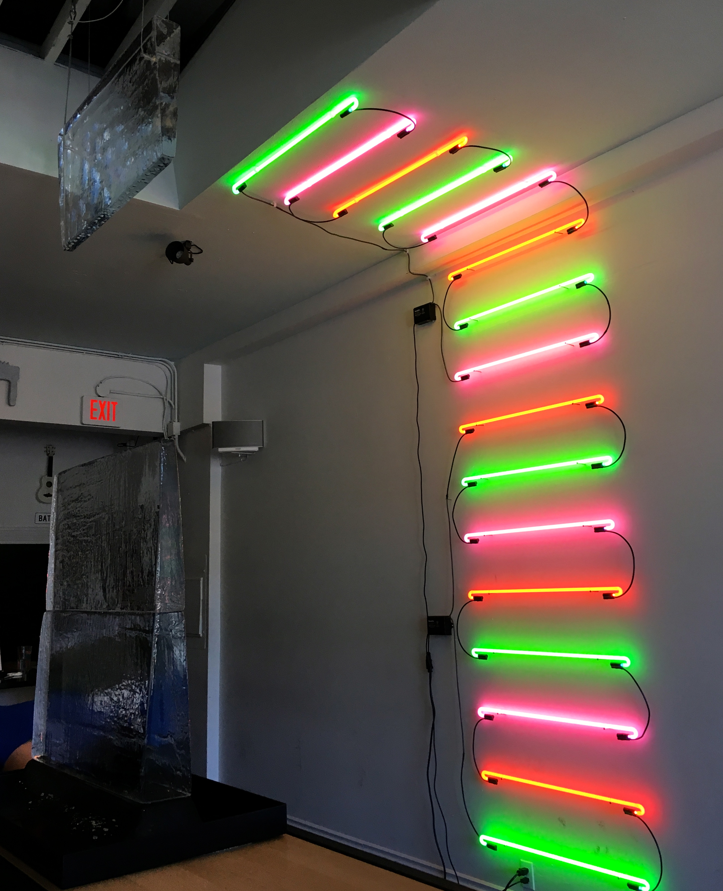
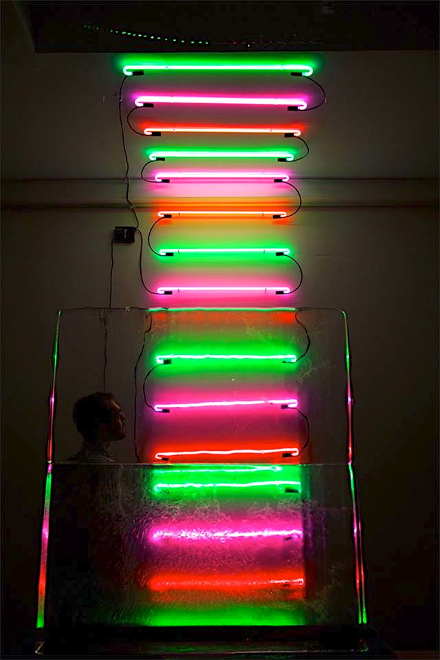
James brought more ice, what we lovingly called an ice guillotine. A big pointed slab of ice was hung from the skylight, dripping down onto an even bigger pointed block on the table. At first it seemed like everyone was going to die while installing the hanging ice, then it seemed the splash zone was far too large. But as the ice kept melting it got to a spot where you could watch the drips coming down and melting the block on the table without any fear. So cool. Scotty and Devon also created an archway out of neon along the wall, with the ice completing the circle. This was interesting from every angle, both walking through the portal and viewing the neon through the ice from the other side. A awe-inspiring end to an already superb project.
I'm sad its over, but more than anything glad it happened. Who would have thought that these people from all over the country would come together in this little bar to create and collaborate and be so inspired. It exceeded all expectations, and, for me personally, reinvigorated my creative spirit. I met so many amazing creative people and feel lucky to be counted among them as a collaborator in this project.

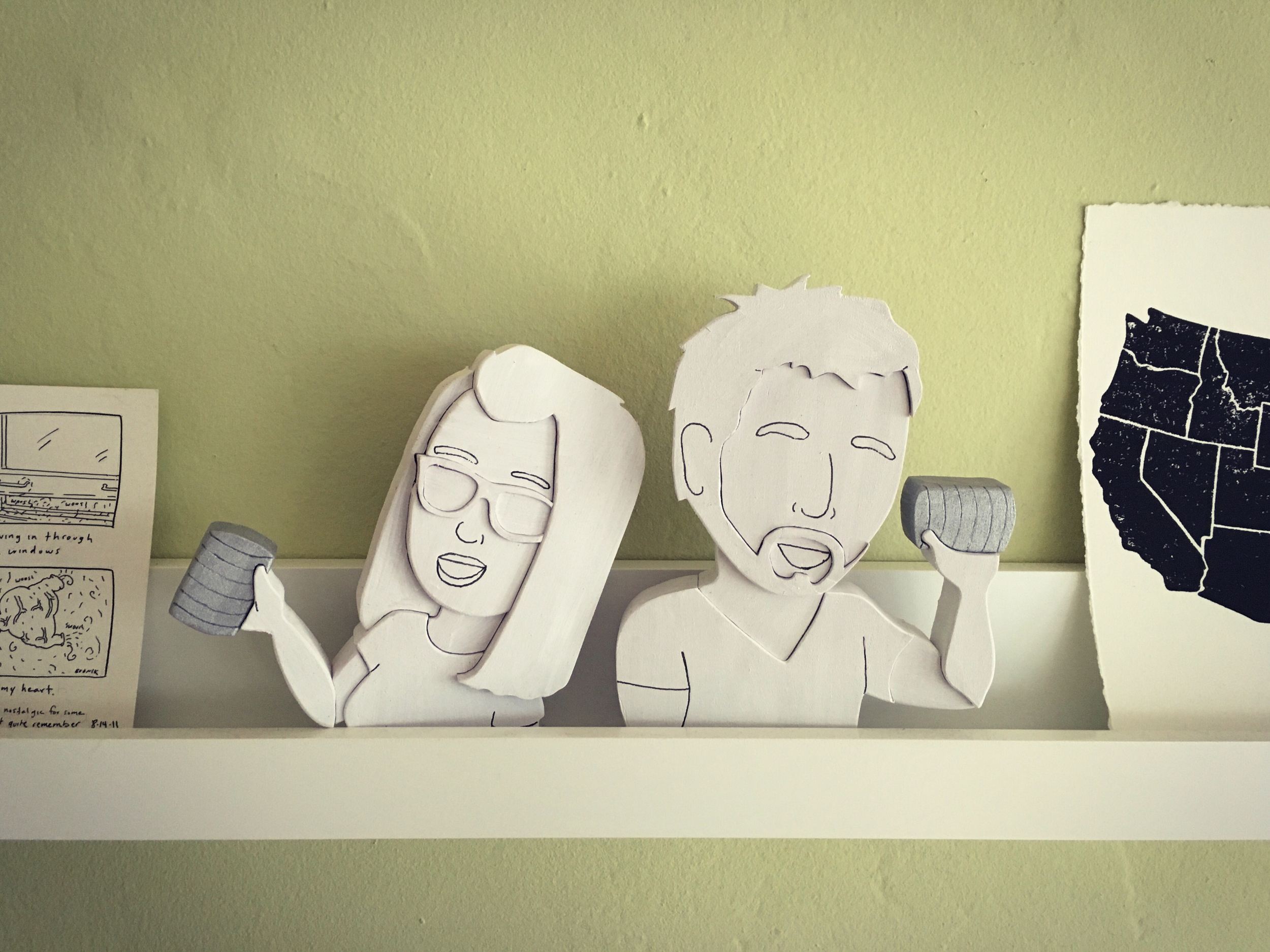
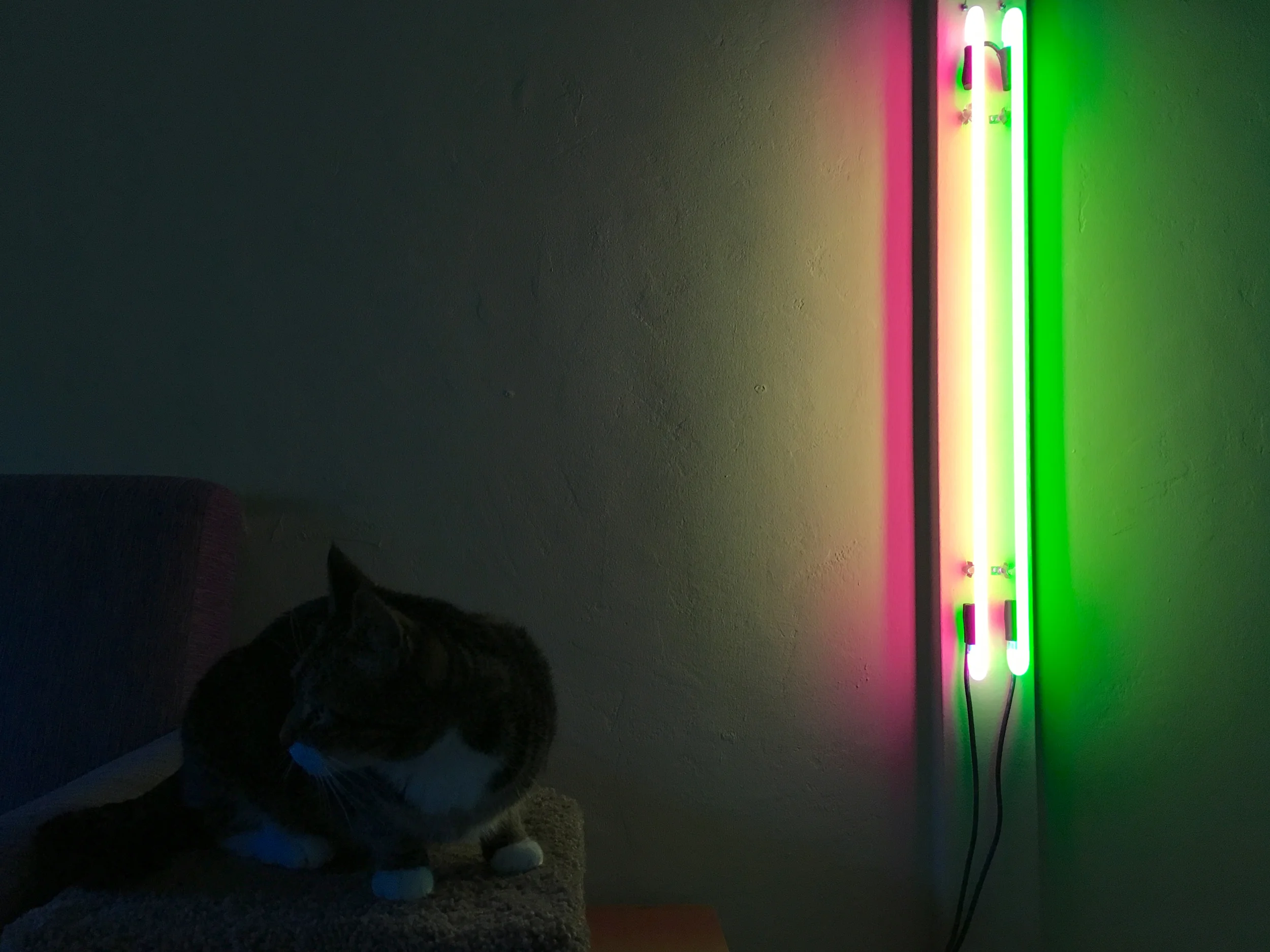
Before he left, Scotty installed some neon in my house, making me the proud owner of a Scotty Gorham original. Now my house and heart are forever filled with neon.
So come to where I live, stay in my extra bedroom, hang out with me every day for a month, oh and invite me to make some art with you? Couldn't have asked for any more. Lots of love Scotty. I know I'll be there as you continue on in your art journey, where ever that may take you, and I know this will be a huge step towards your continued success.
Books the Cat had a good month, too
See all of my design work for Soup Can here.