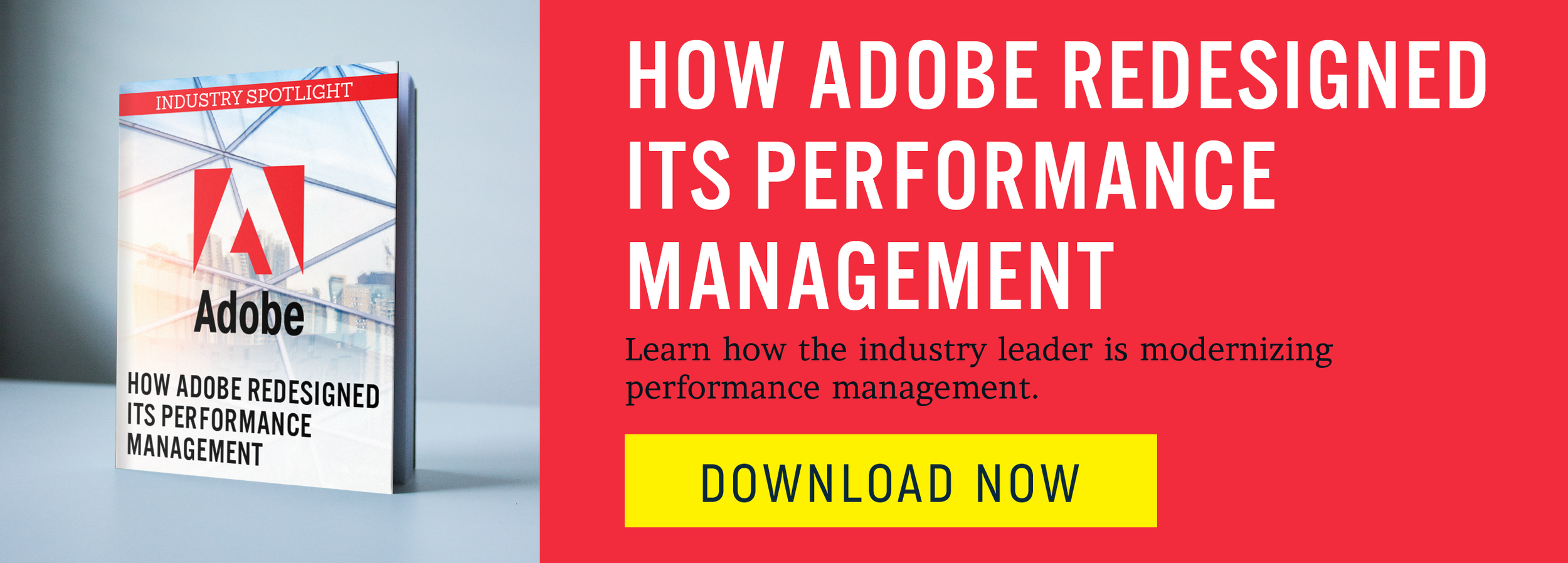
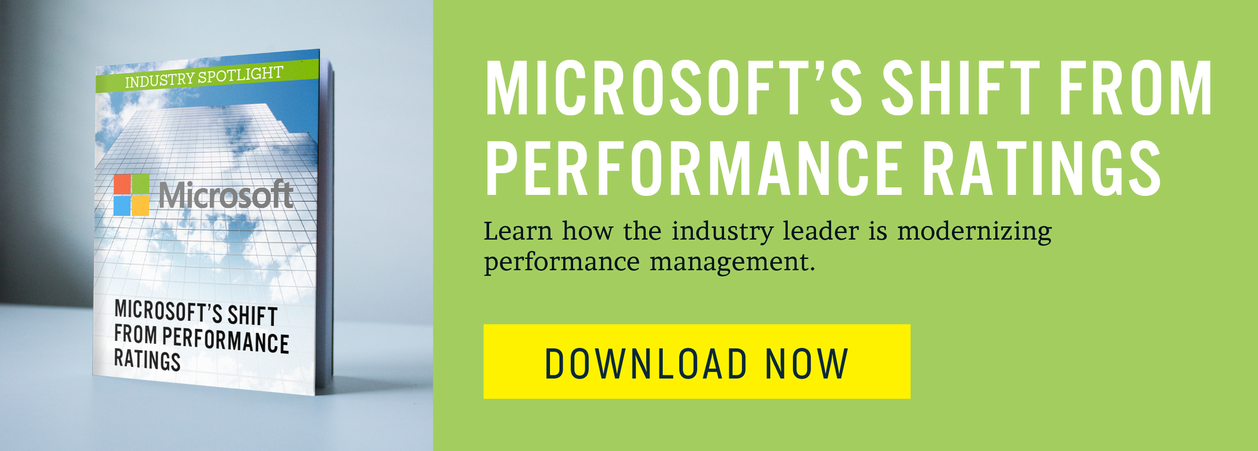
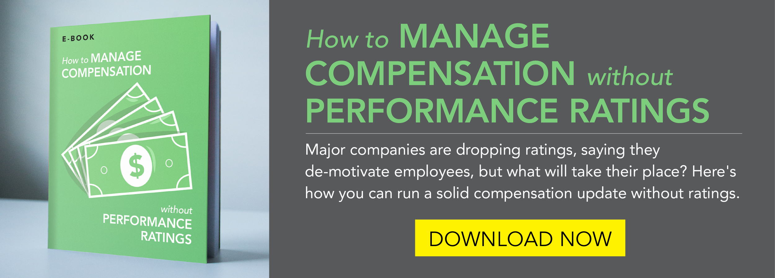
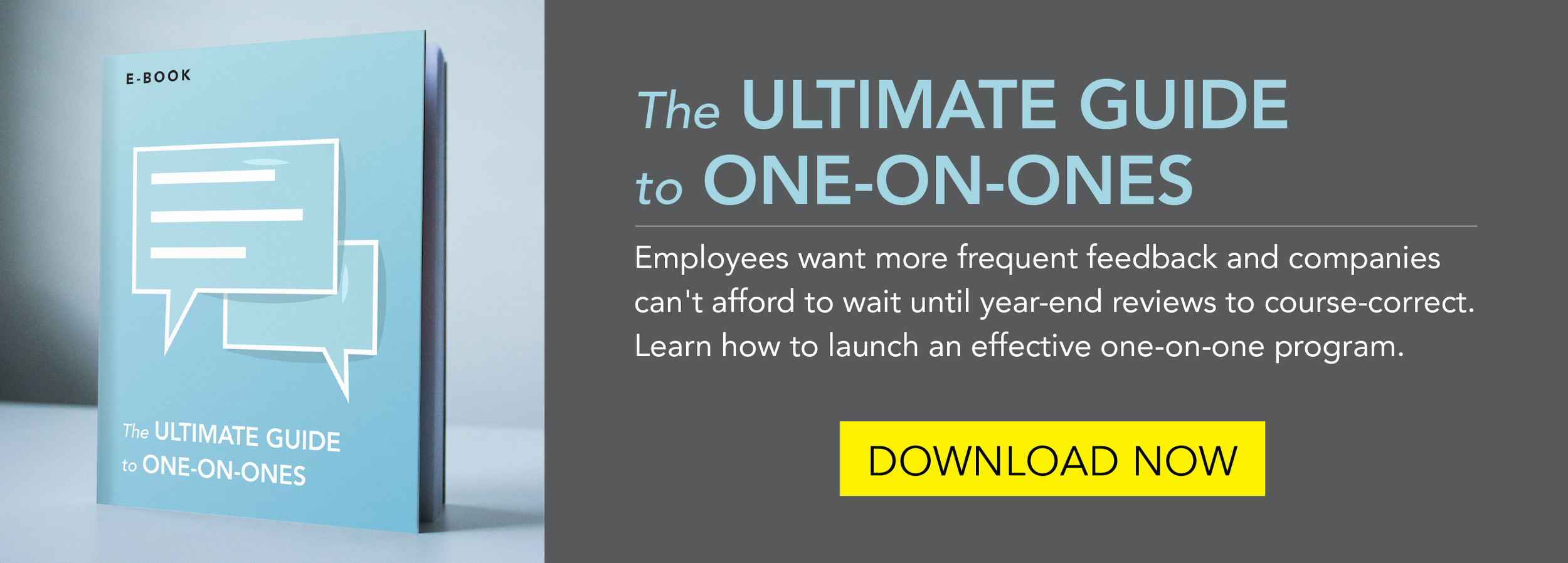
I've recently been working on some projects for Reflektive, a performance management company based in San Francisco. The first thing I did was was a big infographic. Using their company colors and fonts, I turned a giant list of stats into something more digestible. I really enjoy infographics, they're just like super precise illustrations. I even got to draw a few icons.
I want to delve really deep into infographics now, and be the best infographics guy around. Its cool to turn something thats sort of boring like a big list of numbers into something really visually impactful, to communicate without words.
I also worked on some ebook covers and banners for them. I made two different sets, first using stock photos and companies' logos. These each highlighted performance management and reviews at big corporate companies. The general office photos we chose give it that corporate feel, and the colors are pulled from each logo. I mocked up each cover as a real book and used those on the banners.
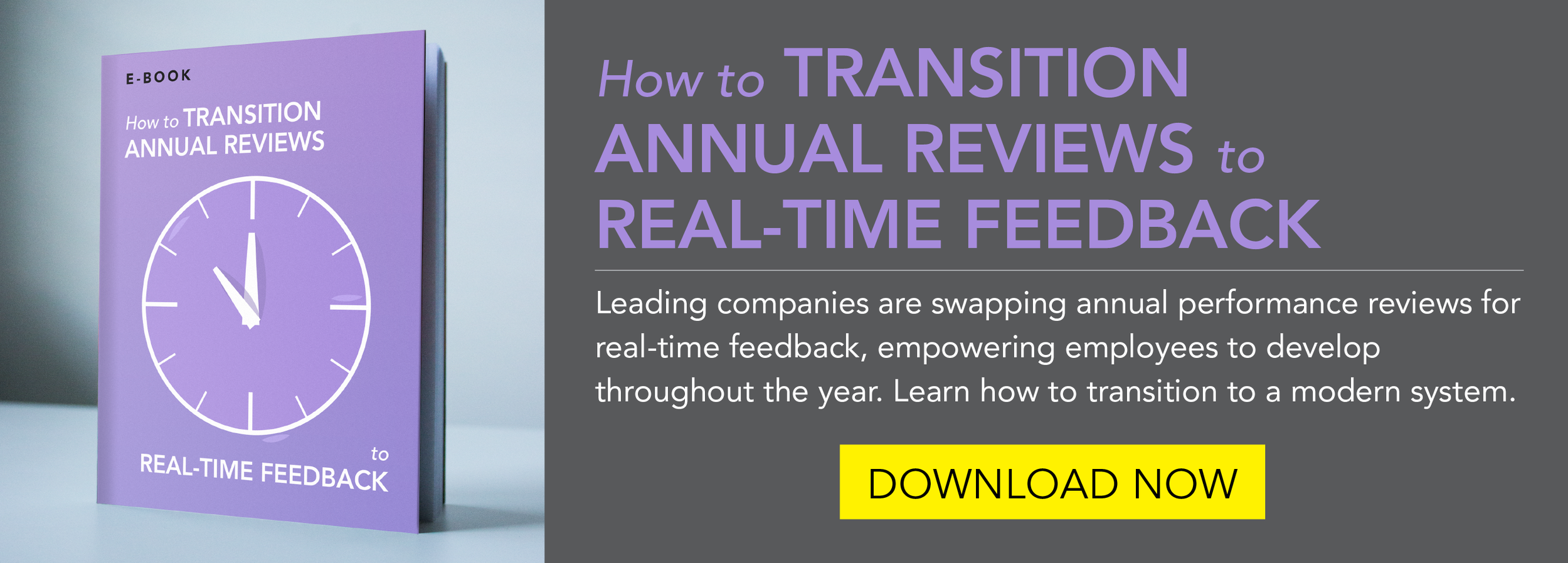
For the second set about more general performance management ideas, I drew up a bunch of simple line drawings with highlights and shadows. Then I made monochromatic covers which were again mocked up for the banners.
I'm happy with how everything turned out and also really happy to find another way to incorporate some illustration into my design work.


